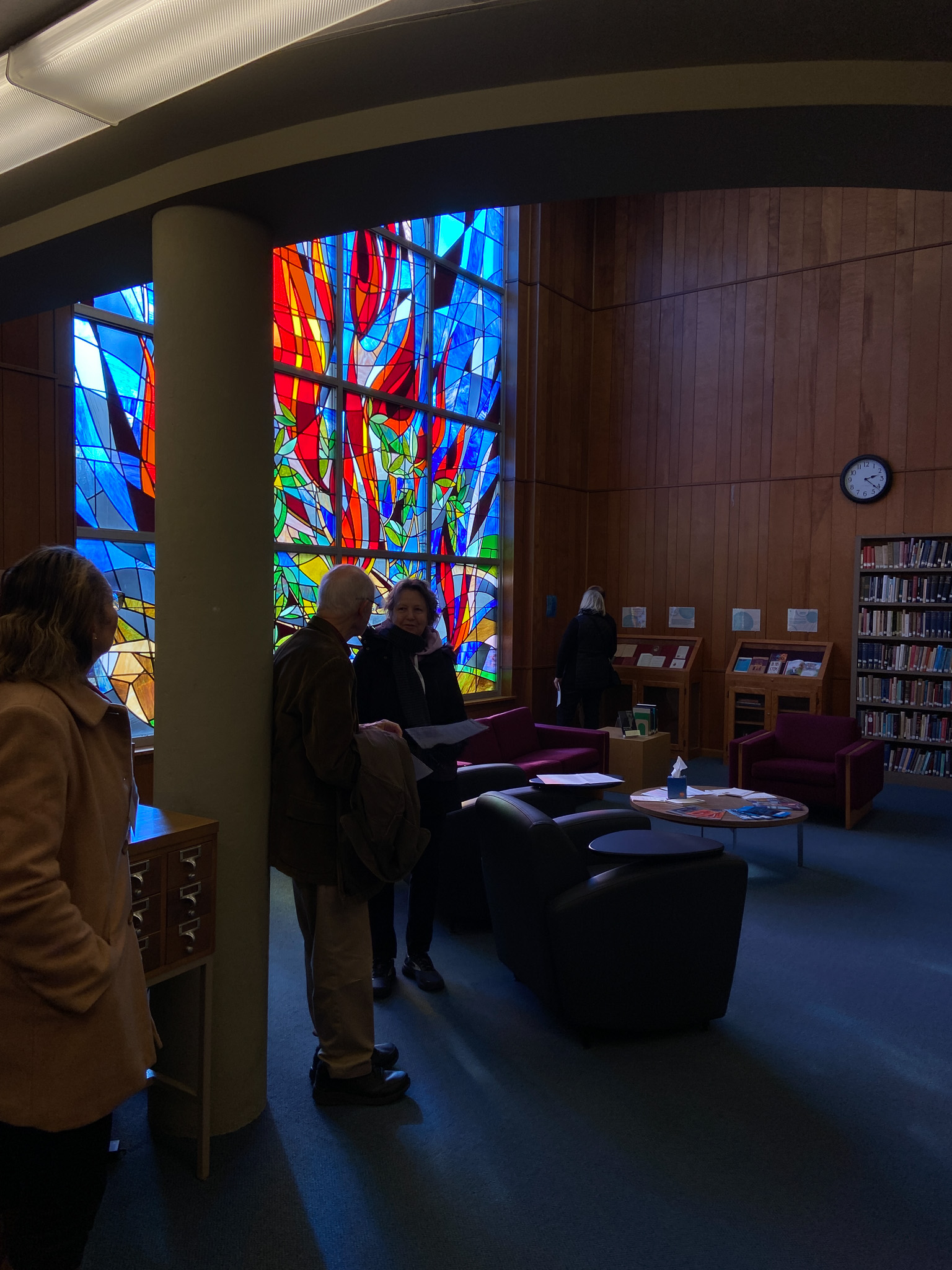
Last year Lawrence Modern learned that KU had placed Smith Hall on a list of university buildings—among a dozen deemed obsolete and “demolition ready”—that were likely to be razed in Fiscal Year 2023. Like the superheroes in The Avengers, we sprung into action with the Lawrence Preservation Alliance and assembled a multitalented team to save Smith Hall. The University’s plans have now changed.
The State Historic Preservation Office of the Kansas Historical Society informed KU last month that Irma I. Smith Hall, a building located within the University of Kansas’ East Historic District, is now a “contributing” property within the district. This action significantly strengthens the possibility of saving Smith Hall from the wrecking ball. I recently wrote an OpEd about this in the Lawrence Times, which you can read here, but for the Lawrence Modern preservation group, a key stakeholder in the effort to save the building, I’d like to provide a bit more detail about how we got here and what lies ahead.
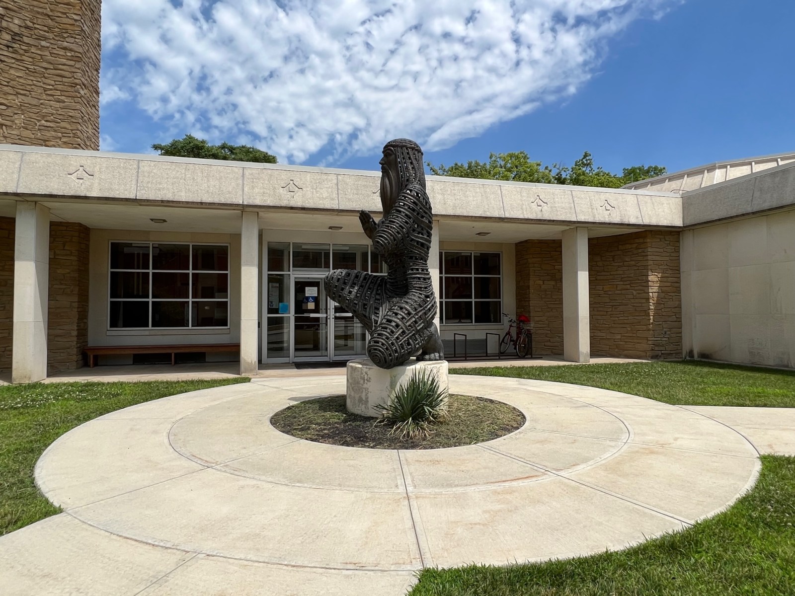
The road to preservation began last December, when Lawrence Modern, the Lawrence Preservation Alliance, and the Historic Mount Oread Friends group hosted an open house at Smith Hall to raise awareness of the building’s plight. More than 125 people attended. The event featured family members and friends of building namesake Irma I. Smith, and of Elden Tefft, the late KU professor and renowned bronze sculptor who created the statue of Moses that rests in Smith Hall’s front courtyard. Since then, community members have banded together and written letters to key decision makers, penned newspaper articles, engaged in online outreach, and taken political action.
The community response has been remarkable. Students, faculty, Lawrence residents, and beyond have demonstrated deep and long-lasting ties to Smith Hall. The messages sent to the Chancellor, Provost, and the 12-member Kansas Board of Regents (KBOR) have made a significant impact.
Parallel to the letter writing campaign, a coalition of individuals met with Lawrence legislators, which led to discussions about Smith Hall at the statehouse level. At a House Higher Education Budget Committee meeting in February, Lawrence Rep. Mike Amyx asked KU Chancellor Doug Girod about KU’s demolition planning process, as well as specific plans for Smith Hall. You can watch that illuminating exchange here.
At the meeting Girod indicated that a final decision about Smith Hall would be put on hold until the new Campus Master Plan is completed later this year. The Campus Master Plan is a blueprint for the development of the KU campus over the next 10 years. Girod noted that KU has had town halls to invite everyone in the community into the master planning process before final decisions are made. The larger Lawrence community was not invited to discuss Smith Hall, however.
When asked about Smith Hall, Girod said: “Smith Hall has been an area of focus obviously for us, it is largely a vacant building that needs significant repair, and would need massive upgrades.”
Technically speaking, Smith Hall was not vacant. Classes were held there in the fall 2022 and spring 2023 semesters and office space was still in use. The library continued to be utilized as a place of study, work, and contemplation. The building is currently in the process of being vacated. KU says the building will be heated and cooled in addition to staff checking on the building once that’s completed.
Perhaps most importantly, Girod’s comments about Smith Hall’s condition do not align with information contained in KBOR records. In January 2021, KBOR released a building condition study that assigned a facility condition index (“FCI”) score to buildings at Regents institutions across the state. That report gave Smith Hall a score of .25, which translates into a “B” on a scale ranging from A to F. This index is an industry standard metric that identifies the magnitude of needs and deficiencies for a building or college campus. According to that study, the cost to bring Smith Hall to a 90% renewal level, or “A / good” condition, is projected at $859,151. The funding KBOR allocated for Smith Hall’s demolition was $650,000.
The study also identifies a total replacement cost for the buildings, and Smith Hall’s replacement value is approximately $5.6 million. This means that it would take at least that much money to build back the same building with similar functionality.
On March 7, the House Higher Education Budget Committee met to make recommendations about KU’s budget. Rep. Amyx offered an amendment that was aimed at ensuring KBOR would have an opportunity to receive complete information about KU’s plans for Smith Hall before voting again on demolition, and that the public would also have an opportunity to offer testimony to KBOR on the topic. The amendment requires a majority vote from KBOR before the building can be demolished in Fiscal Years 2023 or 2024.
The House Higher Education Budget Committee voted to include this amendment in its funding recommendations. You can watch the committee’s deliberations here. The full text of the amendment can be found here.
Meanwhile, the Lawrence Preservation Alliance prepared a draft nomination and a request for the State Historic Preservation Office to reevaluate Smith Hall’s status within the KU East Historic District. The Office did and granted Smith Hall “contributing” property status in July. As I noted in my column, this change offers KU new opportunities and responsibilities in its stewardship of Smith Hall going forward.
For instance, the university is now able to apply for and use state historic tax credits for repairs or rehabilitation to Smith Hall. Any proposed changes to the building will require review under the Kansas state preservation law (K.S.A. 75-2724).
Furthermore, KU has an agreement with the preservation office allowing the Campus Historic Preservation Board to review any proposals for modifying buildings within the district. A finding by the board that a proposed project would “damage or destroy” the historic building would halt the project unless an appeal is made to Gov. Laura Kelly.
While these important steps taken offer hope that Smith Hall ultimately will be saved from demolition, the building is still endangered. We look forward to communications from the KU administration about their plans for Smith Hall given its new status.
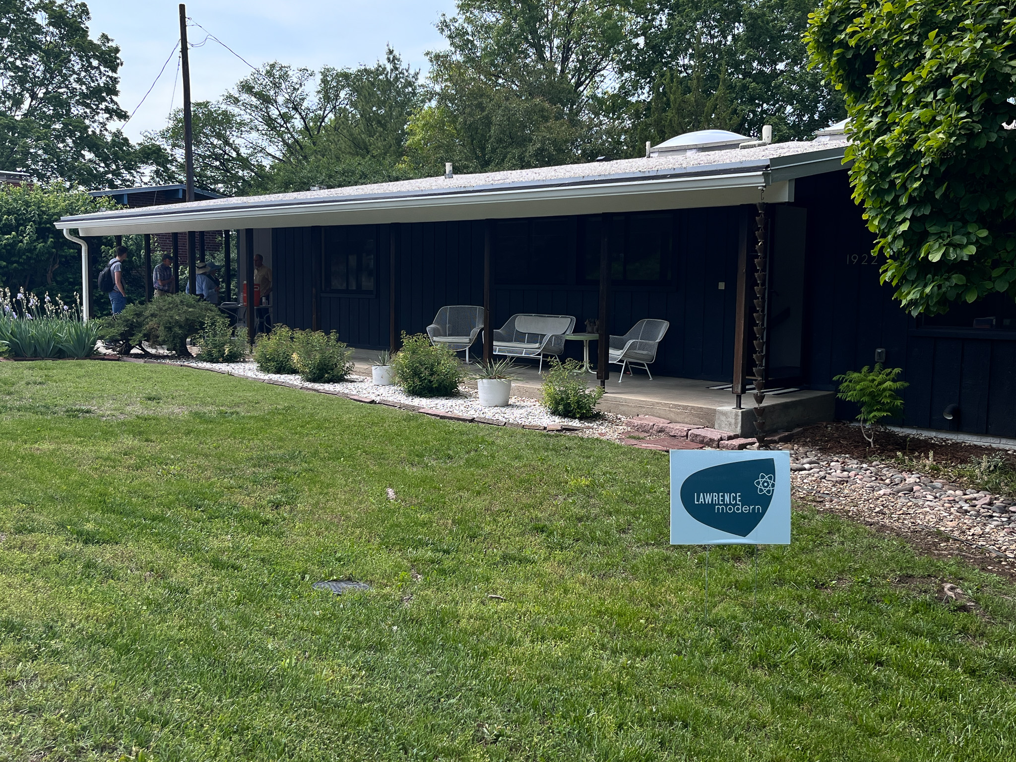
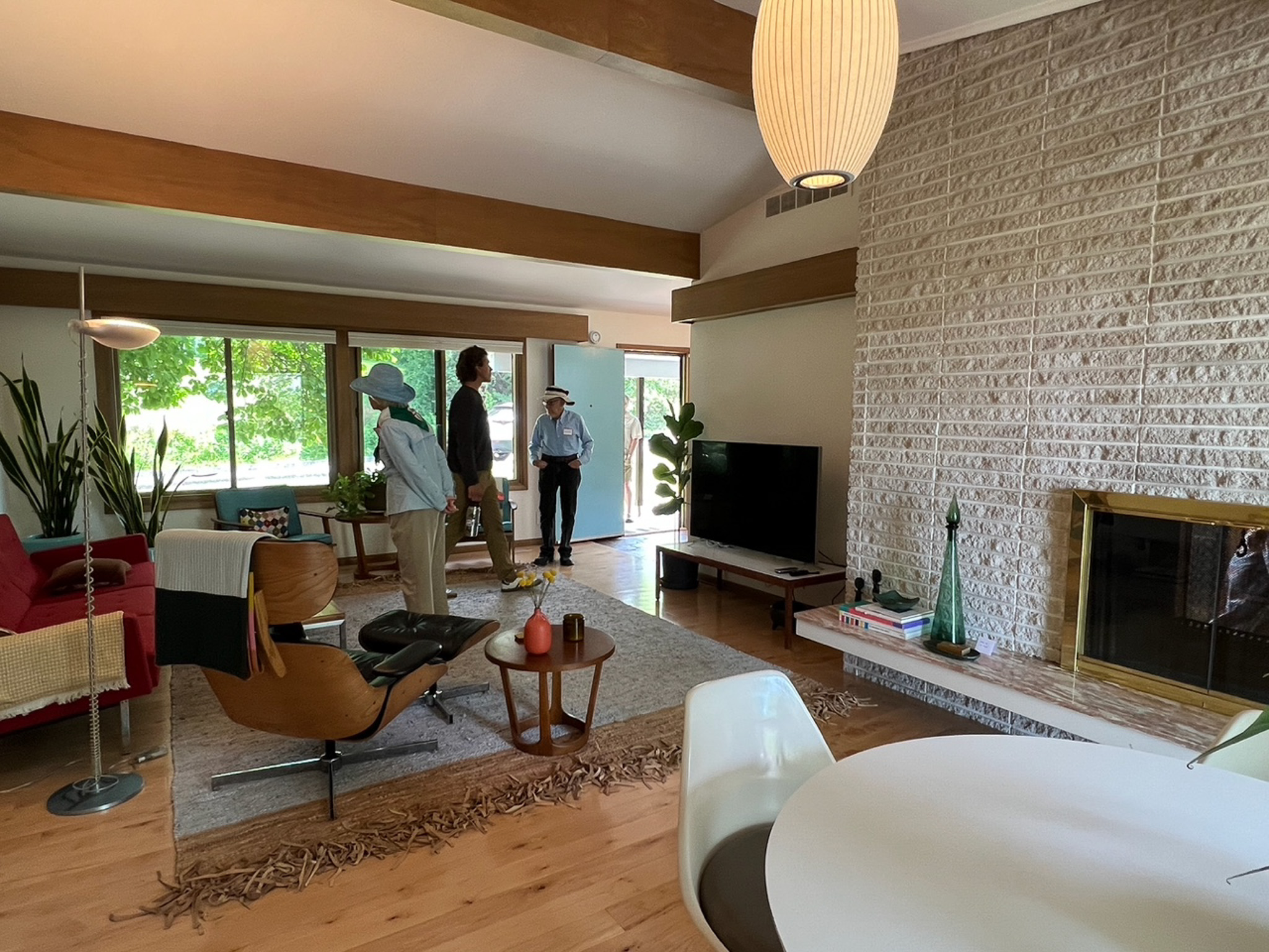
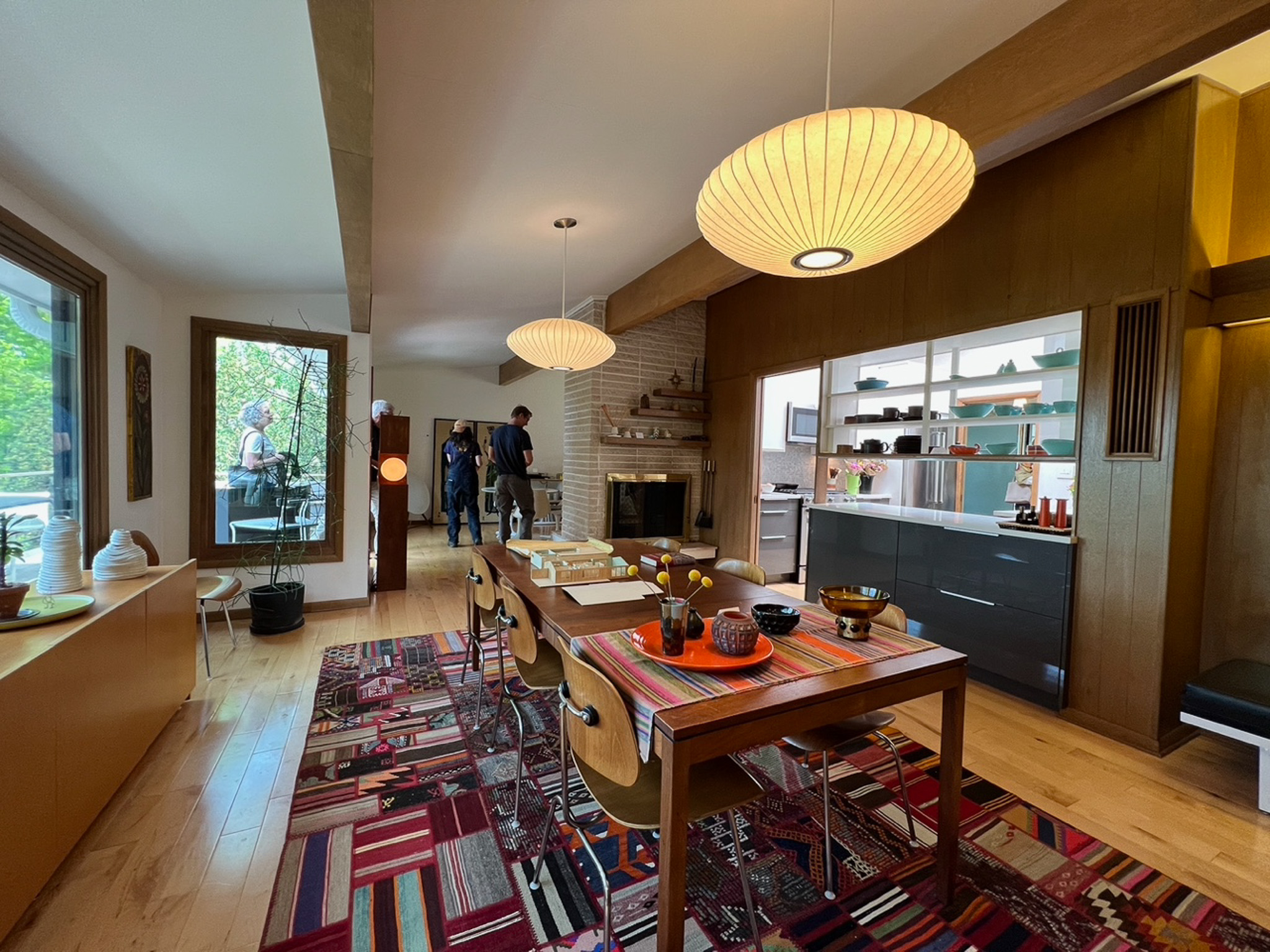
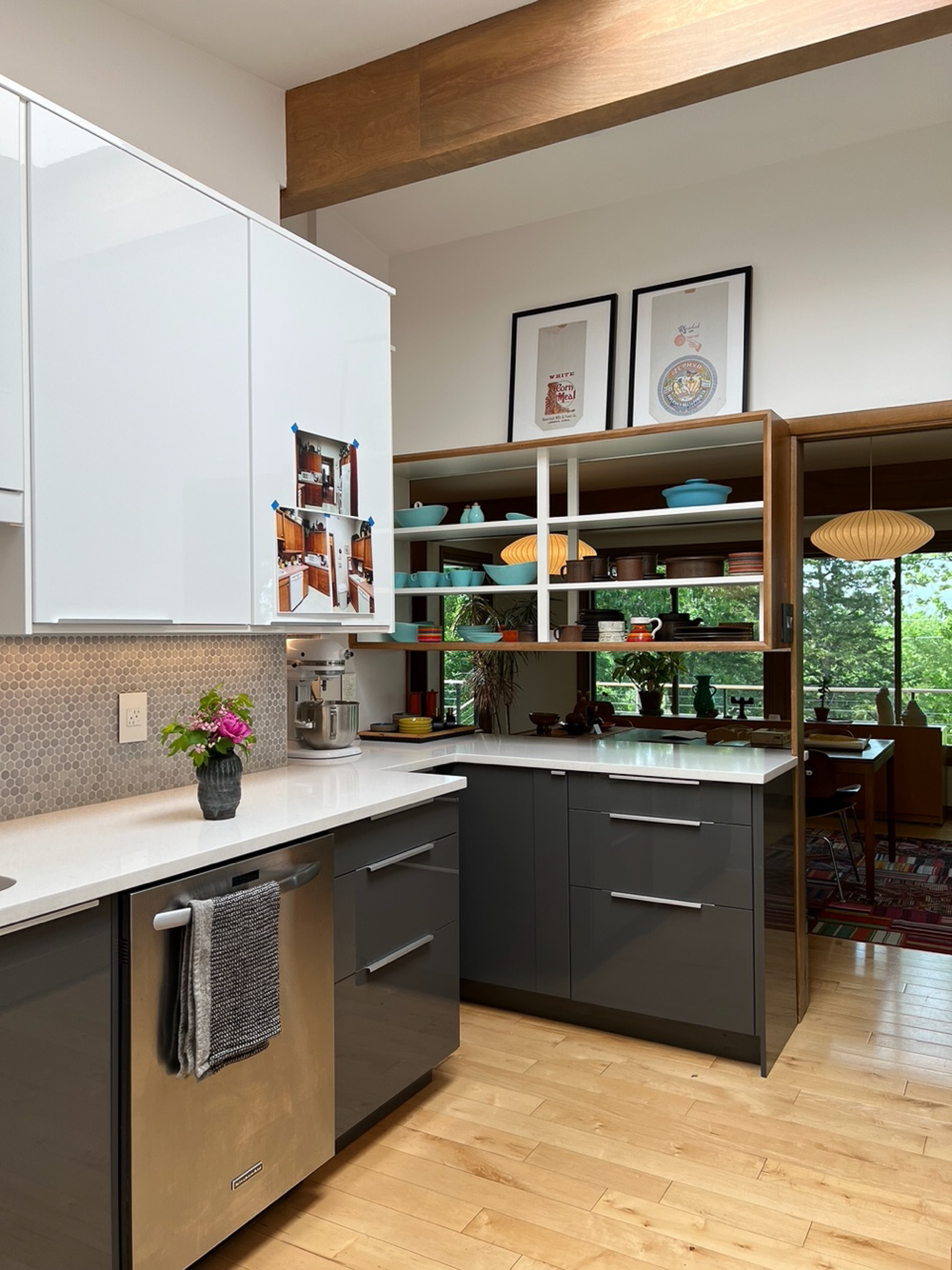
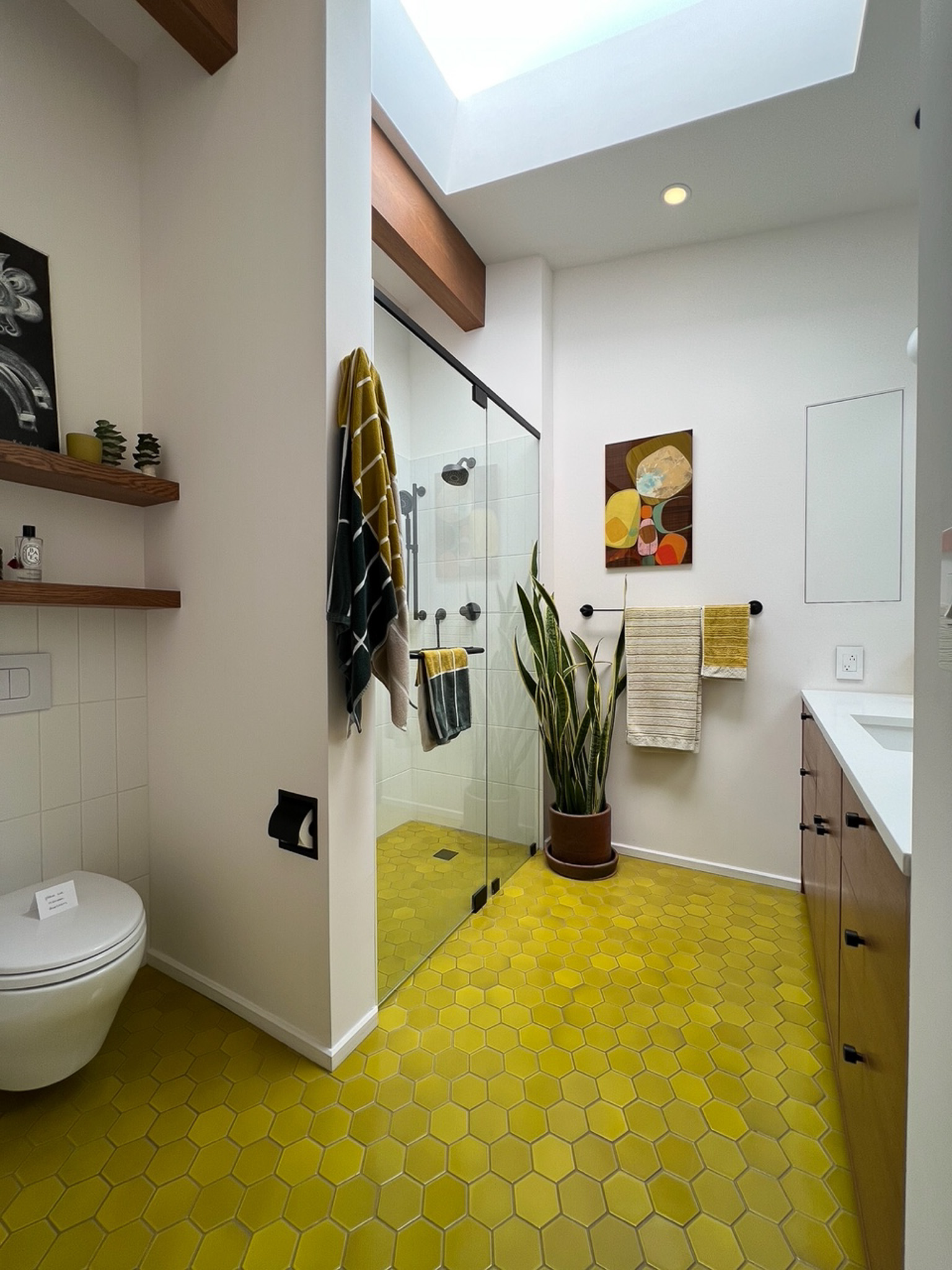
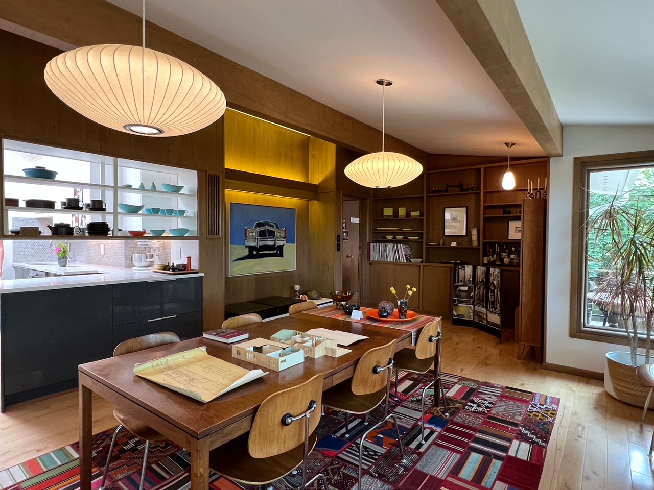
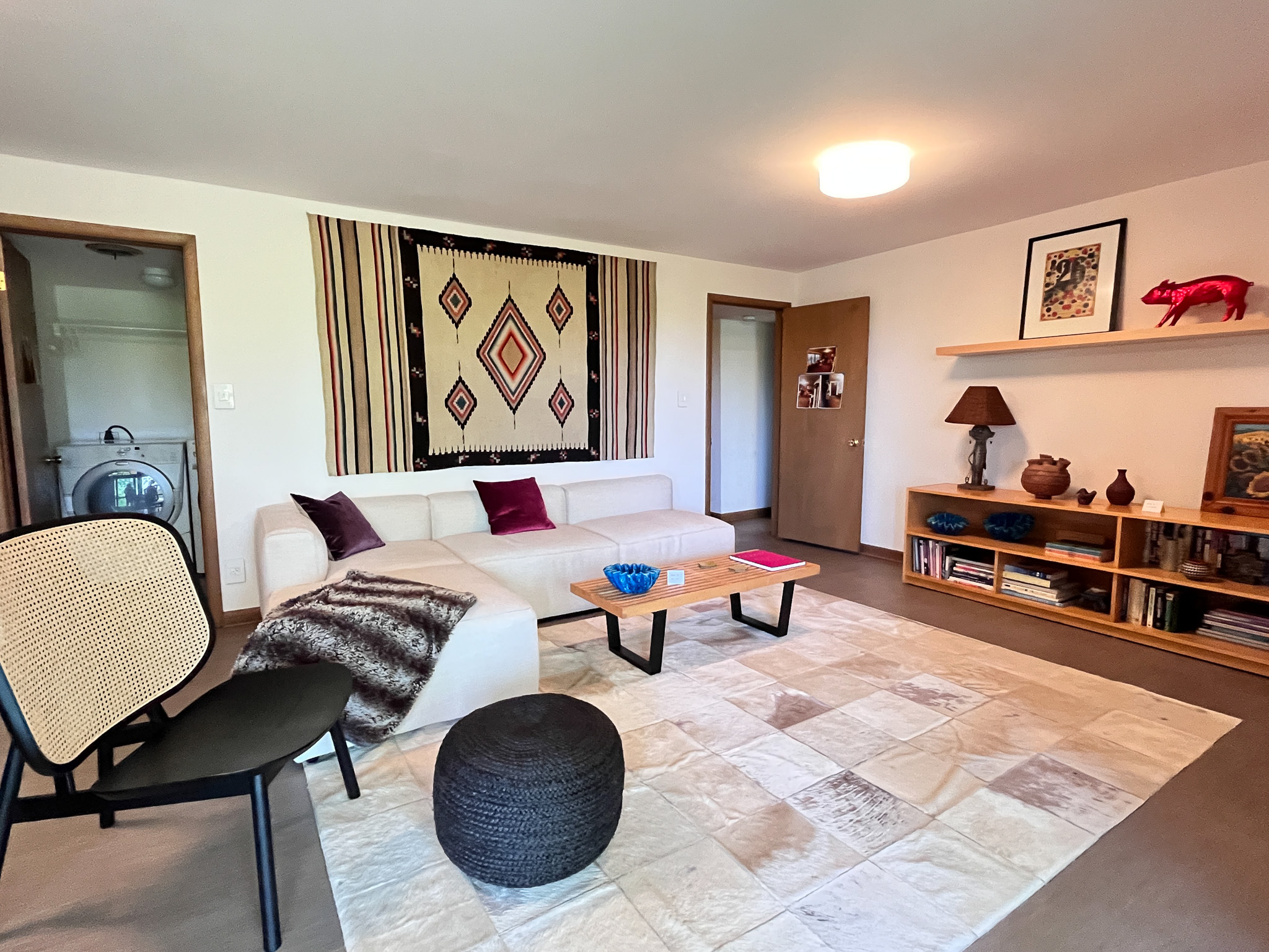
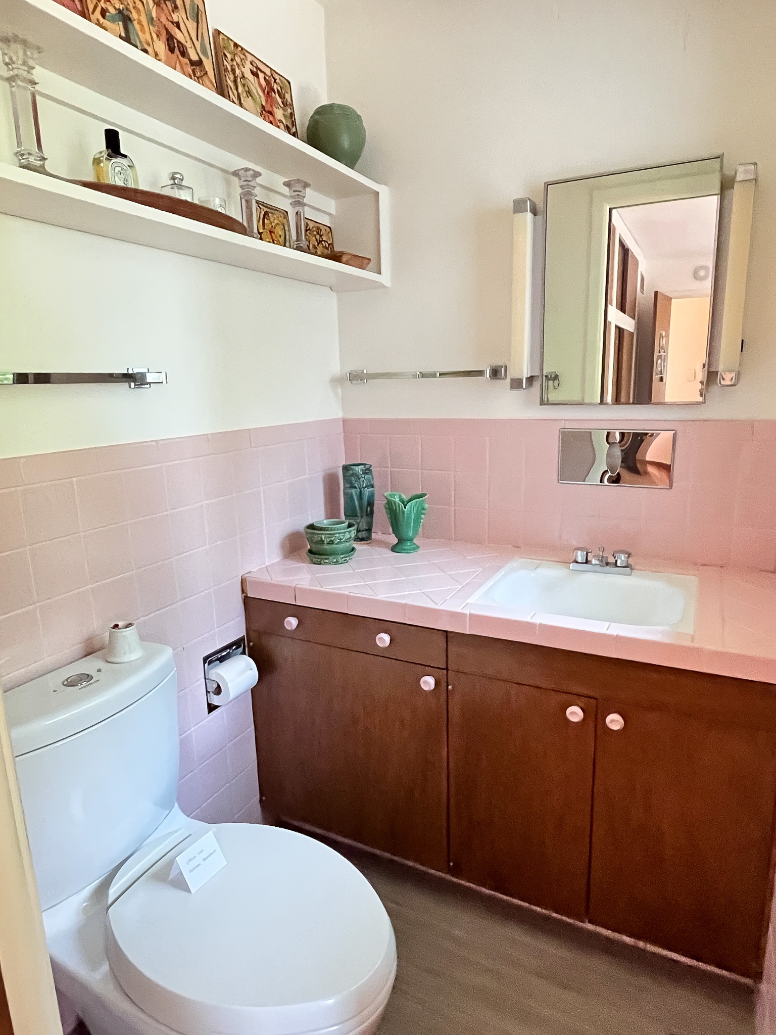
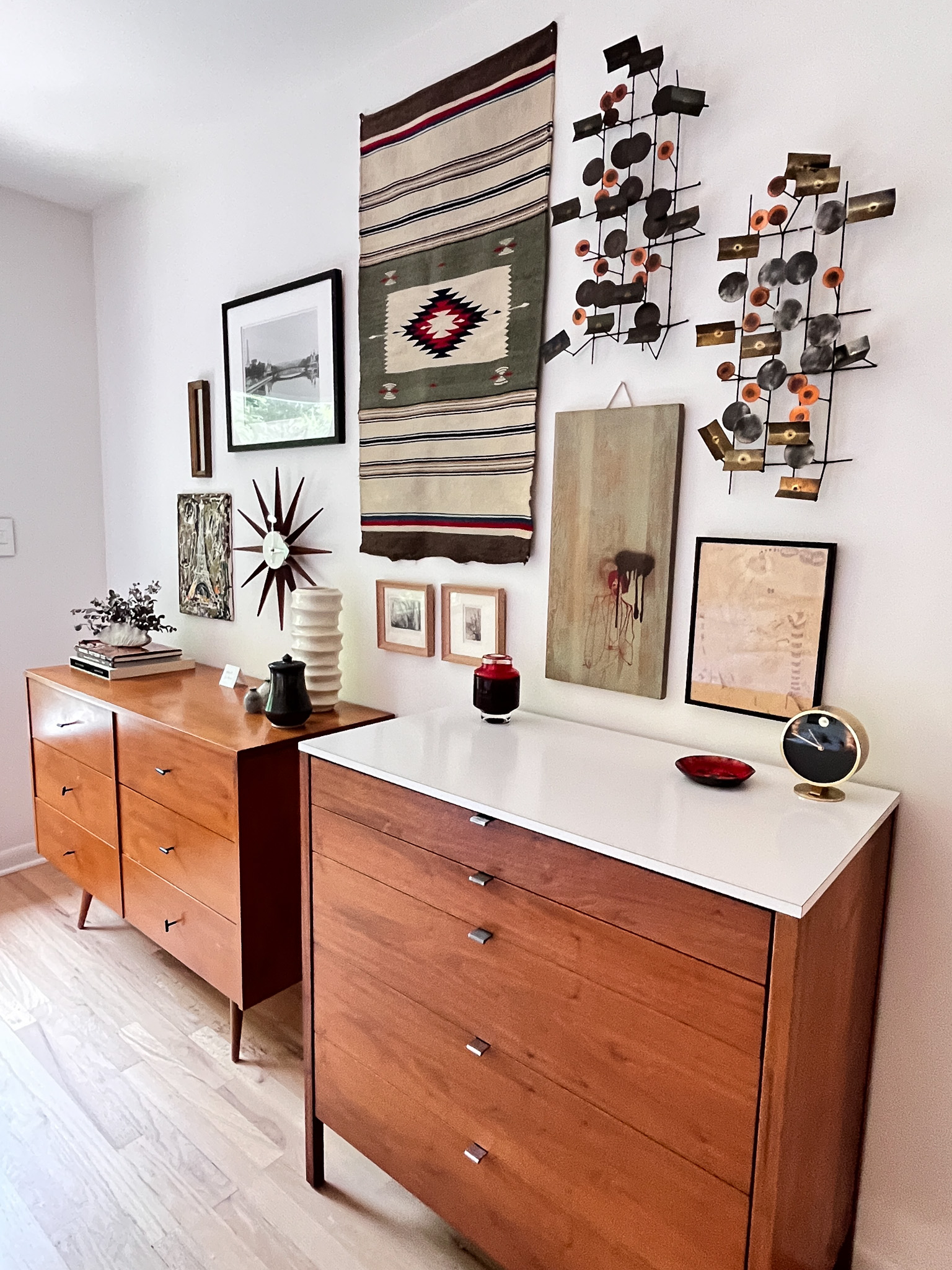
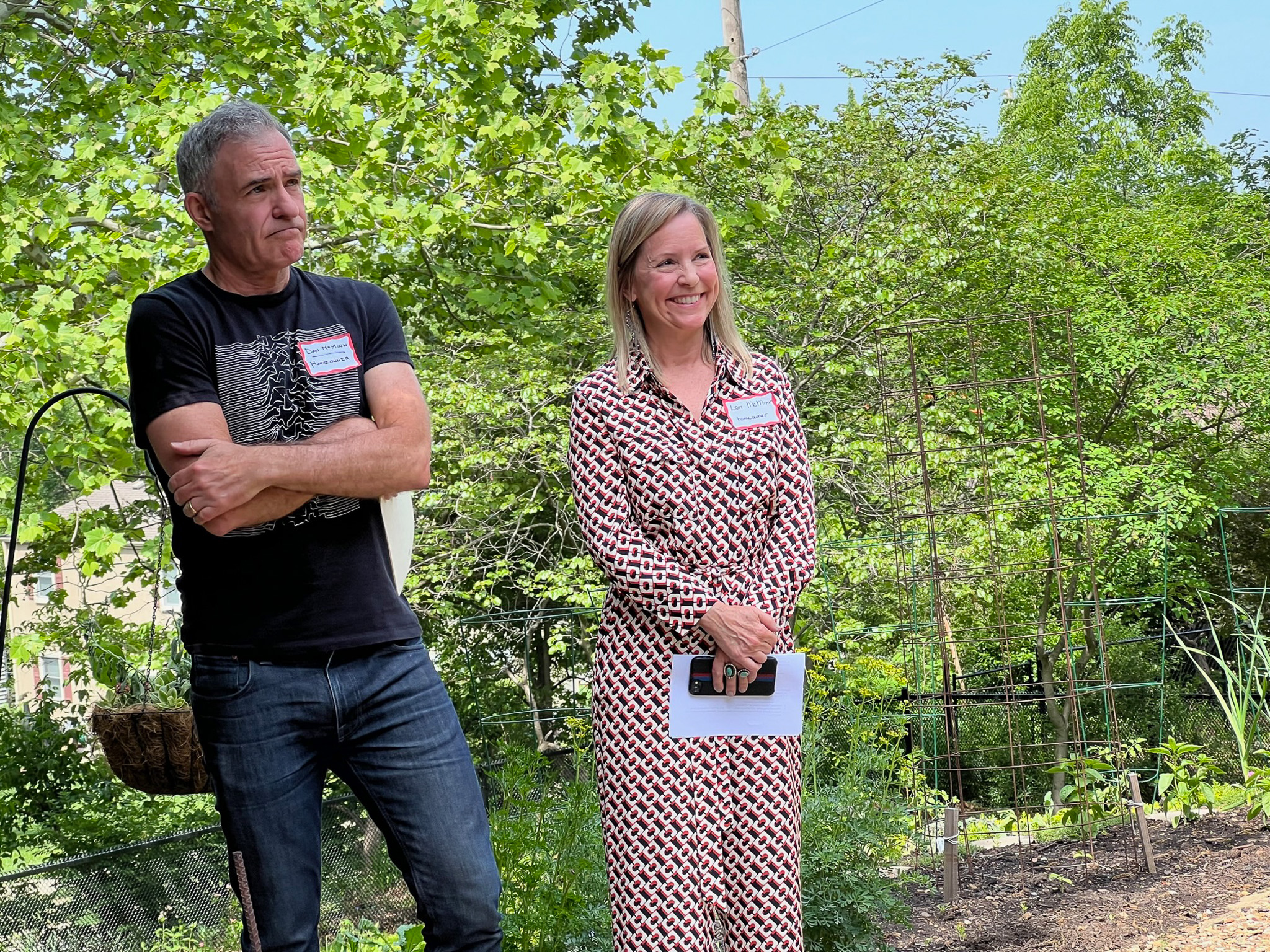
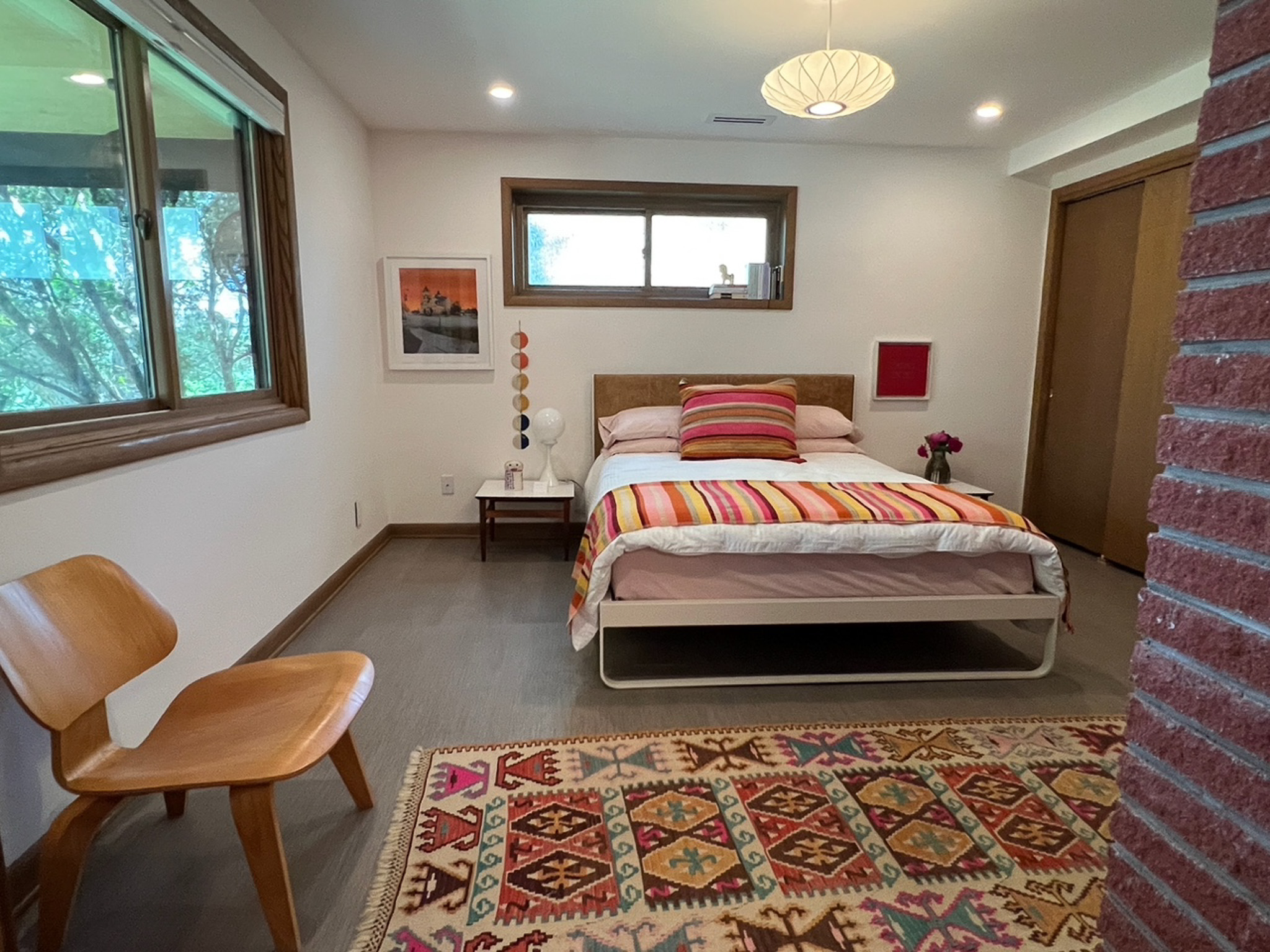
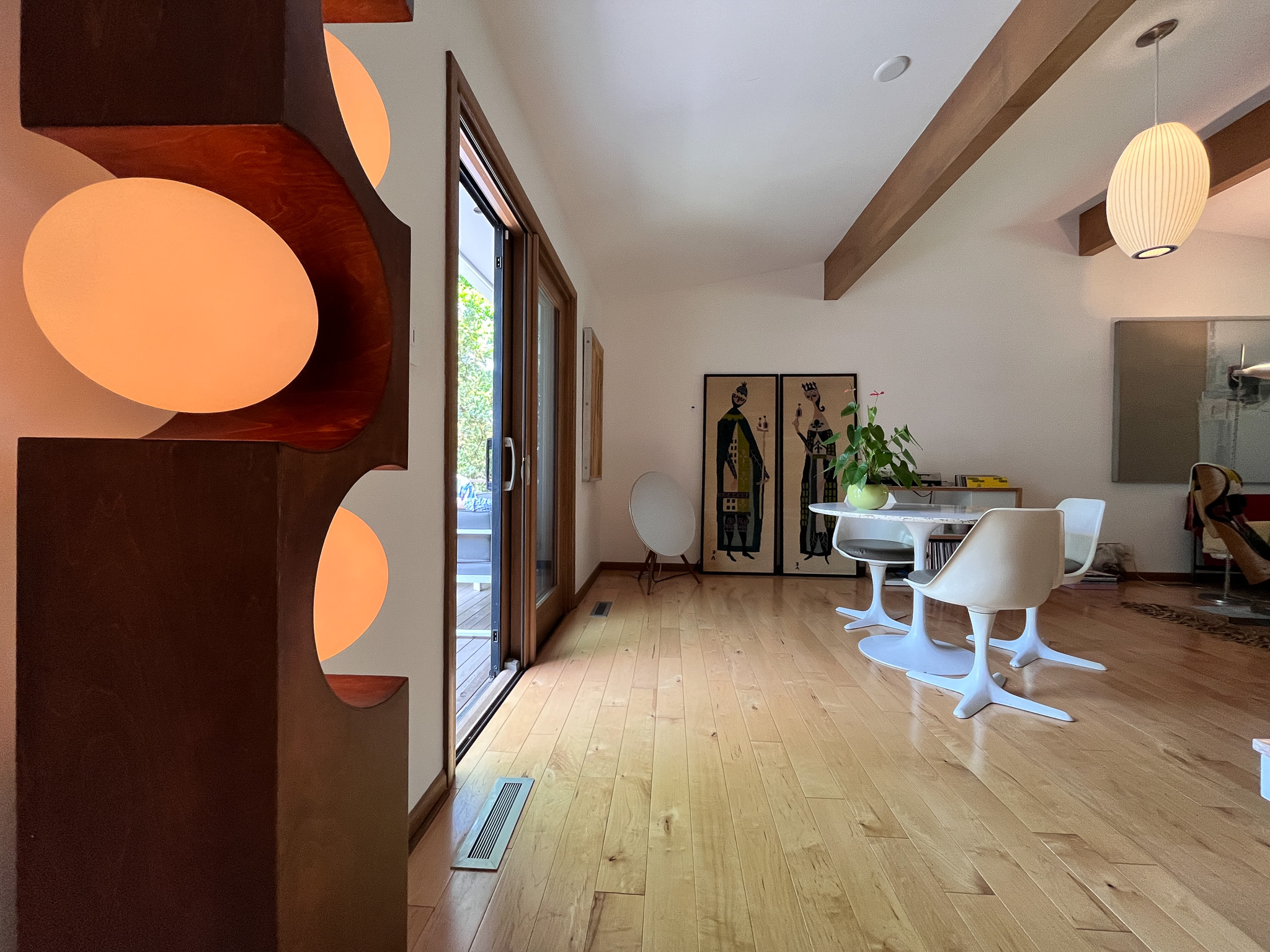
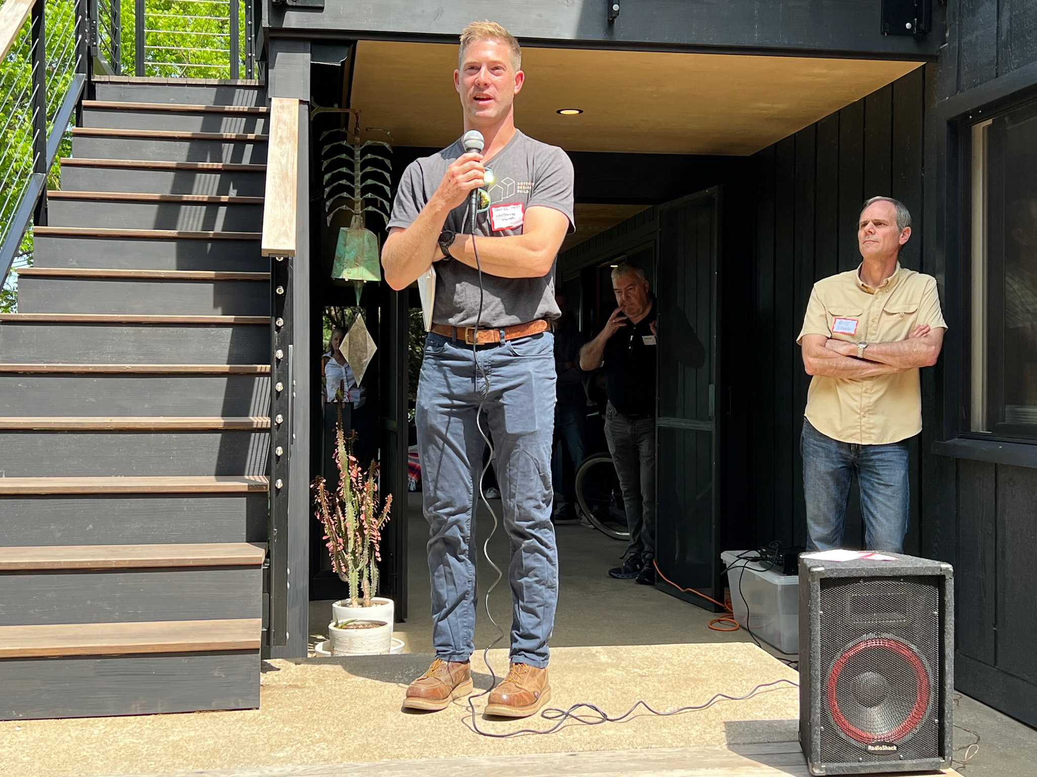
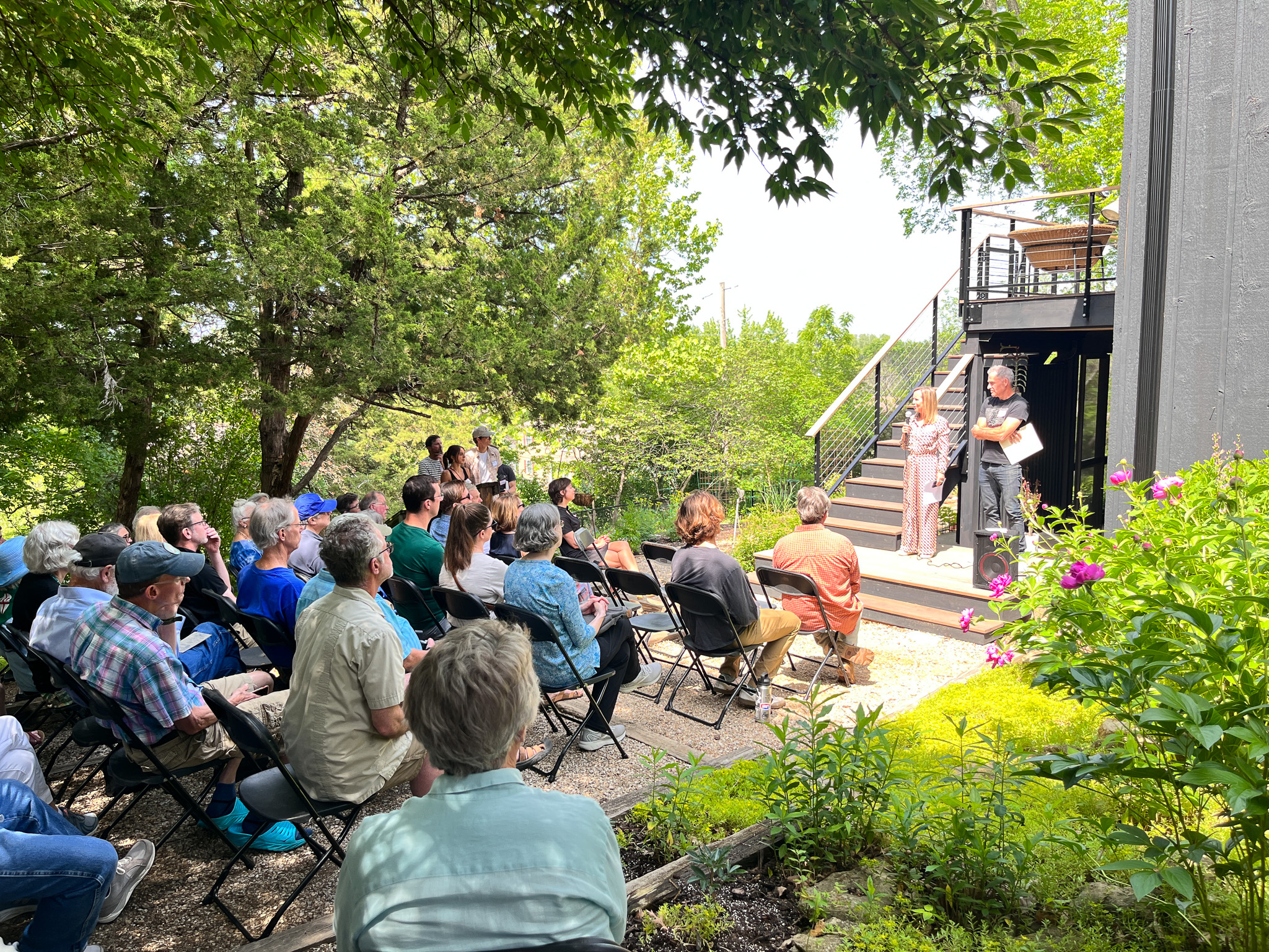
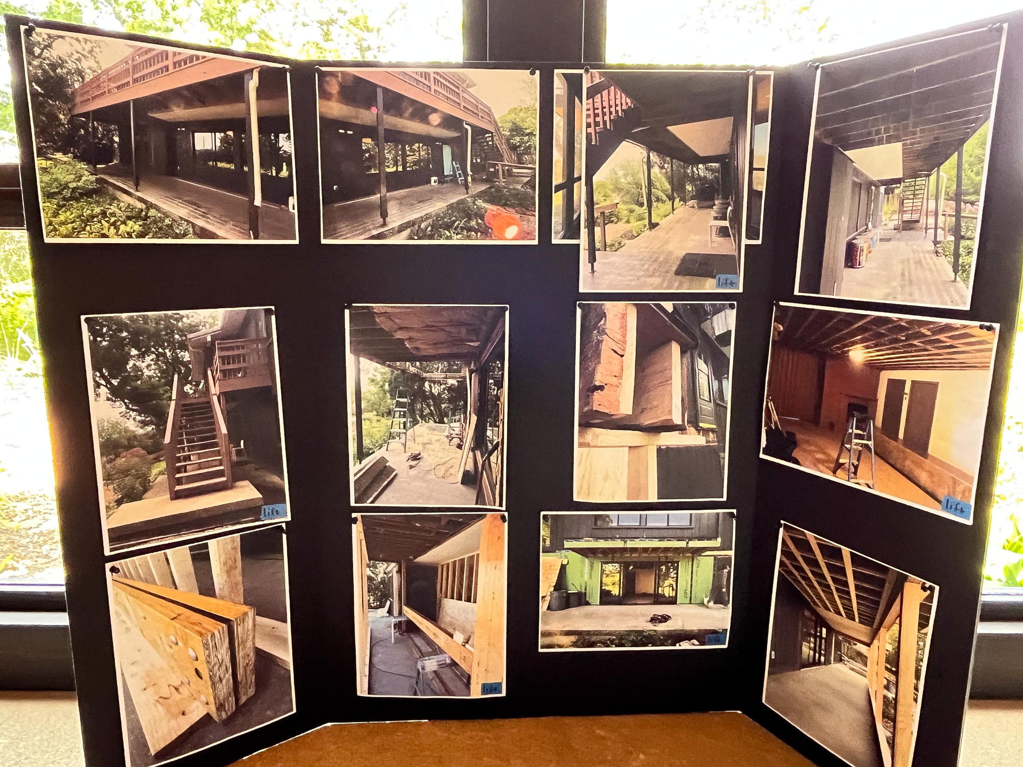
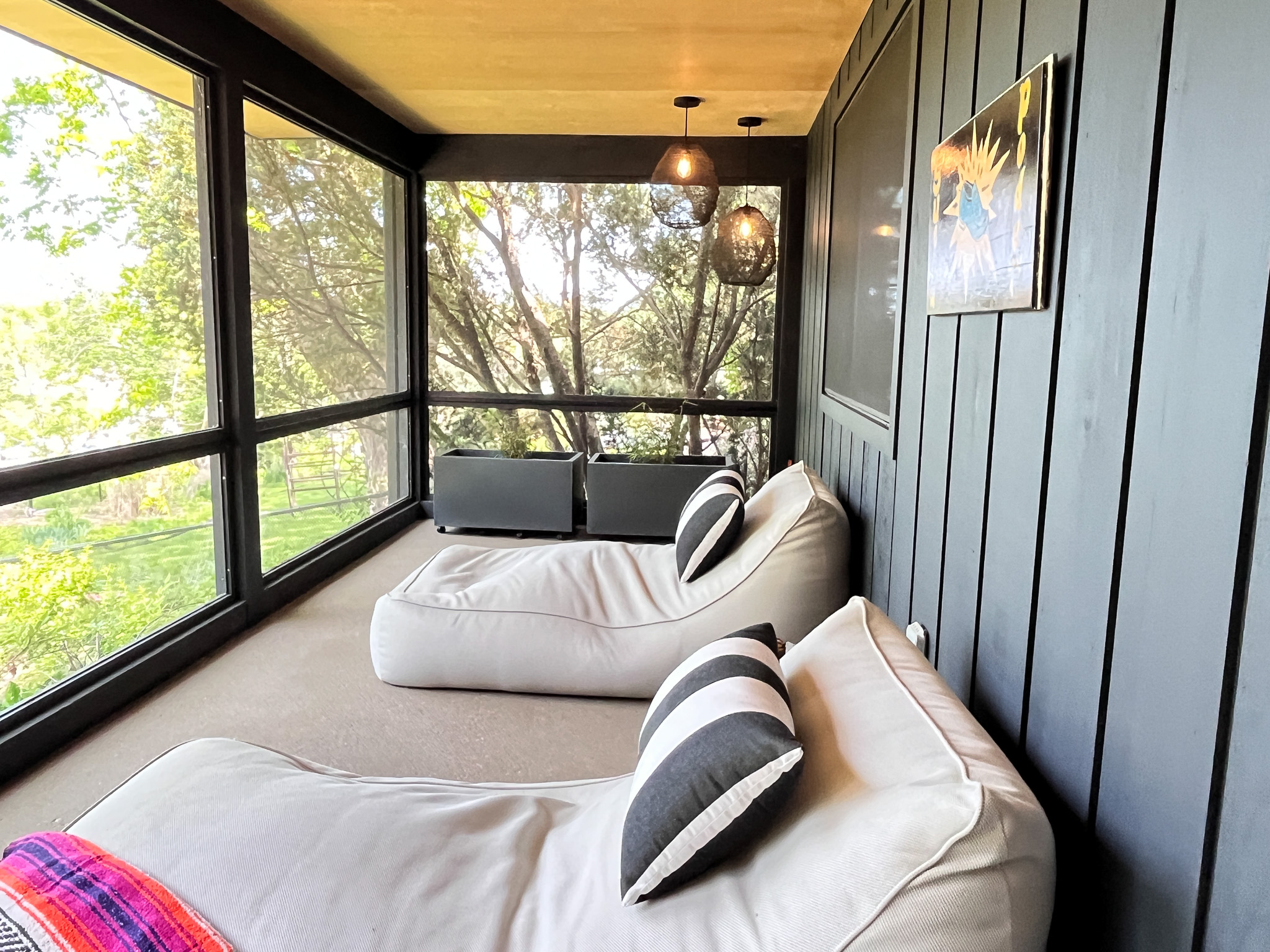
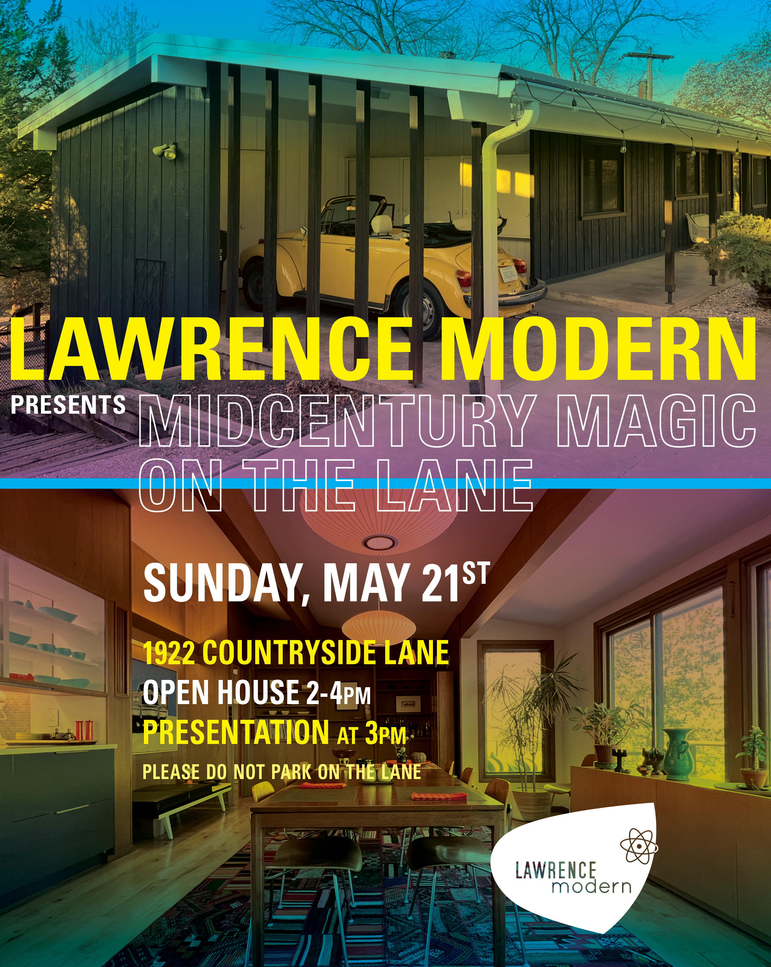
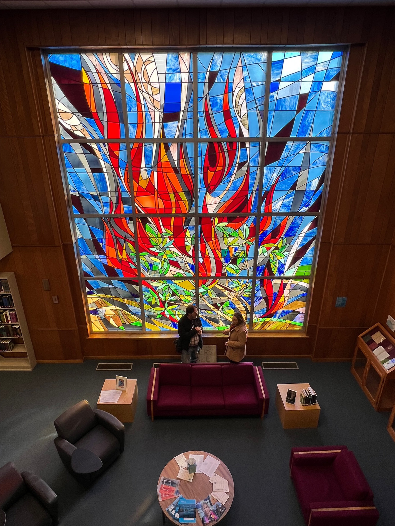
Lawrence Modern held its first residential gathering in four years at the Countryside Lane home of Dan & Lori McMinn on May 21. (It was also the occasion of Lawrence Modern’s 20th anniversary.) More than 100 guests enjoyed warm spring weather and a fabulously cool house that has been remodeled period-correct, landscaped for living, and furnished appropriately but also daringly, with an off-kilter pro-style that is both playful and unaffected. In other words, it is an inspiration for homeowners thinking about a remodel or redecoration of their midcentury home. During the presentation portion of the event, the McMinns explained their philosophy on remodeling: 1) when you remodel, give a nod to the era; 2) before remodeling, live in the space to get a feel for how you use it, and 3) find a good building partner to work with. This led them to hire Daniel Hoyt of Hoyt House, a former KU architecture grad, who made significant enhancements to the kitchen, bathroom, deck, screened porch, and other areas that were updated. In lesser hands the parts would have negated the sum but here everything comes together beautifully.
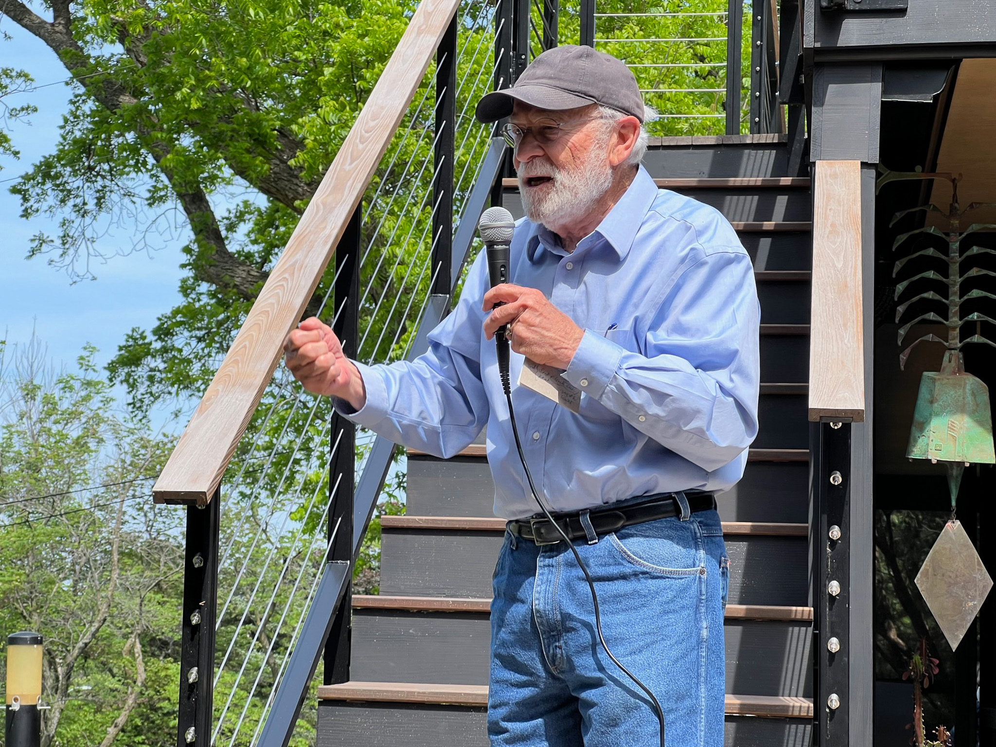
In his summary talk, Lawrence Modern’s Dennis Domer was inspired by the house’s form-follows-function architecture and elaborated on the philosophical ideas that underpinned it. He reminded attendees that the McMinn house was built during a heady time when modern-minded students were pouring out of the KU architecture department and new ideas for modern residential living were streaming in from the outside. “Lawrence was a great place to receive modern architecture,” Domer said. “And I think when you come into this building, doesn’t it just make you feel good? Doesn’t it make you feel young and new and inspire you to enjoy life to the fullest in a very modern and very humanistic way? This is not a machine for living as much as it is a machine for a home to be built. For anyone living here it’s a great pleasure to come to this place. This kind of place makes it worthwhile to live in Lawrence.”
For many years, we at Lawrence Modern have fed your addiction to midcentury modern architecture and lifestyle with numerous private home tours of cool midcentury houses. But over the past four or five years we have held no private gatherings at residential properties, giving you all time to dry out. Well, that time has passed. It’s time to recoup your addiction and join us for our next event at the McMinn residence on Countryside Lane.
Built in 1962 from plans purchased from Better Homes & Gardens and customized by architect Norman Fuqua, a KU architecture grad, Dan and Lori McMinn’s home is likely one that people will recall when asked someday when they first fell in love with midcentury modern. (Others here may recall seeing the house as part of our tour of Countryside Lane homes in 2008.) Sited along the edge of a steep slope overlooking the Kaw River Valley, the 2,256 sq. ft. house channels Southern California modernism with its strong connection to the outdoors, emphasis on materials, and attention to craftsmanship. Originally owned and built by Henry Remple and Lucy Remple McAllister, the McMinn’s purchased the property in 2015—they are the second owners—and have since thoughtfully (and surgically) renovated many parts of the house and adorned it with beautiful furniture and art. It helps that the couple have good taste: Lori is a former creative with the esteemed fashion label Esprit, and Dan is in the music business. Together they have not only significantly enhanced the original design but managed to preserve a precious gem of mail-order modernism.
Following the house tour, the run of show will include talks from Dan and Lori McMinn, contractor Daniel Hoyt of Hoyt House, and our own Dennis Domer. Don’t miss this event! Come, and be ready to be inspired. This is rare opportunity to see one of the prettiest examples of midcentury modern style living in Lawrence, groomed to perfection!
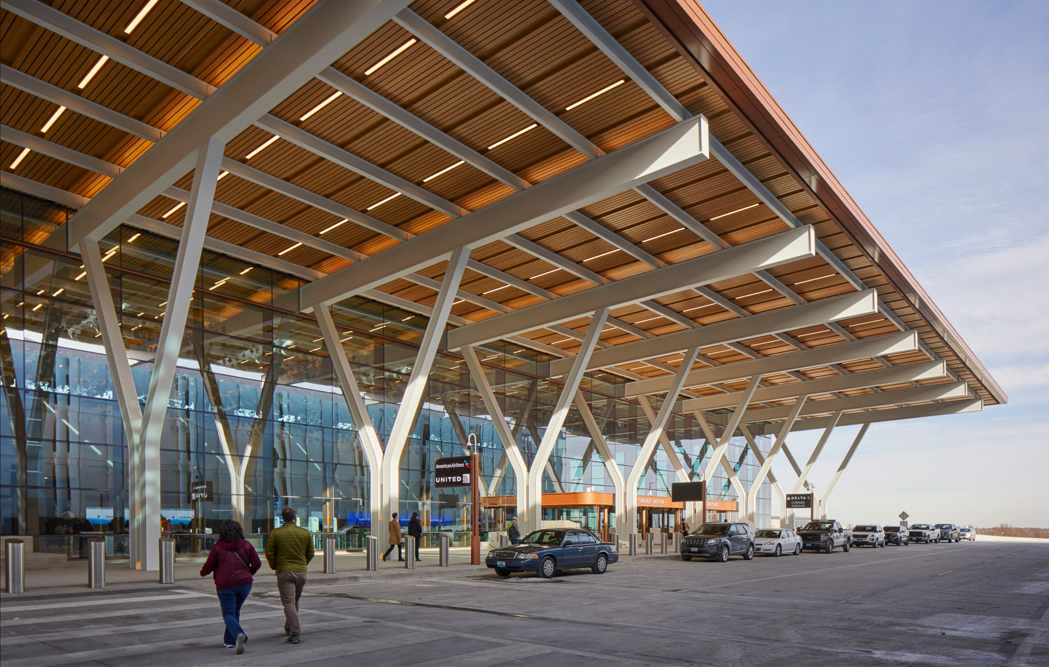
Departures level entrance. Photo by Lucas Blair Simpson, courtesy of SOM
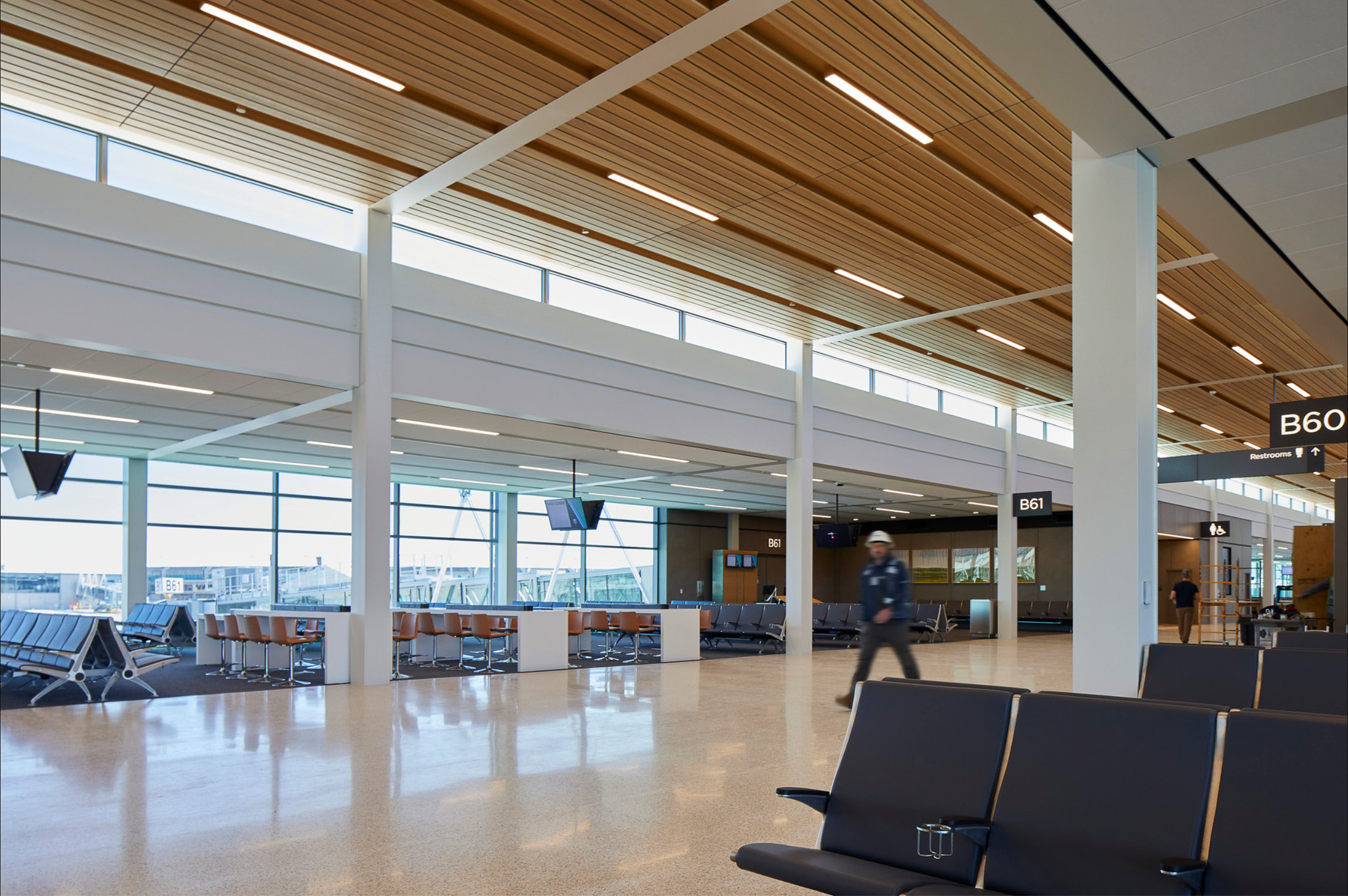
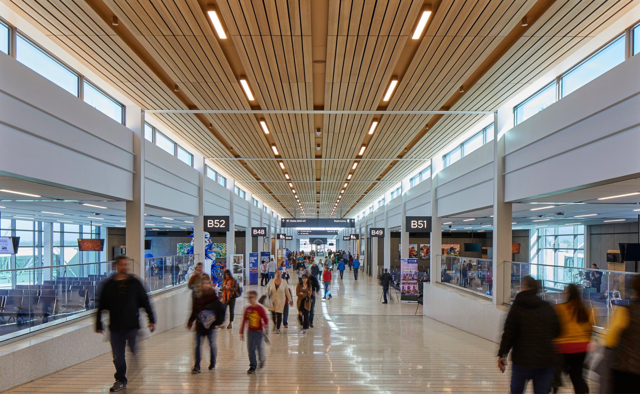
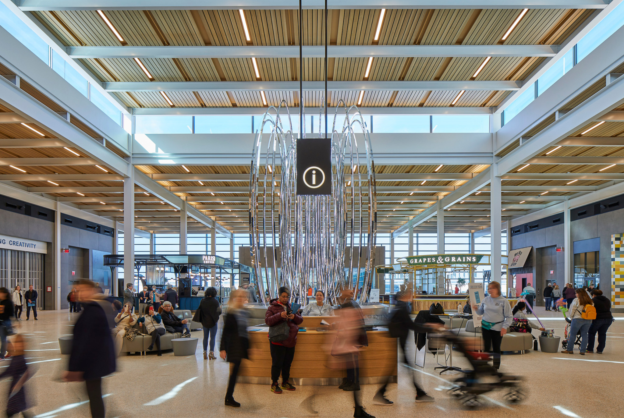
It’s hard to leave home, but Kansas City has given us good reason to do so with the new Kansas City International Air Terminal. With its flying canopy and epic structural spans, the terminal stands as a gleaming temple of aviation—an inviting gateway to the heavens in the middle of flyover country. Fronted by a near-monolithic, 6,000-space parking garage, the $1.5 billion facility is the largest infrastructure project in Kansas City’s history and, interestingly, also the largest public art project in the city’s history. Architecturally, the building is worthy of its own exhibit: stroll anywhere in its well-lit spaces and you’re sure to admire the honesty of expression in construction and notice recurring motifs in every joint, panel, seam, and surface.
The 1.1 million-square-foot terminal was designed by Skidmore, Owings & Merrill, the legendary architecture firm behind the Sears Tower in Chicago and many other famous skyscrapers, office buildings, and, yes, airports. The firm is known for pushing the boundaries of architectural systems and design and the spacious new terminal continues in that tradition. Here, a striking Y-shaped entrance lends a sense of lightness to the whole that is continued through efficient modular structural systems in the main concourses, where every dimension is laser-cut to exacting detail. Lawrence local (and friend of Lawrence Modern) Matt Schwabauer, a senior project manager with Clark Construction, the prime contractor on the terminal, worked with SOM for six years on the project and can attest to the company’s fastidiousness. “Most of us have never dealt with that level of specification,” Schwabauer said. “They controlled everything, right down to the orientation of the carpet pile.”
Wanting to learn more, Lawrence Modern’s Bill Steele recently contacted architect Jordan Pierce, SOM’s senior designer on the project. Pierce was largely responsible for the building’s look and feel and says the work of contemporary architects such as Alberto Kalach, David Chipperfield, and Peter Zumthor informed his ideas. “I’m interested in simple, thoughtful, elegant designs,” Pierce says. “Honest use of structure and materials and real attention to detailing are just some of the things that get me excited.”
A bit of a latecomer to architecture, Pierce studied English literature in college and worked as a communications strategist for nonprofits and foundations before finding a passion for buildings. “I wanted to be involved in something where I could feel there was a product at the end of the day that was lasting and physical,” he said. Pierce eventually went back to school, took night classes in calculus prerequisites, and put together a portfolio of things he had done in his spare time, such as woodworking and drawing. He was accepted into the Yale School of Architecture and hired by SOM soon after graduation in 2013. Today, Pierce works out of the firm’s San Francisco office, where he discussed his work on the project and thoughts on airport design a month after the terminal opened in February.
This was a massive project. In terms of the architectural design, how big was it, and what was your specific role?
It was huge. I would have to say that over the life of the project we easily had 100 architects work on the project. And we really did design and work as a collective. We had a great team of folks, not only with SOM [Skidmore, Owings & Merrill] but also working with a number of local firms in Kansas City. We also worked with three local firms, Draw Architects, HJM, and Wellner Architects. My individual responsibilities on the project included concept design, thinking about the overall massing of the building, the look and feel, and working in particular on the passenger spaces. My title is something like Senior Designer for the project, and a lot of that is thinking about the actual look and feel, the planning, layout and the experience for the passengers’ spaces in the building.
What were some of the general design requirements for the scope of work that you were given?
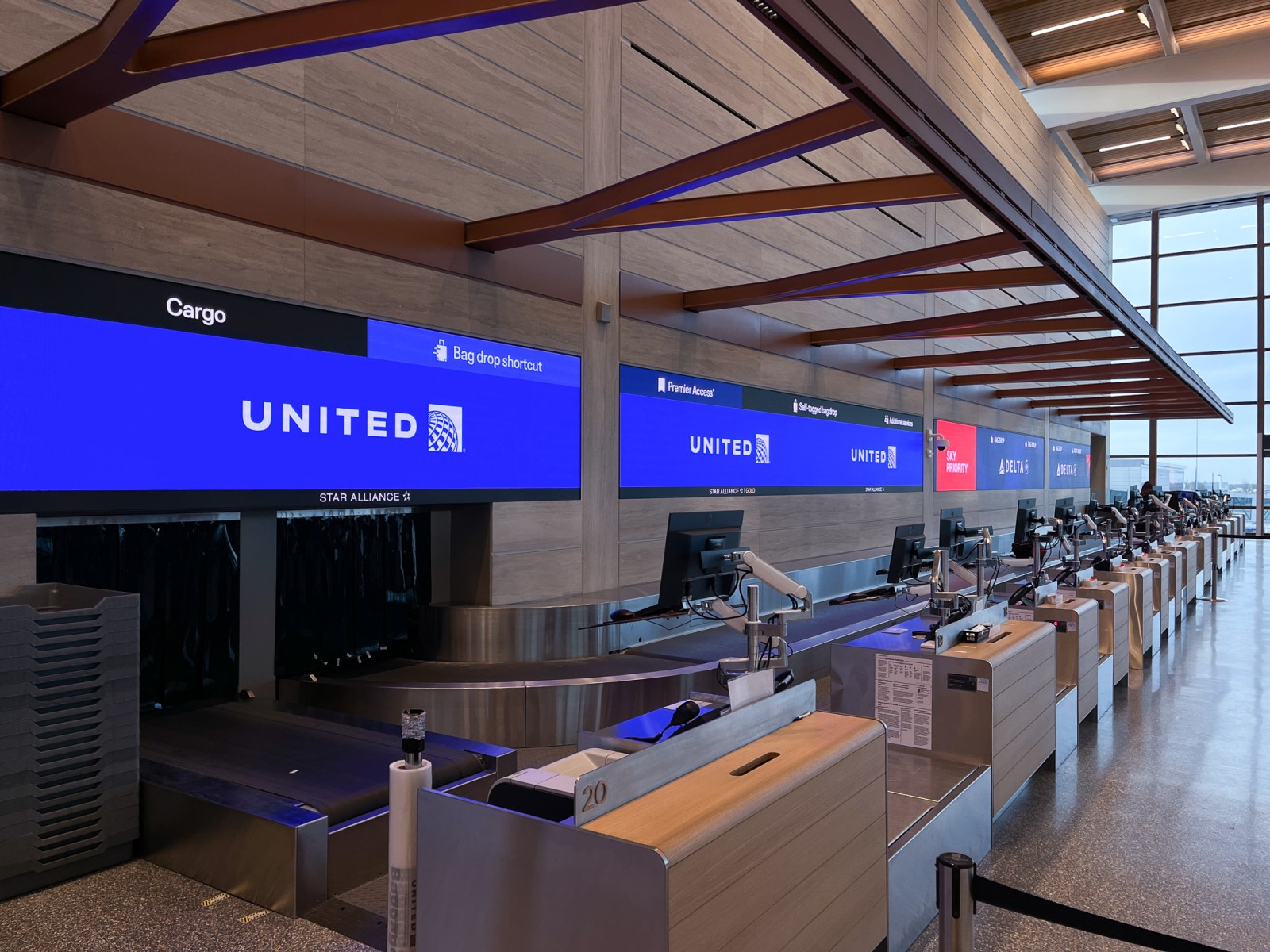
As we sometimes do, we inherited a study that had already thought through a good number of the requirements for the building. So we knew that there was a requirement for 39 gates, we knew the general square footage, we knew the organization that the airport wanted for all the pieces. An important part of the design were the public meetings that we did early in the process. Before we ever put pencil to paper we did dozens of community design meetings throughout Kansas City and into Kansas as well. We met with over a thousand people to talk about what was important for folks in the building. And we heard a mix of things, and many made their way into the building in some form or another. So one was, people wanted to maintain the convenience of the existing terminals, that was really important to folks. Also, the public wanted the building to embody a forward-looking spirit of Kansas City, that it should really reflect not just KC as it is but where KC sees itself in the decades to come. We also heard that people wanted the building to be really welcoming on the whole, and that’s embodied in a pretty extraordinary suite of amenities in the building, but it’s also embodied in the incorporation of a lot of warmer, more natural materials than you’re accustomed to seeing in an airport.
I definitely felt that the first time I walked into the main hall on the second level. What was your overall design intent for the terminal?
There’s a term used in airports called processors, which is that you’re trying to get people through various processes in the building. You’re checked in; you go through security, bag drop-off, bag claim. And that there’s a tendency in airport design to create buildings that express a machine-like character, and for this project and for many of the projects that we do, it’s critical for us that the building is efficient, that’s it’s modular, that it’s easily constructible, that we’re really considering the details. But we’re trying to make buildings that people really want to spend time in, which may sound like an oxymoron for an airport. For KCI and all the buildings that we do it’s really important to us that the buildings feel welcoming and inviting, and that goes for everything from the introduction of natural light, the proportion of the spaces, and the materials themselves. So as you walk around the terminal you might see it’s not just the hemlock ceilings, it’s the also the natural Missouri limestone that’s incorporated throughout the entirety of the building. It’s choosing even the material of the walls, which isn’t your standard white gypsum board that you see everywhere. Rather, it’s a large format porcelain tile in massive five-foot by ten-foot sheets that has a real character to it. What we’re trying to do in this building and other buildings is come up with a way to bring all of those elements together to create a truly inviting space for passengers that we hope adds something to an experience that for many people can be really stressful.
Tell us more about the limestone. Whose idea was it to use that material?
There’s no single author. We looked at a bunch of different ideas of what it could be, but once we made it down to the quarry and really looked at the material, I think we all felt it was absolutely the right thing to do for the building. It’s from a quarry in southern Missouri outside of Springfield called Phenix, an old quarry from the 1800s. It was shut down and only recently reopened this past decade or so. The material from the quarry was used in the Missouri statehouse, it was used in the New York Stock Exchange, it’s been used all over the country and all over the world. It has a character to it that really feels civic, that feels substantial, like it’s in a building that is going to last the test of time. And in addition to that real civic character, which drew it to us, is the story of Missouri geology that it tells. It’s a sedimentary rock, so when you look at that back wall [at the departures level] you can see these horizontal striations that run along the length. And we use it in two different ways. If you look at that back wall, you see where the steel columns are located behind that wall. There, the stone is rotated so that the striations run vertically to express the vertical nature of the structure. Because when you cut the stone that way, you’re really cutting through millennia of time as you’re seeing all of those sediments of when Missouri was a shallow sea. You’ll see a variety of fossils in there as well.
Yet, while the building has the solidity of that stone, it also has this lightness. How did you achieve that, and how would you describe the overall architectural expression of the building?
To create that feeling of lightness in the building, it was really about working with the proportion of each space and designing structural modules that really worked well with introducing natural light. Tuning the ceiling height to the program, in particular, was a big focus for us—that each of the spaces has a proportion that’s really tuned to the function of the space. So when you go to the check-in hall and that sort of massive span—it’s a single span running the whole length—of about a hundred feet, because of the scale of that space, keeping the ceiling at thirty-five feet, keeping it really high, we felt was important with additionally having clerestories in the center of the building and each of the structural bays so that we’re bringing light into the heart of that deeper space.
We spent a long time thinking about how to size each space for its use. So it’s a whole sequence of volumes, right? You come through the kind of grand space of the check-in hall. There’s a moment of compression when you go through security. It opens up again when you get to the retail, it feels a little bit more like a kind of town hall or a kind of a civic space there. And then each of the volumes changes in size as you move through, but there’s a break at each where you see light above the transition to the space beyond. I don’t know if you picked up on that, but there’s a clerestory above the limestone wall in the check-in hall. There’s a clerestory above the concourse as you’re transitioning from the retail space down into the concourse and then the concourse itself has its own sequence of clerestories. So the hope was that no matter where you are in the terminal, you’re always able to see light coming from a level above.
I did notice the extensive use of clerestories, which I really like. What are some other things about the architecture that people might not notice but nevertheless be subconsciously affected by?
One thing that most people might not notice is that those big Y columns at the front of the building exist in miniature above the check-in hall, above the check-in desks. So when you get close to the check-in desk you’ll see that in a horizontal application, that same form is coming out. There are actually a whole bunch of things in the airport that have a motif of this kind of eased edges that the Y columns have. You’ll notice that there’s a geometric figure called a disco rectangle, or an obround, which is two semicircles joined by straight lines like a pill shape. Versions of that appear throughout the airport so that the vestibules have these rounded edges. Even the planters in the front of the building have them. So there’s a kind of motif of those things that you’re close to, that you touch, that have kind of a tactile quality to them by virtue of that shared geometry of that rounded edge. Same with all of the check-in desks, all of the info desks—that eased edge appears over and over again throughout the building. So, I don’t know if it comes through, but it was something that we were really thinking about throughout the design.
Photo: Bill Steele
Walking through the airport also gave me the sense that I was in a very orderly, methodical space where everything felt perfectly aligned.
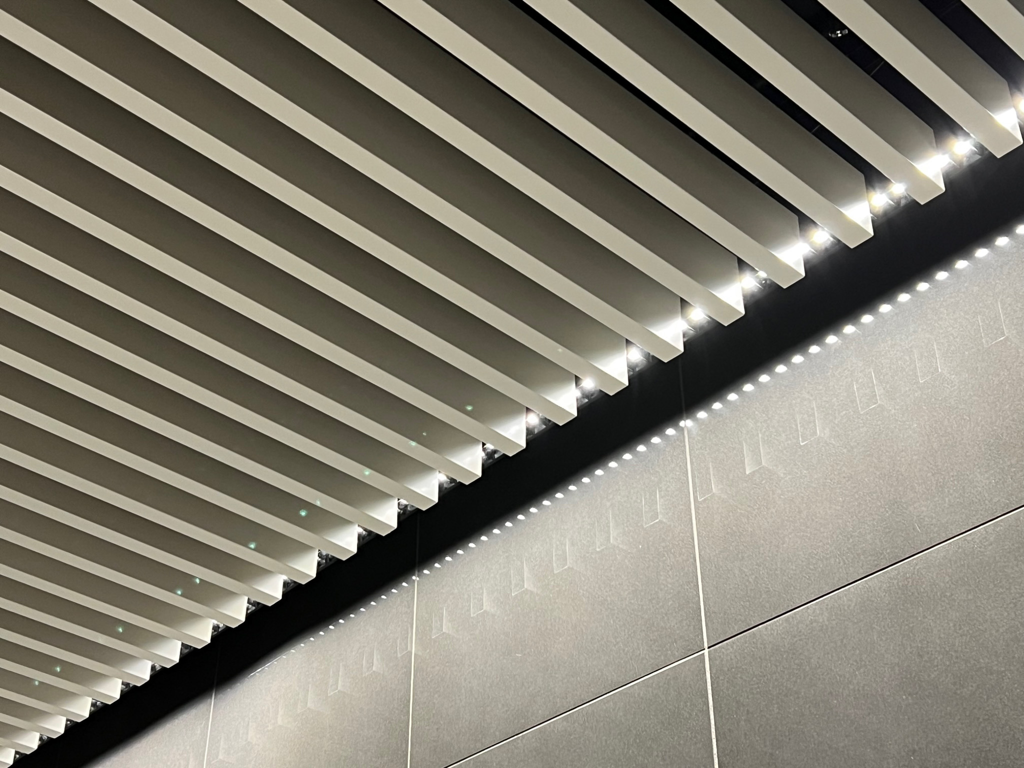
Yeah, yeah. The old joke is that SOM stands for ‘stay on the module.’ There’s a rigor to what we try and do, and I think that module, the structural module, which is generally thirty feet within the building, is very economical. So choosing thirty feet means that we can do everything with simple W sections [wide-flange beams] in terms of the spans. In other words, we don’t have to go to trusses; we don’t have to go to big built-up box beams. It’s a very simple, economical module. That thirty-foot module got subdivided into tens and then fives. So all the exterior walls are at ten feet, and all of the porcelain tile panels on the wall are five feet wide, and that’s also a subdivision that we use for the ceiling. Everything falls into it and I think you’re right, even if you don’t see it, you feel it. What we’re trying to do always is to make these spaces feel calm, feel ordered, and hopefully, that has a psychological impact on travelers.
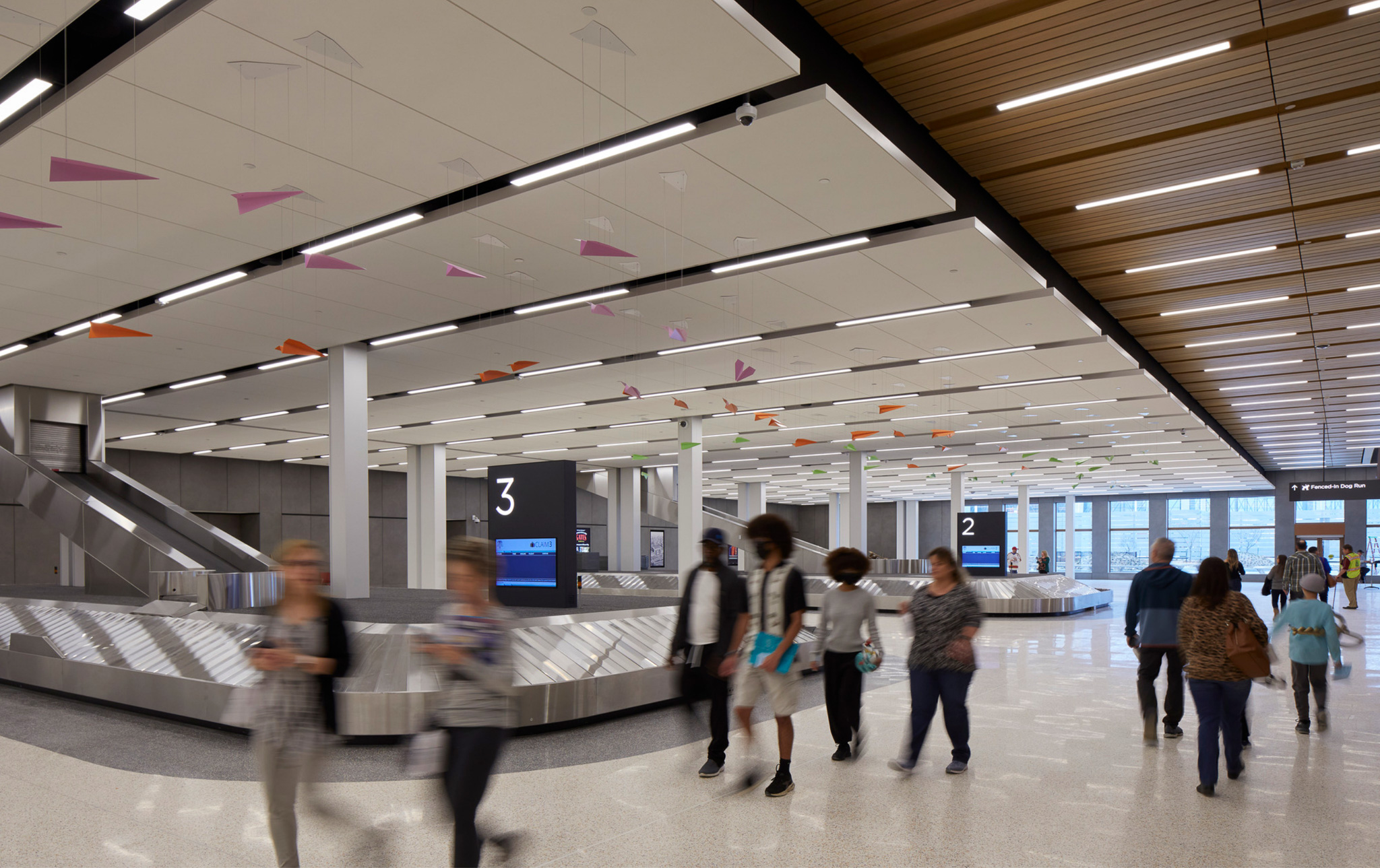
Baggage claim area. Photo: Lucas Blair Simpson, courtesy of SOM
I felt comfortable, which I suppose is the same as feeling calm. The other thing I noticed was that everything looked very flush-mounted, whether it was the lighting, the advertising displays, the signage, or whatever. This seems a bit different from what I’ve experienced in other airports.
There’s so much that goes into an airport between, you know, concessions, advertisements, way finding, the various amenities, there’s a lot to compete for your attention. So part of how we see our task is that the base buildings, as we call it, if it can have enough simplicity and strength, then it’s not competing for attention with all those many things that fit into it. Having the base building provide a clarity, a calmness, and order really allows those concessions to come forward and be interesting and exciting but not in any way feel chaotic. Part of that is things like you’re pointing out, like providing recesses in the wall so that all of the advertisements are flush. We had to coordinate all of that with the structure. The whole wall has to be designed so that we can allow that to be within that depth. It’s part of an overall effort to say, can we give enough simplicity and clarity to the base building and the many elements that fit into it so that it doesn’t have the kind of chaos that can add to what’s already a very anxiety-inducing experience.
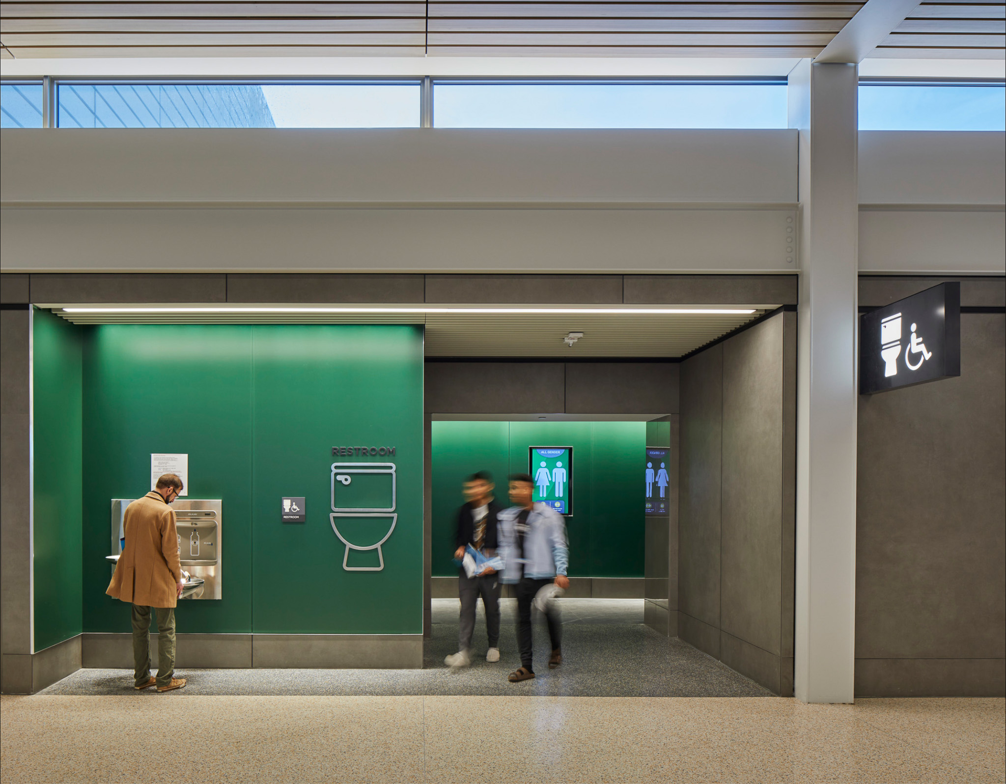
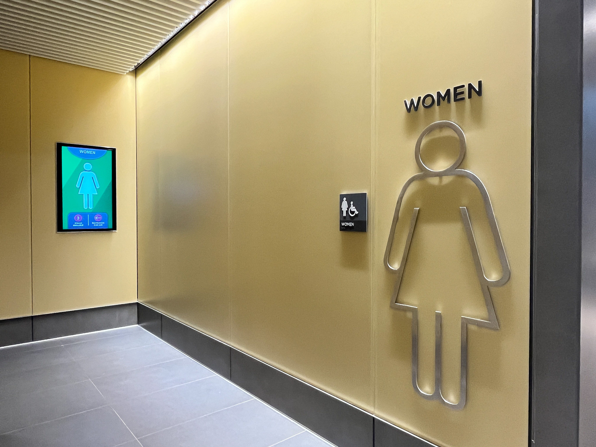
Speaking of simplicity, can you talk a bit about the design of the colorful bathroom entries, which I felt like exploring even though I had no need to go to the restroom. Did you have any role in that design?
We did the design of the bathrooms in partnership with DRAW Architects, a local Kansas City firm. They were one of our subs on the architecture side, a great firm run by a woman named Dominique Davison. They hadn’t done an airport bathroom before, but they’re very thoughtful and talented designers so it was great to work with them on that. The bathrooms are, in many ways, some of the most technologically advanced parts of the entire terminal. [Laughs].
Photo: Lucas Blair Simpson, courtesy of SOM
I can believe that.
I don’t know if you noticed the occupancy indicators above each stall, the red light green light, just like the parking garage? That then feeds into the display at the entrance that indicates the number of stalls that are open on either side, which makes things a lot easier hopefully for passengers. And then also all of the accessories are actually building maintenance system integrated. So they report back to the building maintenance system how many paper towels have been used and squirts of the soap dispenser and all that, so that they know when to cycle their maintenance through. So there’s a lot that went into that, but I think in terms of the way that we think about the bathrooms, you want the bathroom to read as something that is in contrast to the standard finishes of the building so that it has a wayfinding element to it. And so there we chose a back-painted acid etched glass that that forms those walls. It has this very light acid edge that gives the colors a kind of softness to them.
Yeah, it’s quite beautiful in person, actually.
And so that same color is used in two locations. Right behind the lavatories is a tile, and I want to say it’s a four-to-one format horizontal tile that has kind of a hand-glazed finish to it. There’s a sort of soft ombre back there in a place that has mostly, maybe not machined materials, but very precise materials used throughout the building. It’s one of those locations where you’re right in contact with the material, and you’re dealing with it up close, and it has an almost handmade quality to it. So those tiles have the same color as the back-painted glass that is the entrance, and the all-genders are green, the women’s are yellow, and the men’s are blue. The lighting in the bathrooms is a little bit moody. It’s a little bit lower lighting levels than you might have elsewhere, which I like. It doesn’t feel like you walk in and you’re in an operating room being blasted with, you know, 4000 degrees Kelvin lighting. And actually throughout the entirety of the terminal, all the lighting is at 3000 degrees Kelvin, so it’s a much warmer light than you would normally experience.
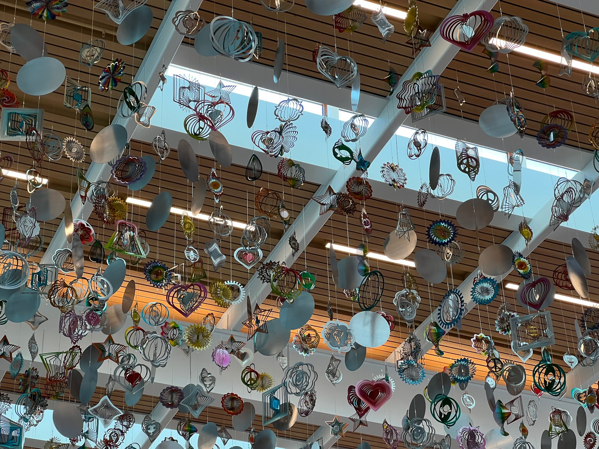
It’s also good for artwork, which I would like to ask you about. Although I like a lot of the art displays,my wife was disappointed that it doesn’t appear to have been thematically coordinated in any way.I wonder how you feel about the artwork. Was there a concern that it might distract or detract from the architecture?
We always knew that there would be artwork within the terminal, and as we were designing the spaces, we knew certain places were going to be the sites of artwork. We knew that at the A node, that central space was going to be some sort of a fountain element. We liked the idea of having art in the concourses and having it be something different in each location but the way that the art was selected is that there were individual committees assigned to each of the art pieces. But your wife is correct that there is not an overarching curatorial vision. But that was partially by the design of the Municipal Arts Commission in the process, so some of the pieces I like more or less than the others, but I think it’s nice that there is some richness added to the overlay of the architecture and additionally that there is enough variety that as you’re leaving from a gate that maybe you haven’t left before, you’ll see something you haven’t seen before. And there are different pieces that work at different scales and distances. There’s some that are really detailed. You’ve got to get up close to understand. There’s some that are a bit more quickly taken in from a distance.
Perhaps she’ll change her mind the next time she flies out of MCI. Speaking for myself, I felt disappointed about the long passageway to get to the domestic concourse, which is something common nowadays in airports. At the old terminals, you know, you got in there, took care of your business at the counter and didn’t have to walk very far to your gate. Was there a constraint there that caused this?
We had a constraint in terms of the physical layout of the space. There’s an active taxiway on the outside [of the terminal] that formed the western boundary of what we could build. That determined where the outside of that outer concourse could be and so the footprint had to be fairly compact within that space. So that was a fairly significant constraint that we had. But as with any project, also we had our program. We had to fit the number of gates that we had, and also the aircraft mix that we were required to use. All of those were constraints that we were dealing with throughout the entire design process.
I’m sure there were many others. It seems like airports are a real specialty of yours. Is this the first airport terminal you’ve worked on?
I’ve worked on a number of aviation jobs within our firm but this is the first domestic airport terminal I’ve worked on. I work on a variety of building types, not just airports, but airports are a type that I find really fascinating and really enjoy working on as a specialty. This year we’re opening a new terminal in Bangalore, India, which is going to be a pretty spectacular building. It really takes the integration of plant life and planting to new heights. Bangalore is the garden city of India and the airport has this sort of massive garden that runs all the way through the terminal between the check-in hall and the concourses in a way that’s going to be pretty impressive.
Best of luck with that and I hope to visit India someday and see the airport. Likewise, for those of us living here in Kansas, and who love great art and architecture, you’ve given us all a good reason to get to the airport a bit earlier than usual.
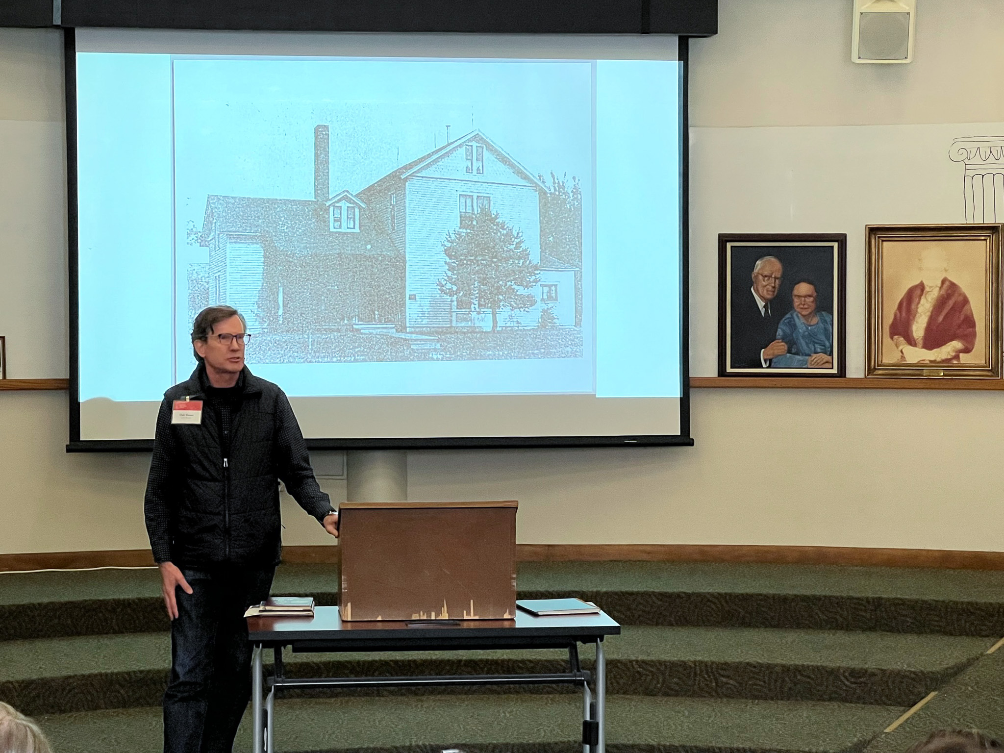
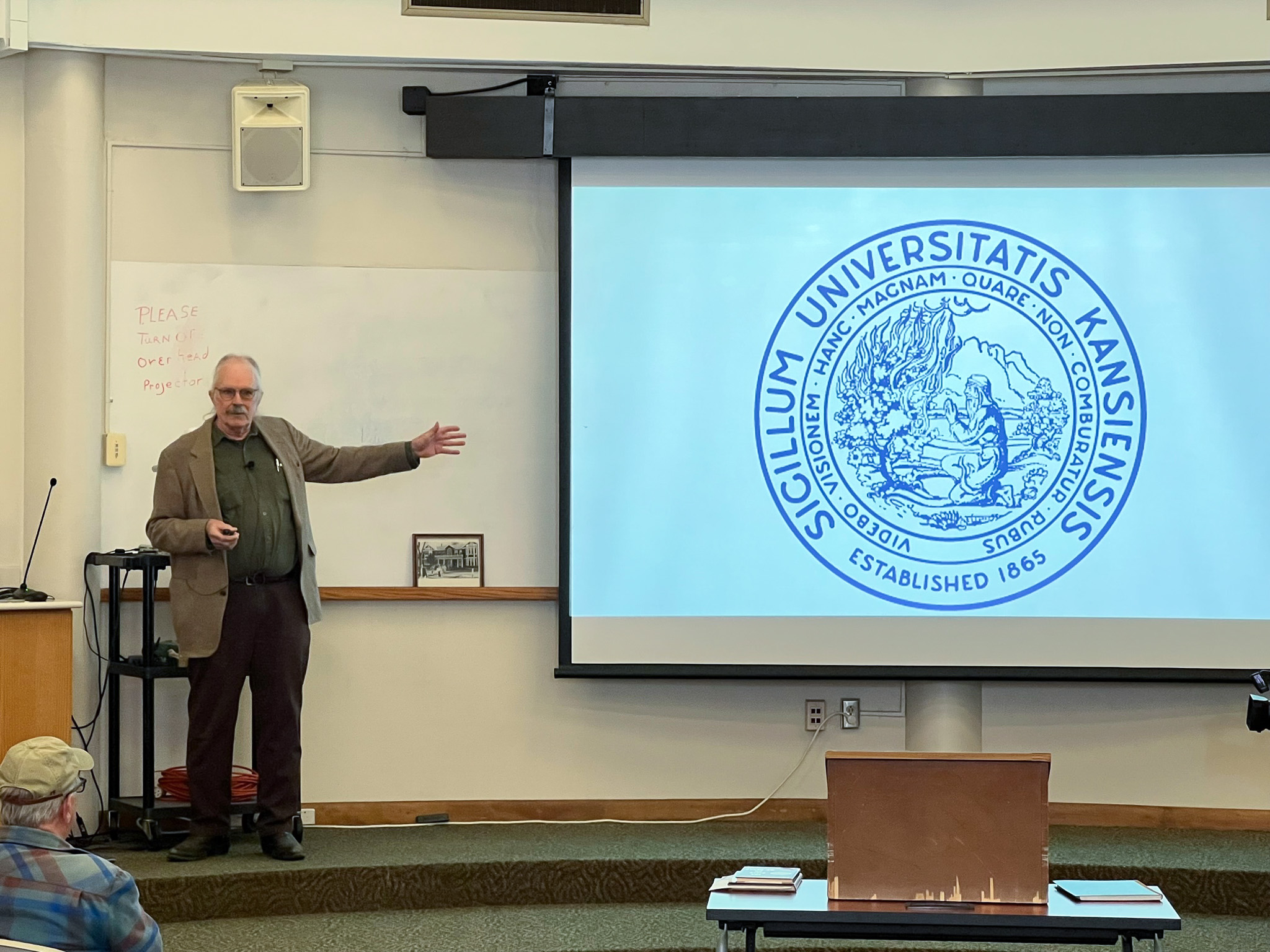
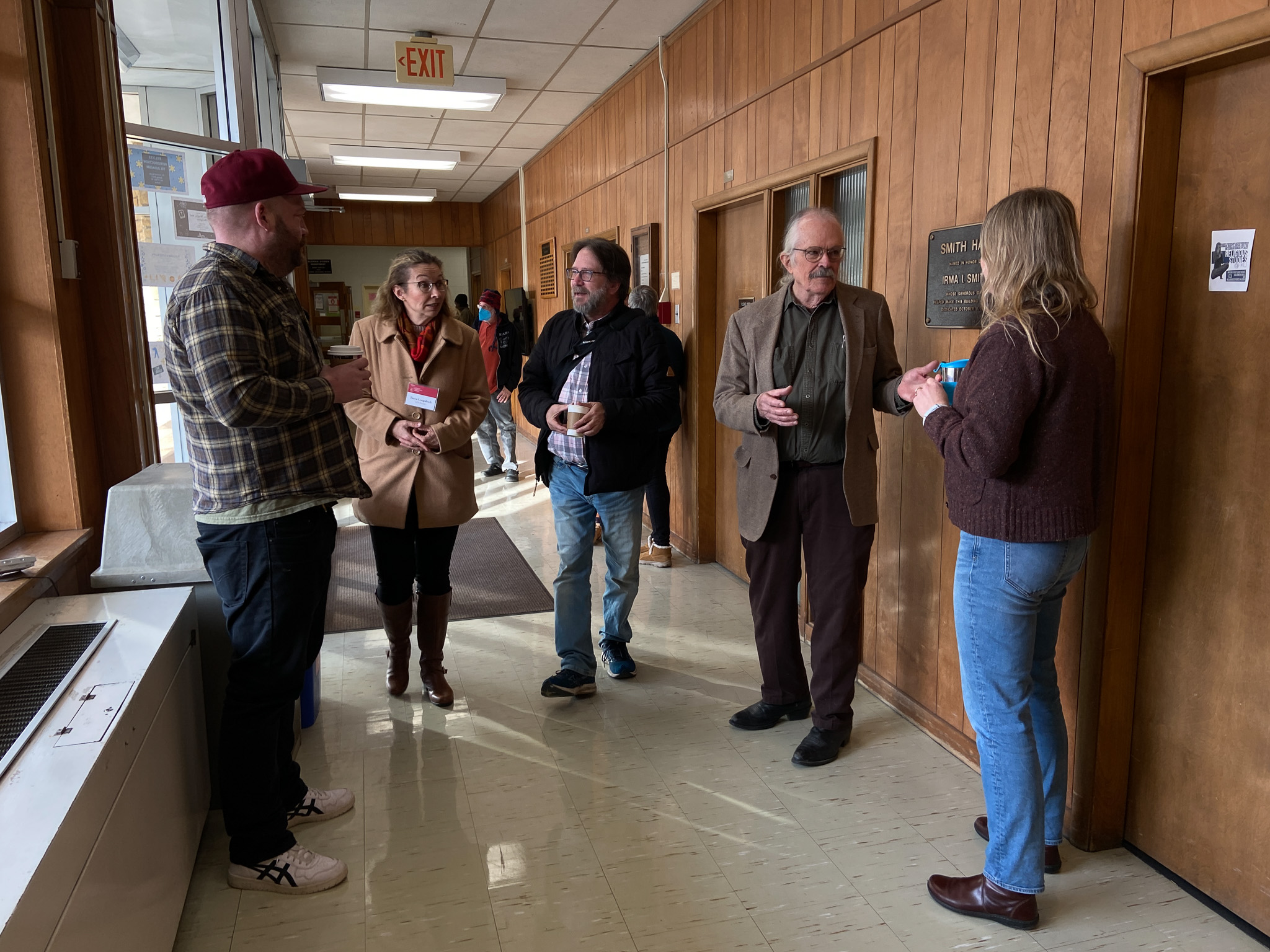
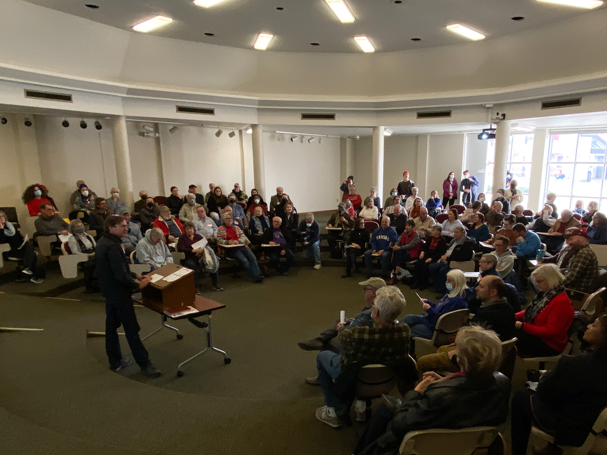
Smith Hall, home to KU’s Department of Religious Studies, has been earmarked for demolition. Lawrence Modern, alongside the Lawrence Preservation Alliance and the Historic Mount Oread Friends groups, hosted an Open House on Saturday, Dec. 3 to raise awareness of the building’s plight. The event drew an estimated 125 attendees—current and former students, faculty, staff and concerned local citizens—for an hour-long discussion about the building’s history, architecture, and relevance. LPA board member Dale Slusser gave opening remarks, followed by a list of speakers that included religious studies professor Tim Miller; retired distinguished professor Dennis Domer; Kim Tefft, son of sculptor Eldon Tefft; Lawrence Modern’s Tom Harper and Bill Steele; and Dale Suitor, great nephew of Irma I. Smith, who was the building’s primary donor (and namesake). Smith believed that young people should have the opportunity to engage with both religious and non-religious worldviews in religious education, a point that Domer expands upon in his talk above, which is a must-watch. “One of the reasons that a university is here is to ask the eternal questions,” Domer said. “Is there a god? And if there is not, why? And if so, why, and what difference would that make?” Since 1967, Smith Hall has been putting that eternal question in the center of campus. As Domer noted, it is a place for agnostics, it’s a place for religiously minded people, it’s a place for Buddhists, it’s a place for Muslims and Jews and all kinds of people, inclusively. “We’re all in it together,” he said. “We need a space like this so that those sorts of questions will be asked for evermore here. And if we don’t have it, what’s the point?”
To learn more about Smith Hall and the issues at stake read Tom Harper’s excellent article in the Lawrence Times or his more detailed post below.
This is a call for action. It’s important for the Chancellor, Provost and Board of Regents to hear your voice. If you value Smith Hall and what it represents we urge you to write a letter of support. Without it, a precious cultural resource and a legacy of religious thought at KU could be erased. We need your help!