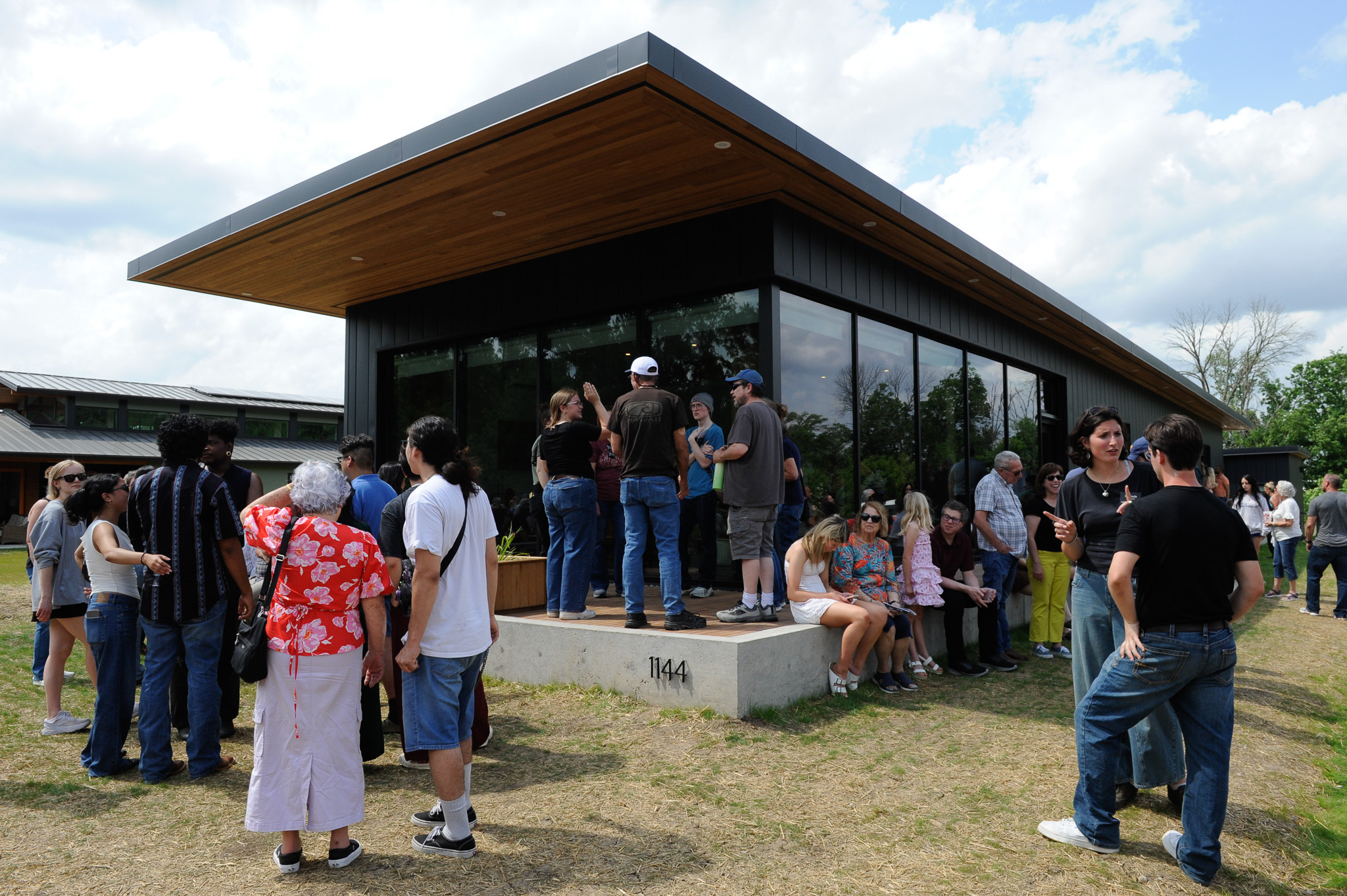
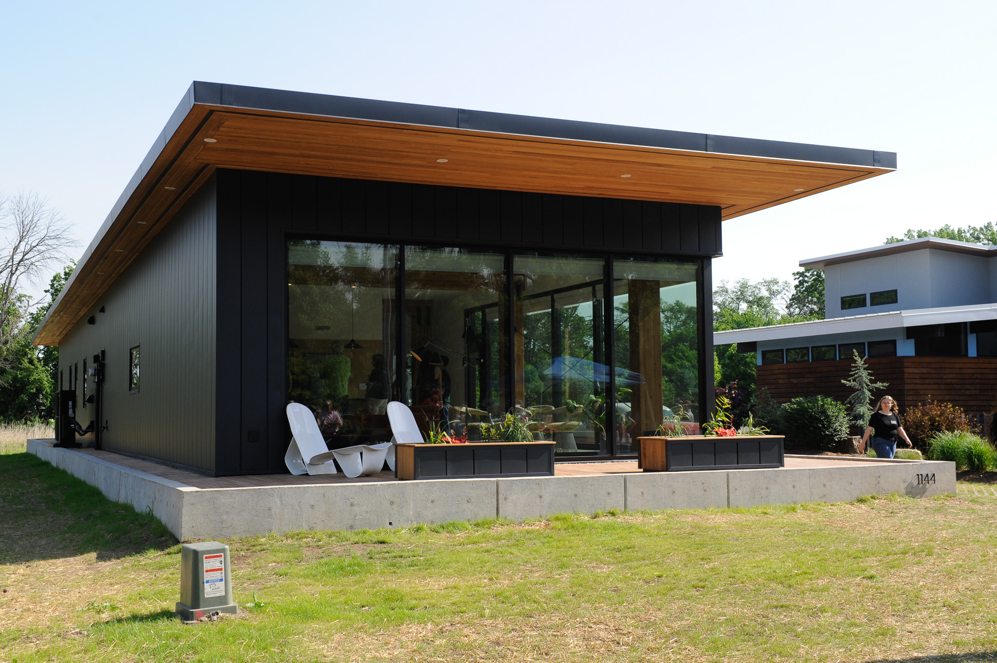
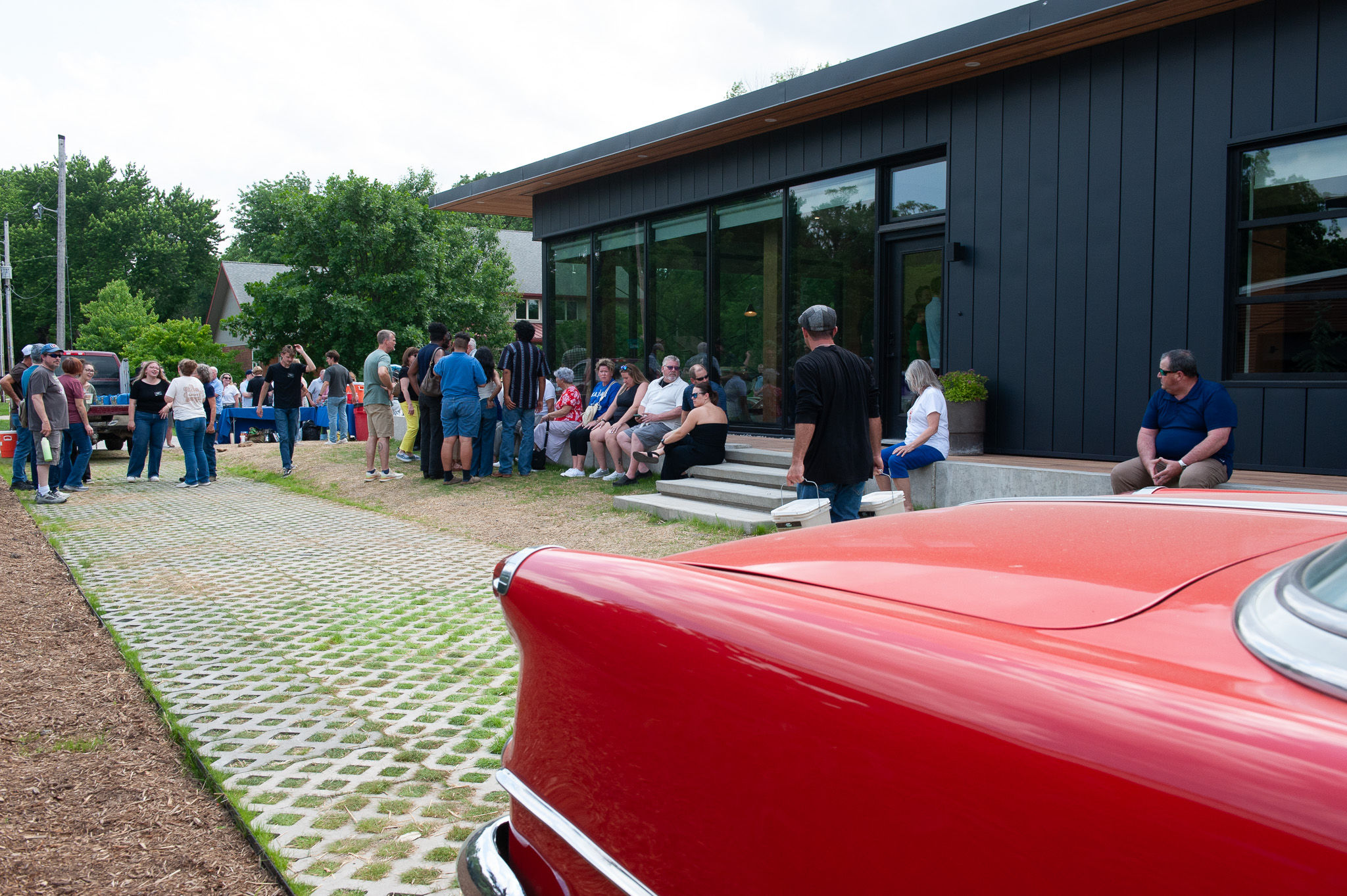
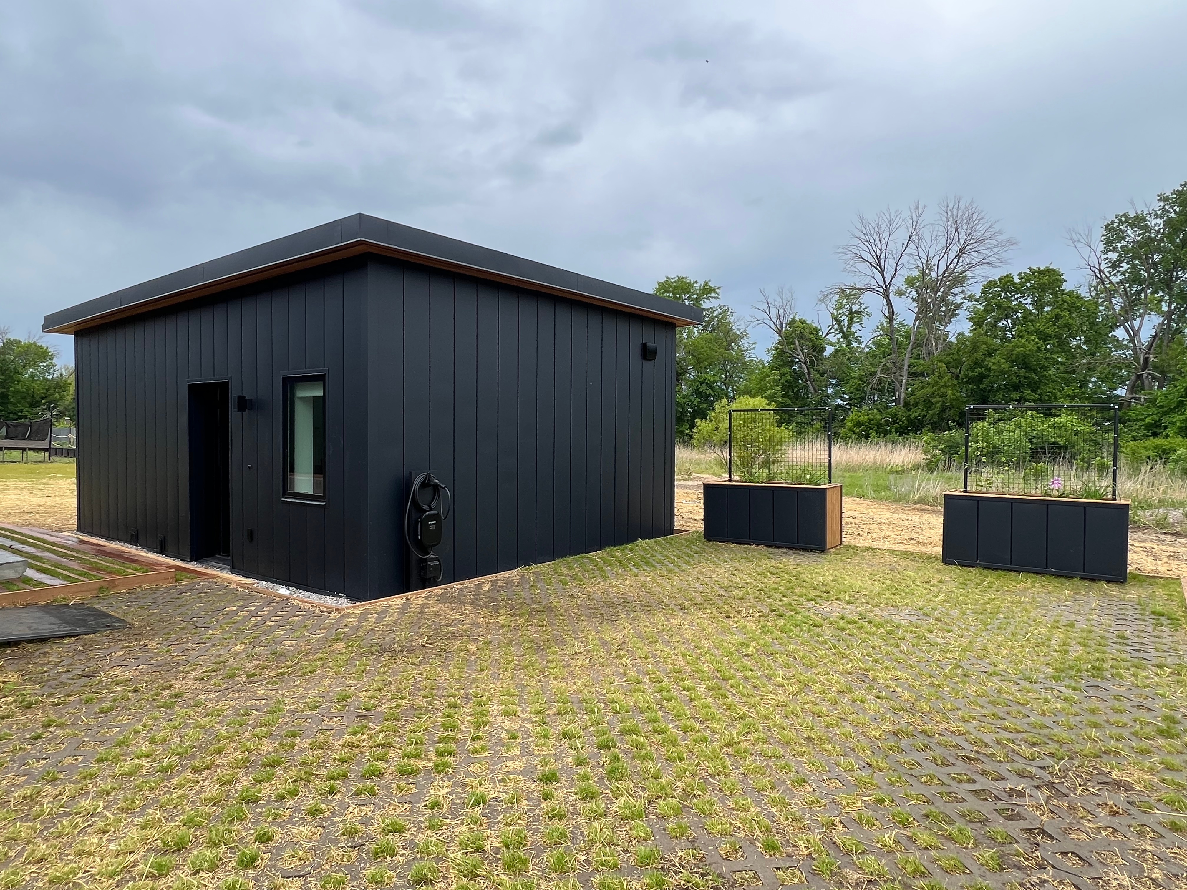
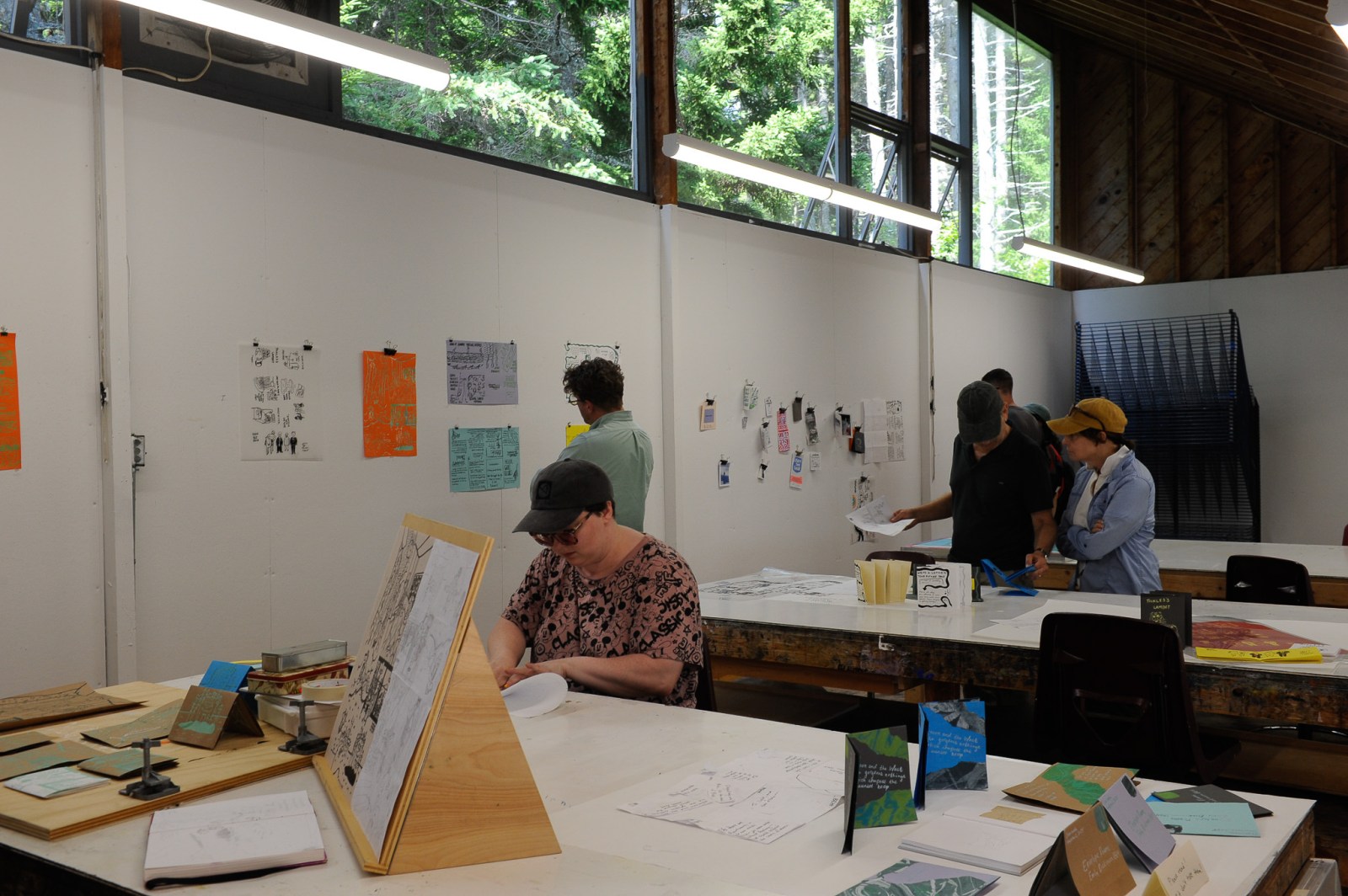
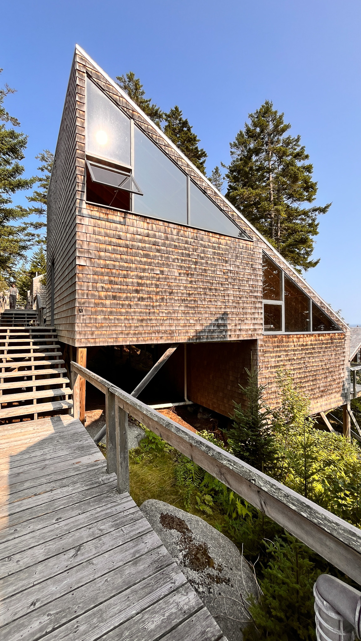
In what’s become an annual rite of spring, every Saturday in the middle of May the Lawrence community lines up to see a shiny new Studio 804 building, oohing and aahing like patrons at a PGA golf tournament. (The Masters tournament comes to mind.) At this year’s outing, the golf metaphor seems apt: following over par efforts the previous two years, the 18 students in KU’s Master of Architecture program have returned to red figures at 1144 East 12th St., producing one of their strongest entries in the 30-building history of 804.
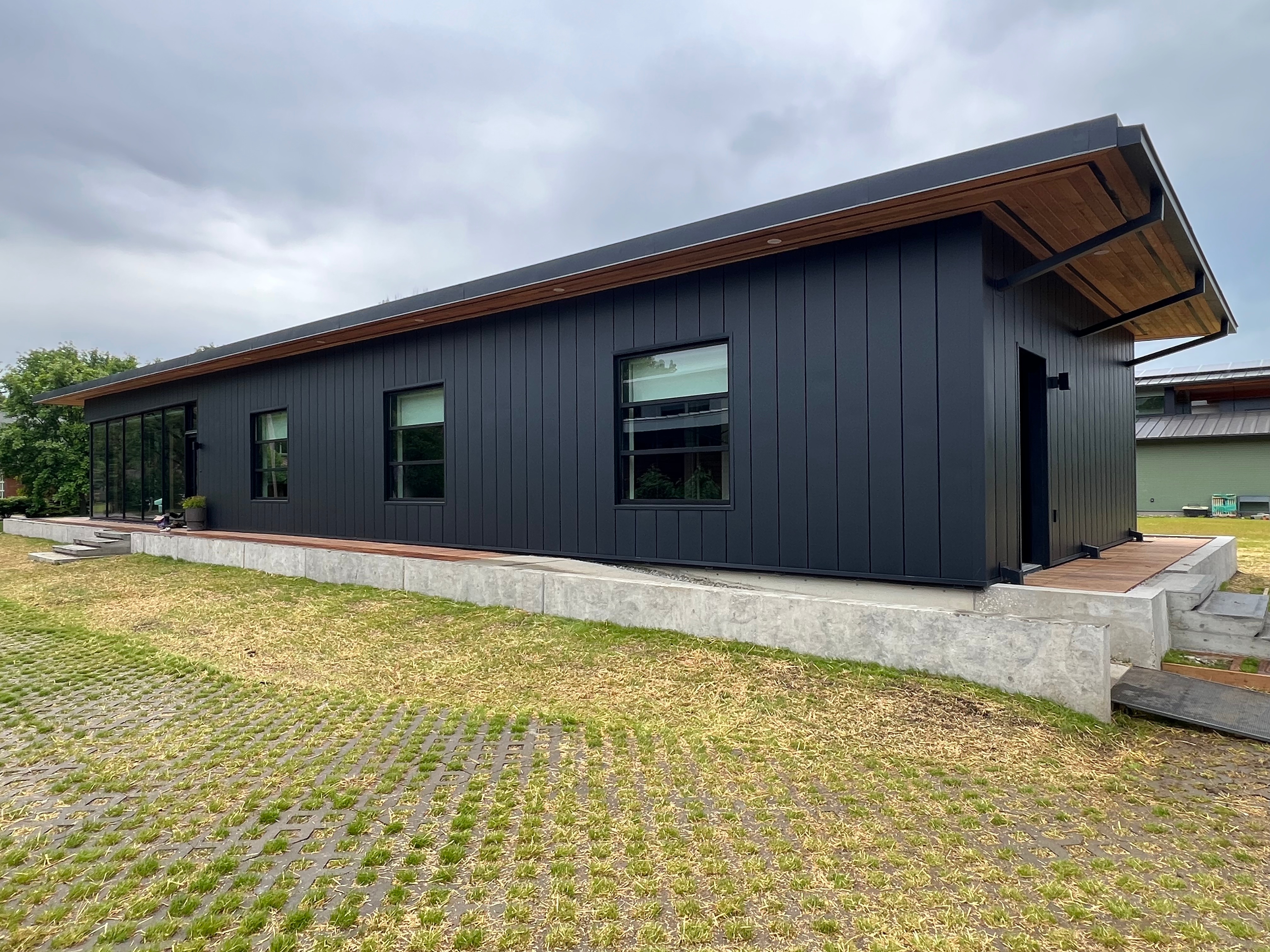
And Prof. Dan Rockhill’s students found their game on what might be one of the flattest, hardscrabble sites in town, located in a funky neighborhood where many of the mailboxes are leaning like tired drunks at closing time. Out of this morass has sprung an arresting, statuesque building that looks something like a cross between an Apple store and the Barcelona Pavillon, Mies van der Rohe’s seminal modernist masterpiece. Love it or hate it, you can’t ignore it.
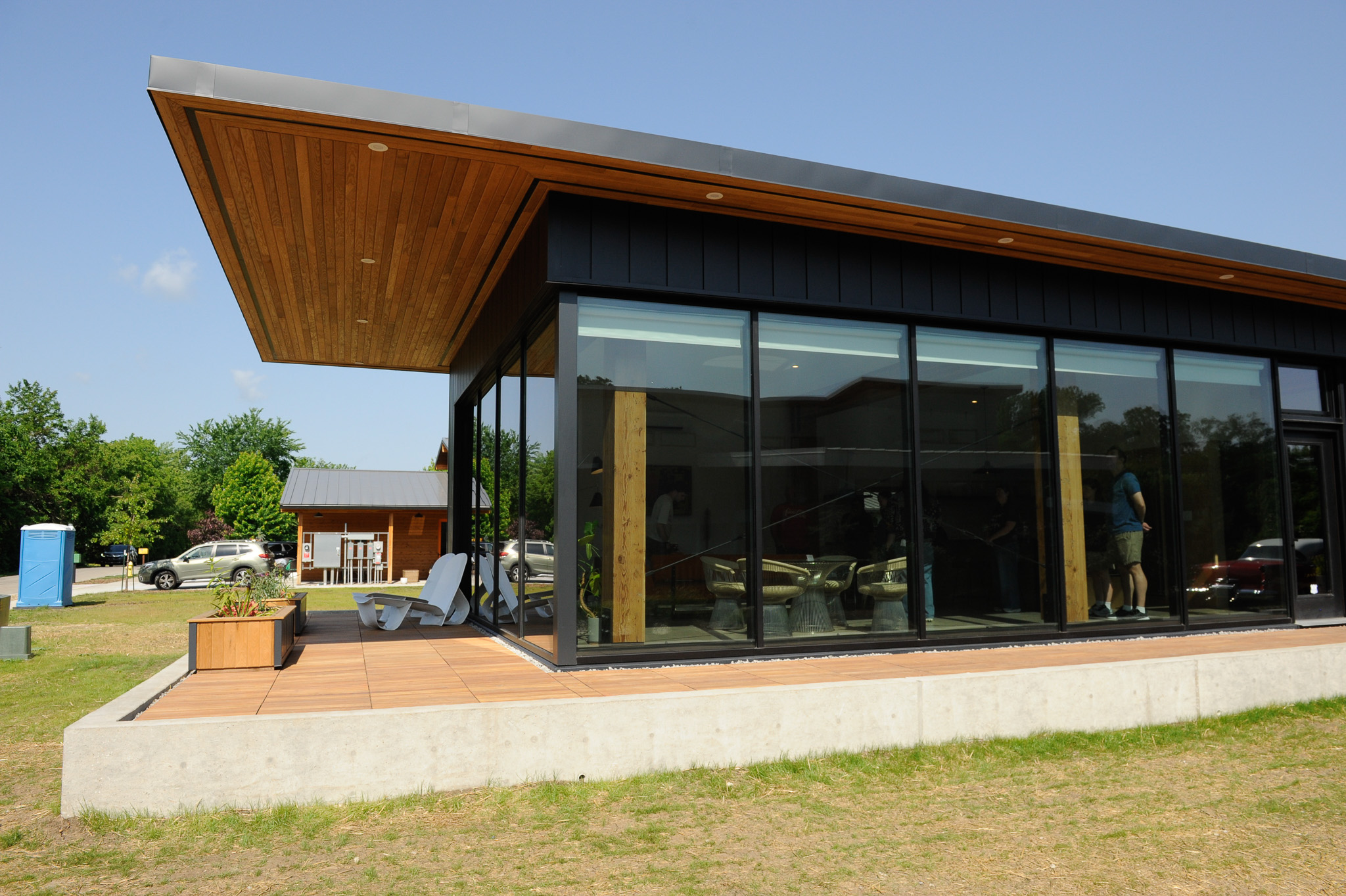
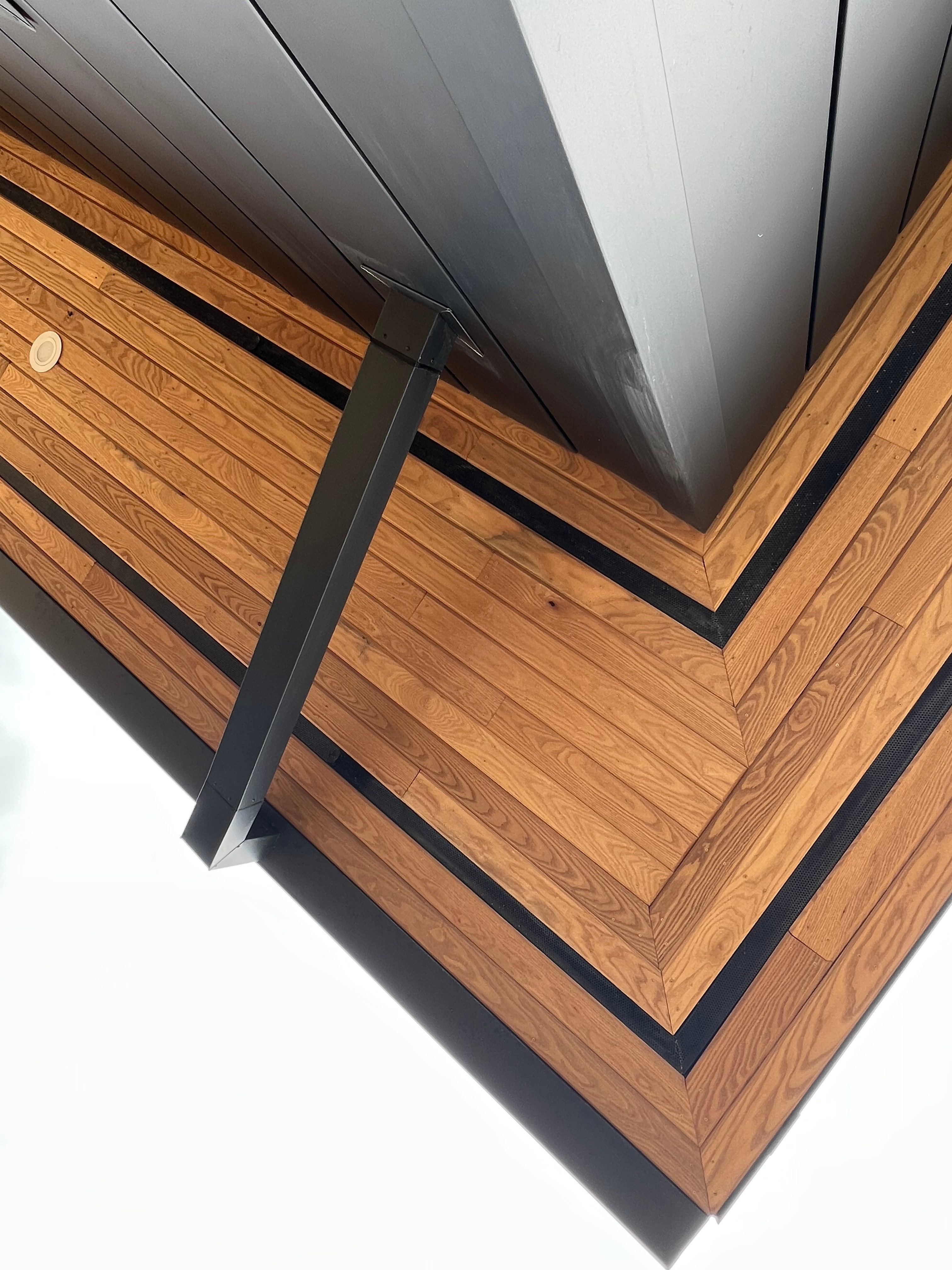
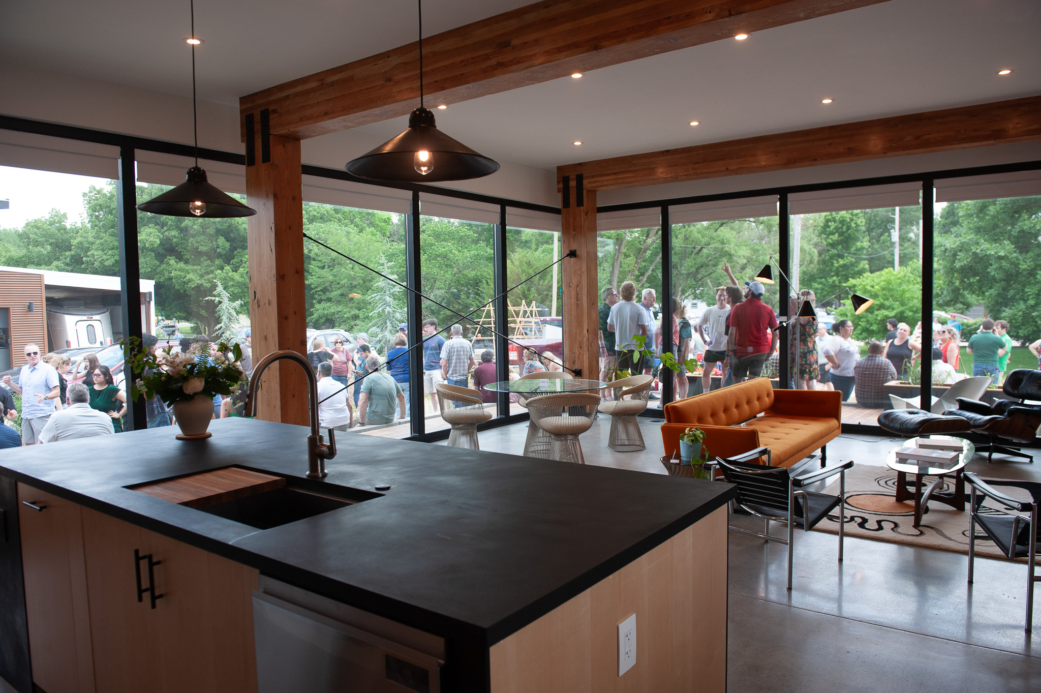
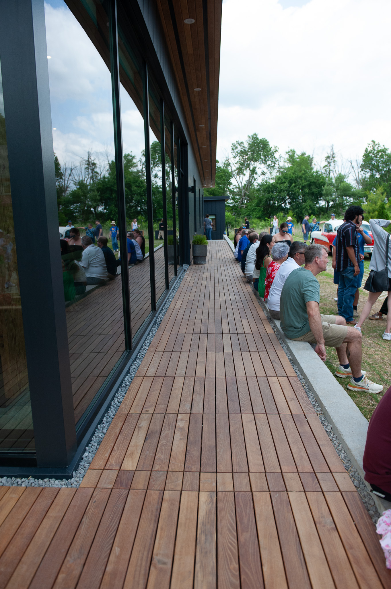
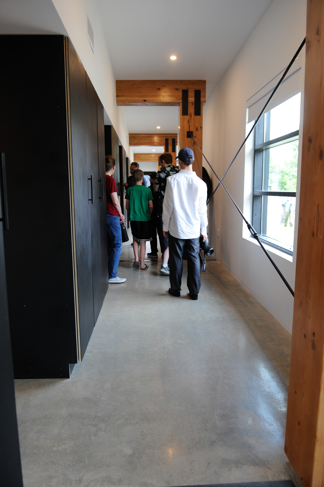
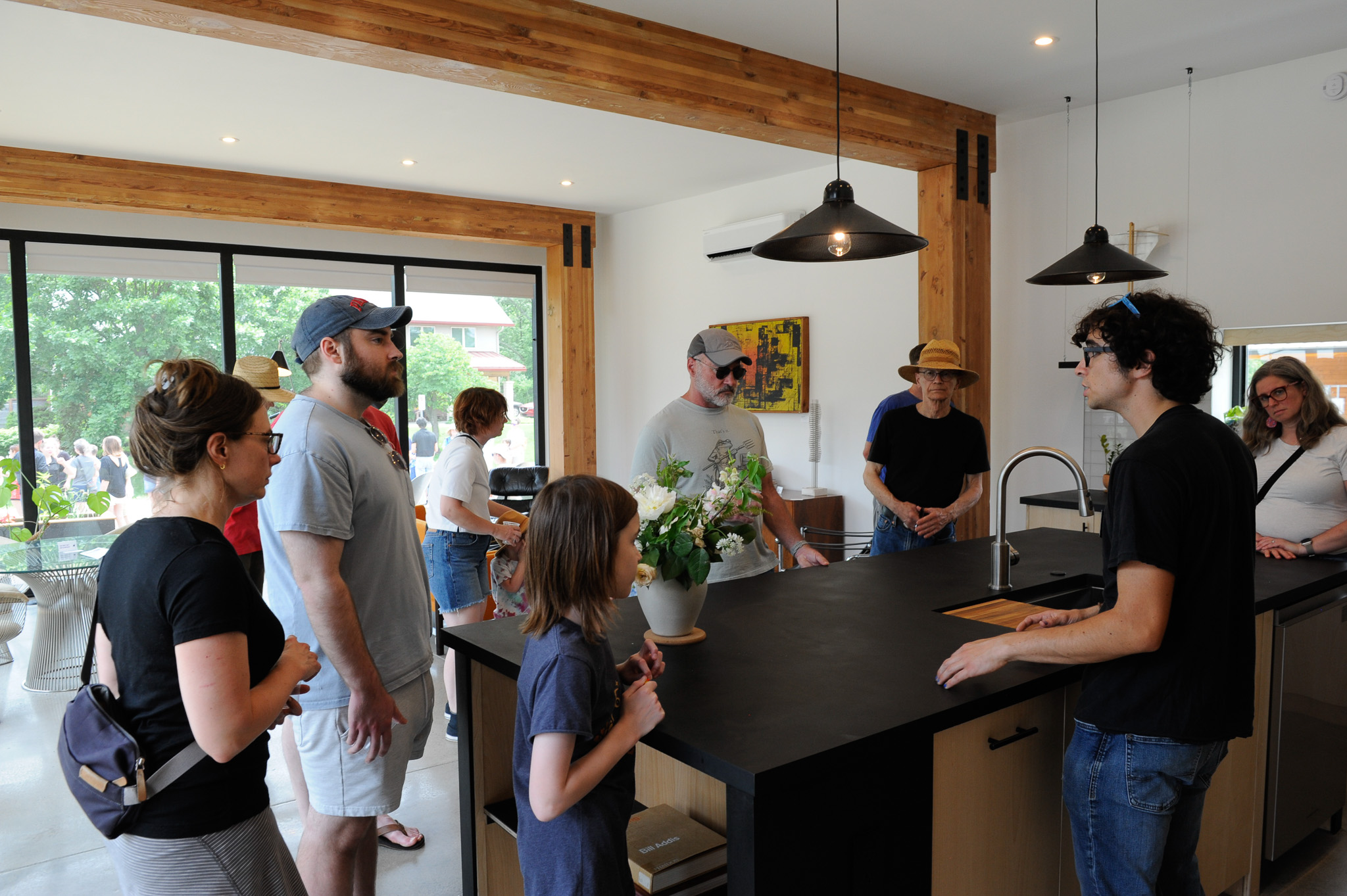
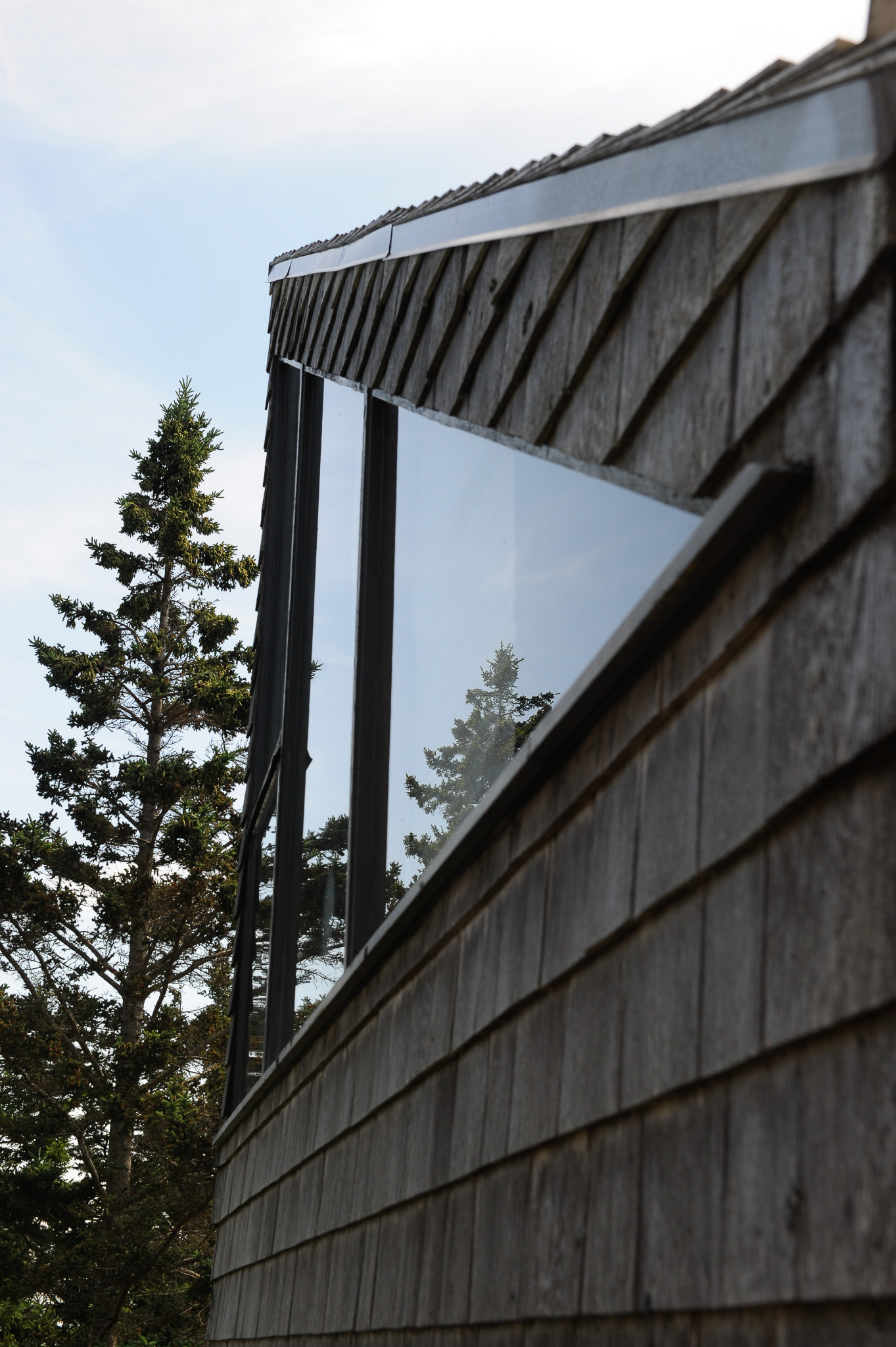
Squatting on a thick concrete plinth, the one-story house’s signature statement is a large overhang that smartly salutes the southern sky, providing ample shade in summer and solar collection in winter. The overhang and building are supported by massive structural beams called glulams, which are fully expressed in every room of the house and can be easily seen from the street through the triple-glazed living room windows. Altogether, the base, roof span, and interior structural expression dynamically uplift what would otherwise be a black slab of architecture.
East facade. Photo: Bill Steele
“We didn’t want the building to look like it was just dropped in place, or like it was taking up so much space, or creating so much weight,” said Tristan Taylor, one of the 804 graduate students who led tours of the building at the May 16 open house. “We wanted it to look like it was sitting gracefully on the plinth overlooking the neighborhood.”
According to Taylor, the form was kept simple to make the building easier to construct and allow students to focus on technical elements, which grow more impressive every year. For 2026, Rockhill and his team are pursuing LEED v4.1 Residential certification, the latest and more rigorous version of the U.S. Green Building Council’s benchmark sustainability rating system. The next-level tech is enough to make a NASA engineer blush.
While this is all well and good, the emphasis on technology has in the past tended to colonize the imaginations of many Studio 804 students and led them down a path that has resulted in houses that were less than optimal from a functional standpoint, to put it mildly, and more about showing off fancy gadgets and fixtures.
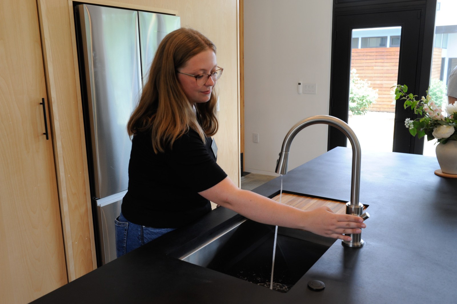
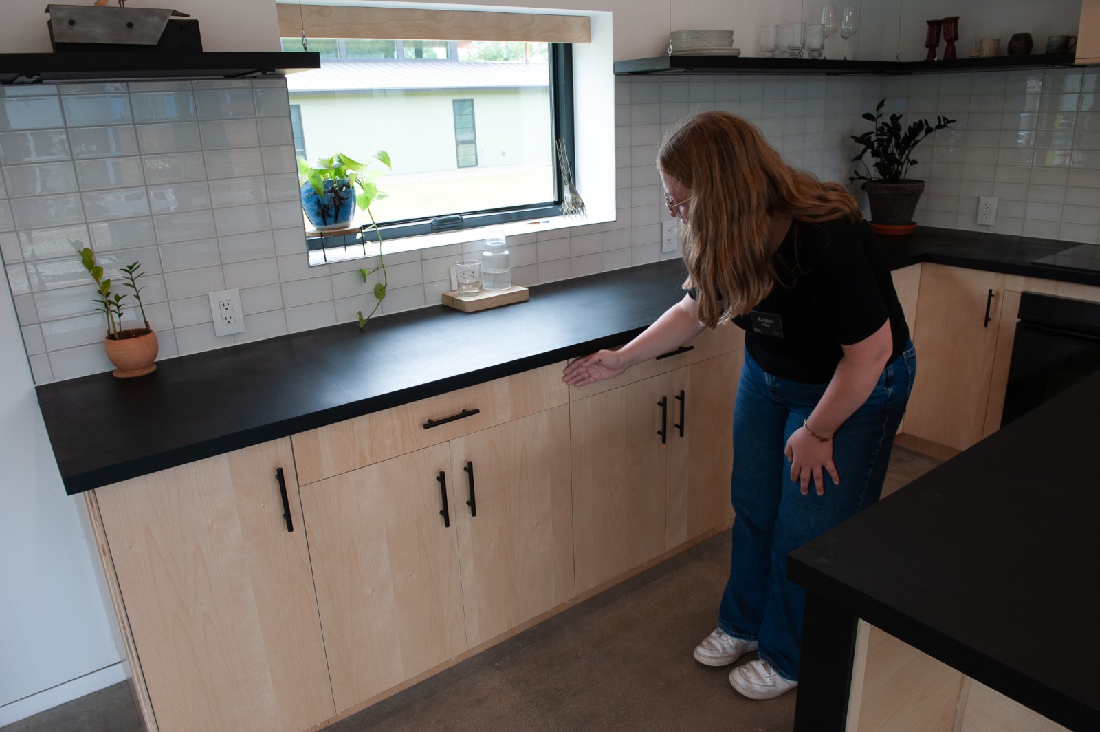
The temptation of tech persists—it’s a big part of the Studio 804 brand—but this year marks a notable shift in emphasis back to the human condition. Everything is on one level, entry and exits are clearly visible and convenient, and accessibility is no longer just an afterthought. For example, students widened doorways and integrated a ramp into the plinth to make it easier for wheelchairs to move about in and around the house. Kitchen cabinets were lowered, ADA compliant faucets were installed, and storage was increased. A 400-sq. ft. Accessory Dwelling Unit was created in the back to use as an extra office, 3rd bedroom, or Airbnb. These kinds of design decisions will, students hope, expand the typical buyer demographic for the home, or in other words, appeal to people who can afford them, which tends to skew older.
“I thought a lot of my grandma when we were designing this house,” said 804 grad Katelyn Fuller, who did a lot of design coordination for 1144 E. 12th St. “She always walked with a walker and had a hard time on stairs, so it was important to me that we integrated those [accessible] things.”
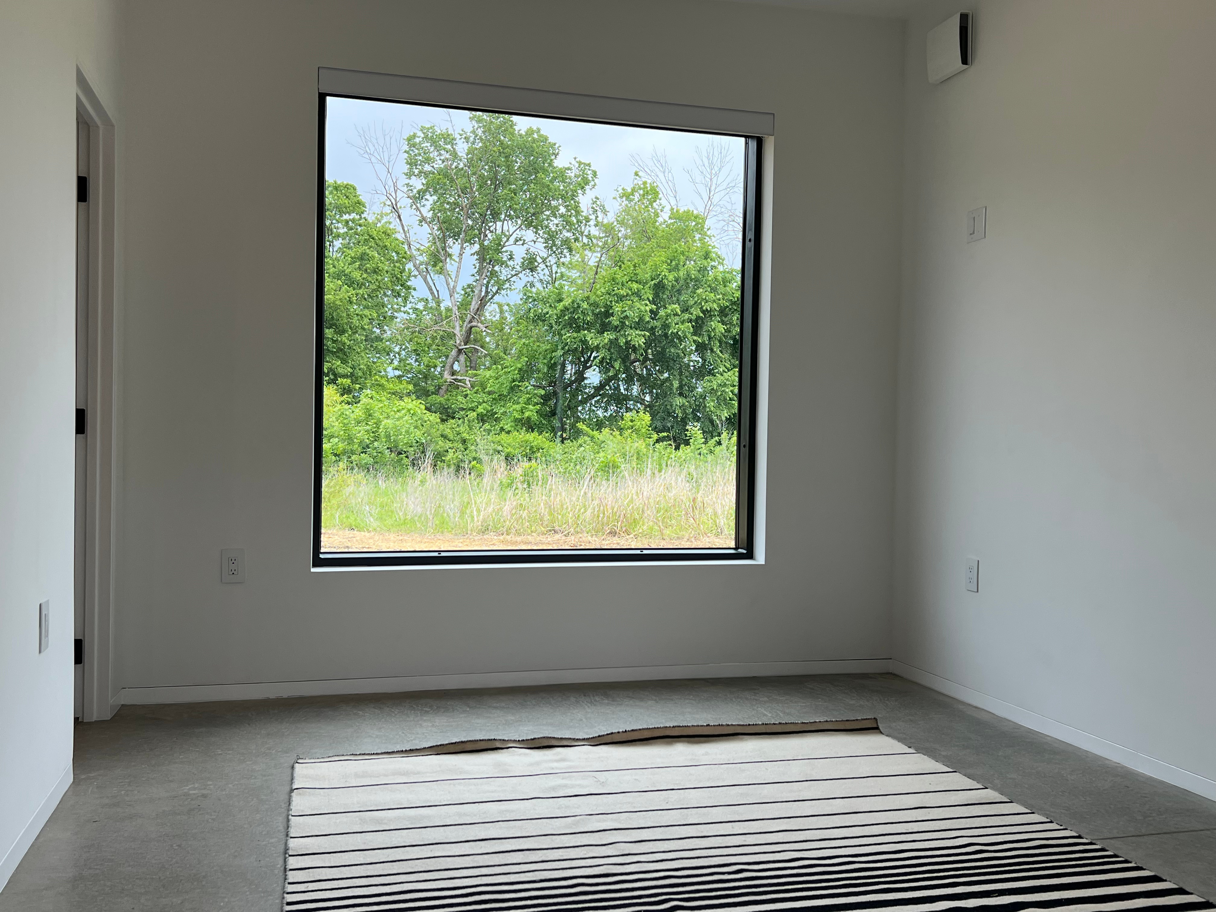
While the architects may have aced the functional program, they swung and missed in several areas that may turn off some potential buyers, who are looking at an asking price of $699,000 for the property. Most glaring is a lack of basic landscaping, which as it currently stands renders the house less like a serene modernist retreat and more like the monolith in 2001: A Space Odyssey after it has crash-landed in a vacant lot off Haskell Ave. Another issue, much further down the hierarchy of problems but nevertheless important, is basic fit and finish. Though improved compared to some previous 804 houses I’ve toured, it falls short of buyer expectations at this price range.
I asked Fuller about some of these bogeys, thinking that I could catch her off guard on something she and her amateur cohorts had overlooked, missed, or disregarded. Not a chance. Landscaping? The house, as it turns out, is built on a former junkyard—a so-called ‘brownfield’ site—with soil quality so poor students ran out of time to complete their landscaping plans. Fit and finish? Students did mock-ups of kitchen cabinets in their warehouse to prepare for a professional install but found it exceptionally difficult to adjust their custom fronts with the underlying Ikea hardware on site.
Most flaws in 804 projects are artifacts of limited material choices—the program relies on donations, deep discounts, and the good will of vendors across the country—and the reality that students have never built a house before. By the same token, the fact that the design-build program continues to produce some of the most progressive architecture in the Midwest, if not the whole country, the burden of expectations to create standout architecture year after year mounts.
And students keep upping their game. Thinking I was architecturally astute by asking why the 804 team didn’t extend the lovely structural beams through the exterior—the quintessential midcentury modern look—Fuller quickly put me in my place.
“If the gluelam was set into the wall, their foundation footings could crack if one side settles faster than the other,” she said.
Just when you think you’ve outsmarted these students, they’ve got an answer that makes you go “aah.”
The absurdity of nuclear politics is dialed to an 11 in Dr. Strangelove (1964), Stanley Kubrick’s seriously funny film about dropping the H-bomb. Based on British writer Peter George’s novel Red Alert, which imagines rational and responsible responses to a nuclear accident between the United States and the Soviet Union, in Kubrick’s reimagining, lunacy and paranoia fully take over the proceedings. Led by a superb cast that includes hilarious turns from Sterling Hayden, George C. Scott, and Peter Sellers at the peak of his comedic genius, the film has lost none of its satirical bite, and is arguably more relevant today given the biblical zeal of our current administration to drop bombs, and our seemingly frozen acquiescence to the present state of world affairs. Viewed through the lens of modernism, Dr. Strangelove depicts a world where rational design—epitomized by production designer Ken Adam’s iconic War Room—cannot contain the irrationality it houses, turning architecture itself into a stage for human folly. And what a stage! Adam’s surreal set design is so stylishly good that the idea of nuclear apocalypse feels like a great opportunity to take an extended, if not permanent, architectural sojourn underground. And why not? Dr. Strangelove recommends it.
We’re all doomed anyway, so why not come join us for some laughter and discussion of this darkly comic masterpiece. A brief Q&A will precede the film with Lawrence Modern’s Bill Steele and KU design professor Tim Hossler. Tickets are $10 at the door or can be purchased online here. Doors open at 6:30 p.m, film starts at 7:00. Runtime is 94 min. Wine and popcorn will be served but remember, this is a movie theater, not a War Room. No fighting.
We look forward to seeing you there.
—Tom, Bill, Dennis & Tim
Dr. Strangelove original trailer | Roger Ebert’s four-star review | Lawrence Arts Center tickets
Back by popular demand—and perhaps by cosmic design—Jacques Tati’s PlayTime returns to the Lawrence Modern Film Series on Friday, November 14. After the laughs we shared over the summer with Mon Oncle, we couldn’t resist bringing Monsieur Hulot back for an encore. Our first attempt at a film series more than a decade ago began with PlayTime, so you might say we’ve come full circle—fitting for a film about people forever going around in circles through the modern world.
Jacques Tati didn’t make many films, but he probably created more masterpieces per attempt than any director in movie history—and PlayTime is his magnum opus. A beautifully choreographed, nearly wordless comedy of confusion and alienation in the age of high modernity, its core theme—loneliness, and the individual’s struggle to find his place in a world arranged around work, leisure, and the gleaming façades of modern architecture—still resonates. For this monumental, nearly three-year production, Tati built his own futuristic Paris—“Tativille”—and once again stepped into the role of the lovably old-fashioned Monsieur Hulot, wandering among a host of other lost souls. Every inch of the wide frame—originally shot in 70mm—brims with movement and invention, moved briskly along by Francis Lemarque’s playful yet tender score.
A box-office flop when it premiered in 1967, PlayTime has since inched steadily upward on the critics’ lists, landing at No. 23 on the 2022 British Film Institute’s Sight and Sound poll of the 100 Greatest Films of All Time. Time has been kind to the film—it looks and feels more contemporary with each passing decade. After years of studio-enforced cuts, original negative deterioration, and thought-to-be-lost sequences, the film got a 4K restoration in 2013, and we’ll be screening it in a Blu-ray disc that brings back the crisp detail, sound design, and vivid color of the film’s initial presentation.
And trust us: this is not a film to watch on the couch or on your laptop. The humor comes alive on the big screen and in the reactions of your fellow audience members… It’s a film you don’t watch so much as wander through—you’ll catch yourself laughing at gags hiding in plain sight.
Join us Friday, November 14th at the Lawrence Arts Center’s Microcinema for this special 4K screening of Jacques Tati’s greatest film, with an introduction by Lawrence Modern’s Tim Hossler, for whom PlayTime is a personal favorite. Show starts at 7 p.m. Run time is 2 hrs. 04 min. Tickets ($10) can be purchased in advance here.
—Tom, Bill, Dennis & Tim
Playtime trailer | Roger Ebert’s original 1967 review | Lawrence Arts Center tickets
One afternoon in the summer of 2014, while visiting modernist architect Carol A. Wilson’s home studio in Falmouth, Maine, I mentioned that my wife and I were planning to take a trip up to Acadia National Park the next day. Knowing that I had an interest in modern architecture, Carol said, “You should go check out Haystack while you’re up there.”
Haystack?
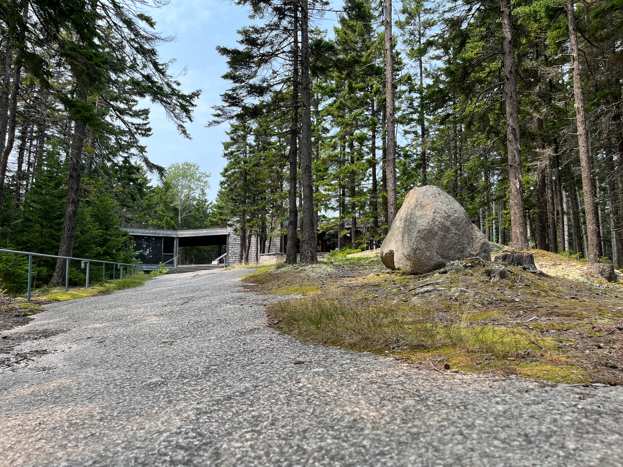
Although born and raised in the state of Maine, it was the first time I’d ever heard about the Haystack Mountain School of Crafts. Located on Deer Isle, an off-the-beaten path tourist destination south of Bar Harbor, the small arts and crafts school offers short-term summer residencies and workshops in fiber, ceramics, glass, metals, graphics, jewelry, and printmaking, in one of the most inspired settings for arts and architecture in the world.
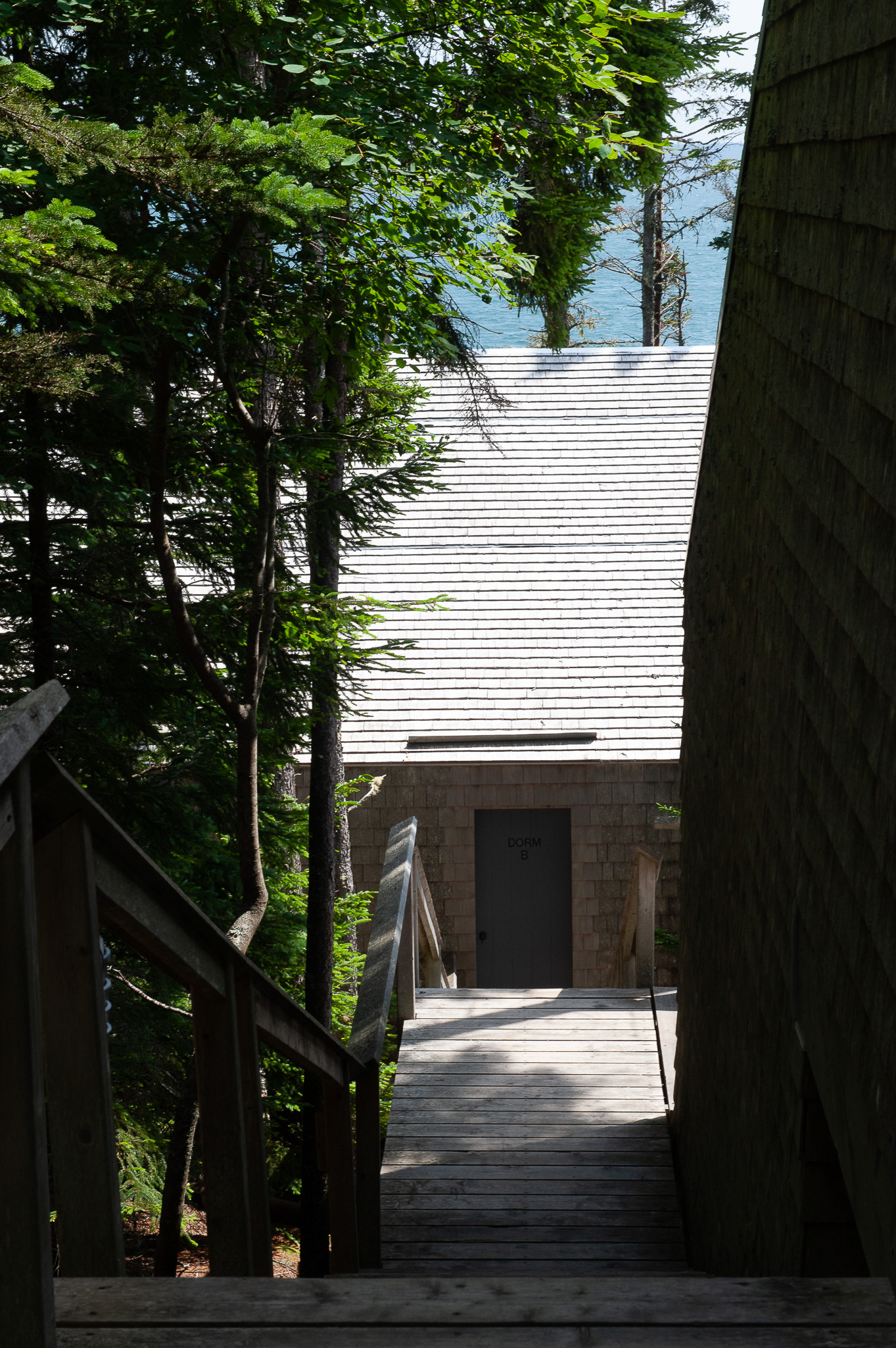
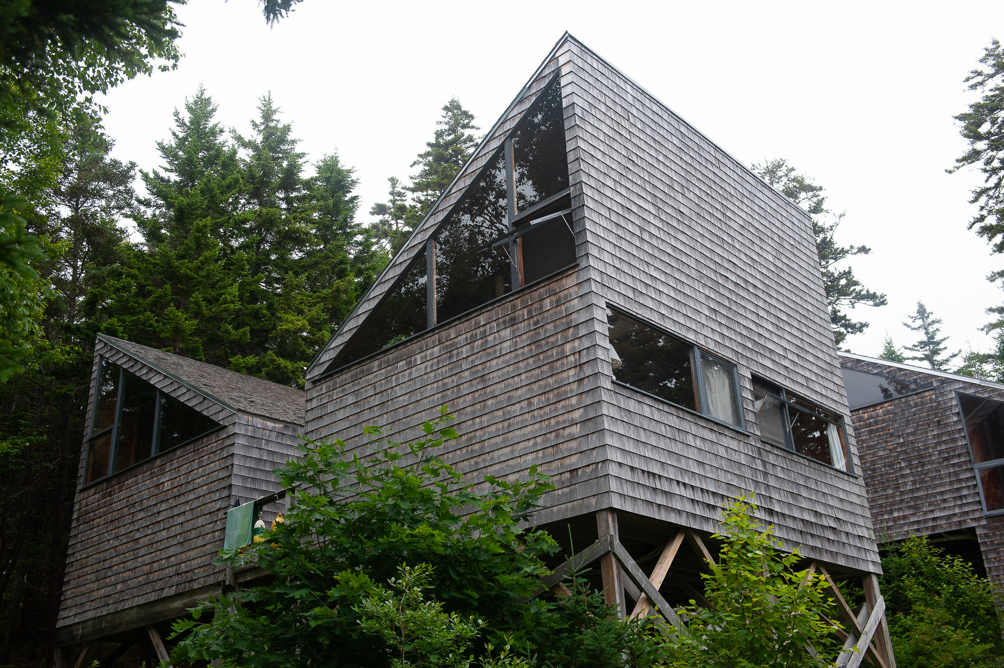
Built in 1961, the school’s seaside campus is situated on a remote, steeply sloped, and conifer-wooded site studded with huge granite boulders and one of the rockiest stretches of coastline in the state. Nestled among the trees and rocks are a collection of dormitories and studio buildings that are shaped like salt boxes and built out of cedar and pine. Various sculptures and other art objects (many created at the school) adorn the landscape. It’s high art in the woods—the kind of arts school in the wild that Mary Oliver might have built if she had been an architect and not a poet.
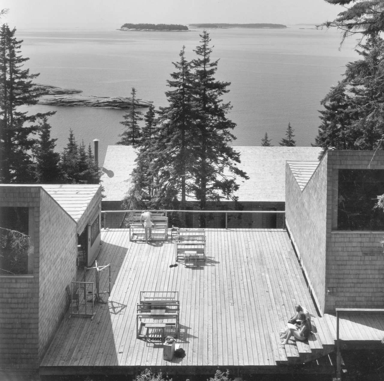
The fiber-graphics deck in the 1970s. Image courtesy of Haystack Mountain School of Crafts, Deer Isle, ME.
After making brief visits to the campus in 2014 and 2024, where I became enchanted by the beauty of the place, I spent a week there in July after being accepted into the school’s new “Square ONE” program for beginners. (I took a workshop in blacksmithing, something I’d always wanted to do since watching Gunsmoke on TV as a kid.) Besides an interest in making art, I was keen to have a lived experience at the school and explore its hidden wonders. I wanted to move past consumer-grade architectural tourism and experience something deeper, something more hands-on.
Much has been written about Haystack—it is on the National Register of Historic Places and frequently cited as one of the most important works of postwar architecture—but its influence has been primarily in architectural philosophy, education, and the crafts, rather than ways of living. I was curious to find out: are there lessons from Haystack that can be applied to our urban and environmental design, and to the preservation of historic buildings, including those under the watchful eye of Lawrence Modern and the Lawrence Preservation Alliance?
Haystack is a worthwhile case study because not only has it stood the test of time, but it is also still well ahead of its time. Long before “sustainability” became a buzzword, it demonstrated an ecological awareness and sensitivity that continues to be a model for architects and urban planners. The school’s non-hierarchical, communal way of living and working together—where ideas flow freely and experimentation is encouraged—is something other schools and even corporations have tried to replicate but rarely succeed in doing. It’s not easy to get right.
One of the things that Dennis Domer, Tom Harper and I noted during our extensive survey of Lawrence’s midcentury modern architecture more than 15 years ago is that, like one of Newton’s laws of motion, when a building is designed right from the beginning, it tends to stay that way. It resists change. If you visit Haystack today, you’ll find it remarkably close to what it looked like 65 years ago.
To understand why, I spoke with a range of people connected to the school—former directors, administrators, caretakers, students, and faculty, including several artists from KU who have taught there over the years—about what makes Haystack, and its architecture, so compelling and enduring.
The Fiber Studio today. Photo: Bill Steele
A community of artists living and working deep within nature was not a new idea when Mary Bishop, a wealthy modern art collector from Flint, Michigan, funded the inception of Haystack in 1949. The Cranbrook Academy of Art and Black Mountain College were already well established by then, but they operated within a familiar hierarchy—conventional, top-down schools where fine art stood above applied art, which the establishment still viewed as secondary. Bishop saw craft as a serious art form and championed the belief that craftspeople should have a dedicated place to work, teach, and exchange ideas, not just be sidelined as hobbyists.
Her patronage came at a moment when leading avant-garde artists were exploring modernist ideas in arts and crafts. One of them was a Cranbrook teacher, Francis Merritt, who Bishop recruited to run Haystack when it opened in 1950, in rural Montville, Maine. Like Bishop, Merritt embraced modernism and saw an opportunity to upend traditional arts and crafts pedagogy that still clung to a master-apprentice structure. It was under his charismatic and energetic leadership that Haystack quickly became recognized worldwide as a vital new space to pursue innovation in craft.
The parallels to the Bauhaus are more than coincidental. Both Bishop and Merritt admired the radical curriculum of the German school, eventually leading them to commission modernist Ed Barnes in 1957 to design Haystack’s new campus on Deer Isle. (The Montville campus was forced to move because of I-95 encroachment.) The convergence of progressive ideas and raw nature forged a new inflection point in modern architecture.
Born in Chicago, Edward Larrabee Barnes (1915-2004) graduated in 1942 from Harvard, where he studied under the well-known Marcel Breuer, and Walter Gropius, the founder of the Bauhaus. Both taught students that they needed to get in touch with their primitive instincts and understand basic form ideas. They also taught the importance of vernacular architecture. These teachings formed much of the design language Barnes would later use at Haystack.
In 1949, Barnes opened his own firm in New York and over his career distinguished himself by his architectural restraint. His prodigious output included everything from private houses, camps and university projects to large-scale works such as the Walker Museum of Art in Minneapolis and I.B.M.’s sleek flagship office tower on Madison Avenue. Common with all of his work is a ruthless simplicity and geometrical purity that to some architecture critics could verge into blandness, though most admired his compositions and refinement. But Barnes also was acutely concerned with context and sensitivity to local differences, which makes his work far more interesting than would first appear.
My initial impression of Haystack was that it was some kind of architectural pose, meant to convey something. The shingled cottages and studios look so simple, so basic, that even a child could do them. They reminded me of those funky looking condos built in the 70s and 80s—no doubt cribbed from Haystack—that seemed awkwardly out of place in their suburban settings. But here they feel just right—honest, weathered, and exactly where they belong.
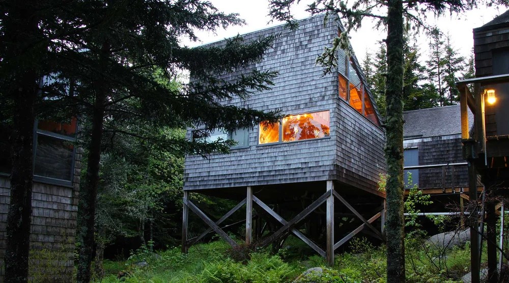
Program participants cabin. Photo: Bill Steele
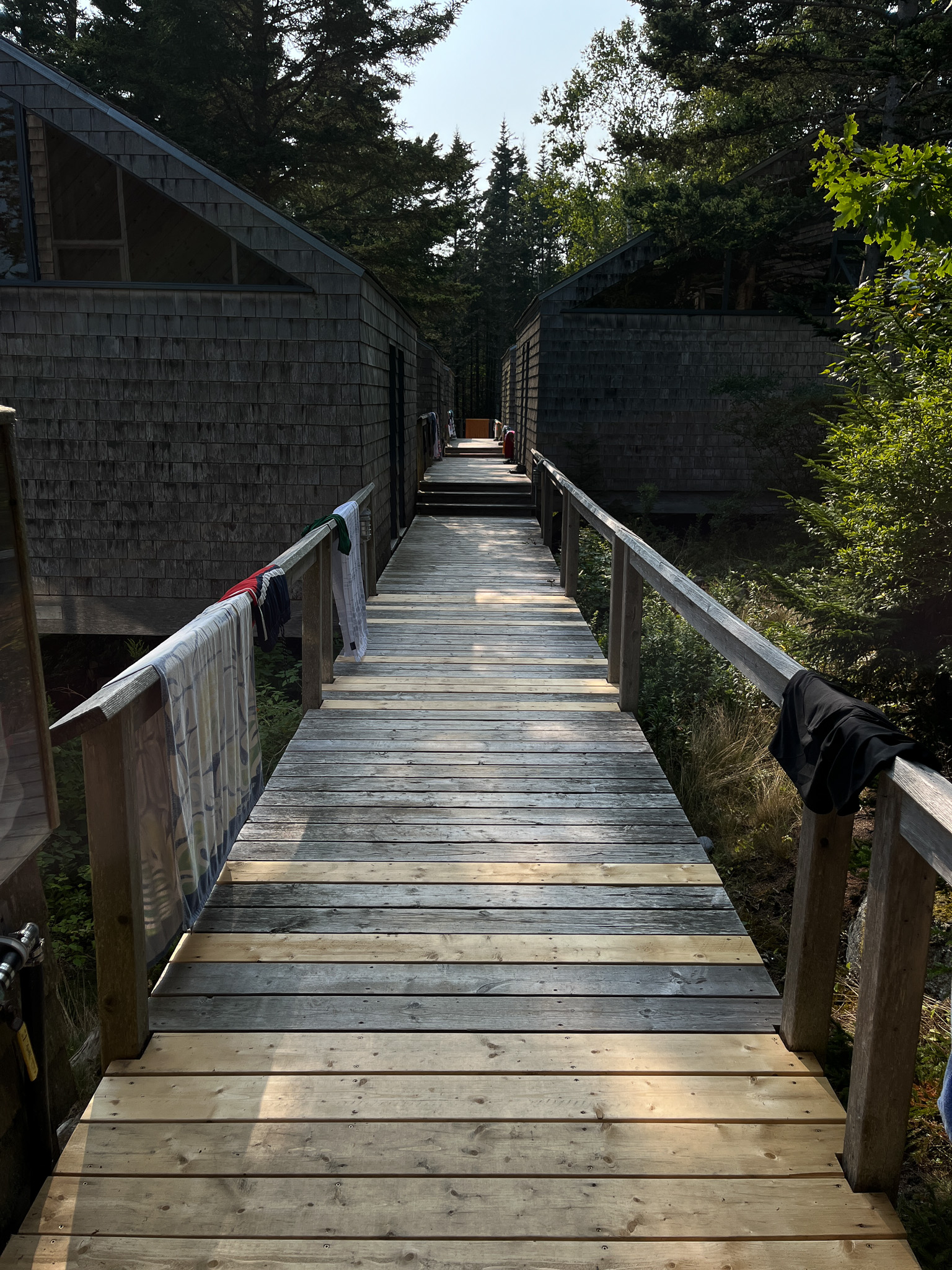
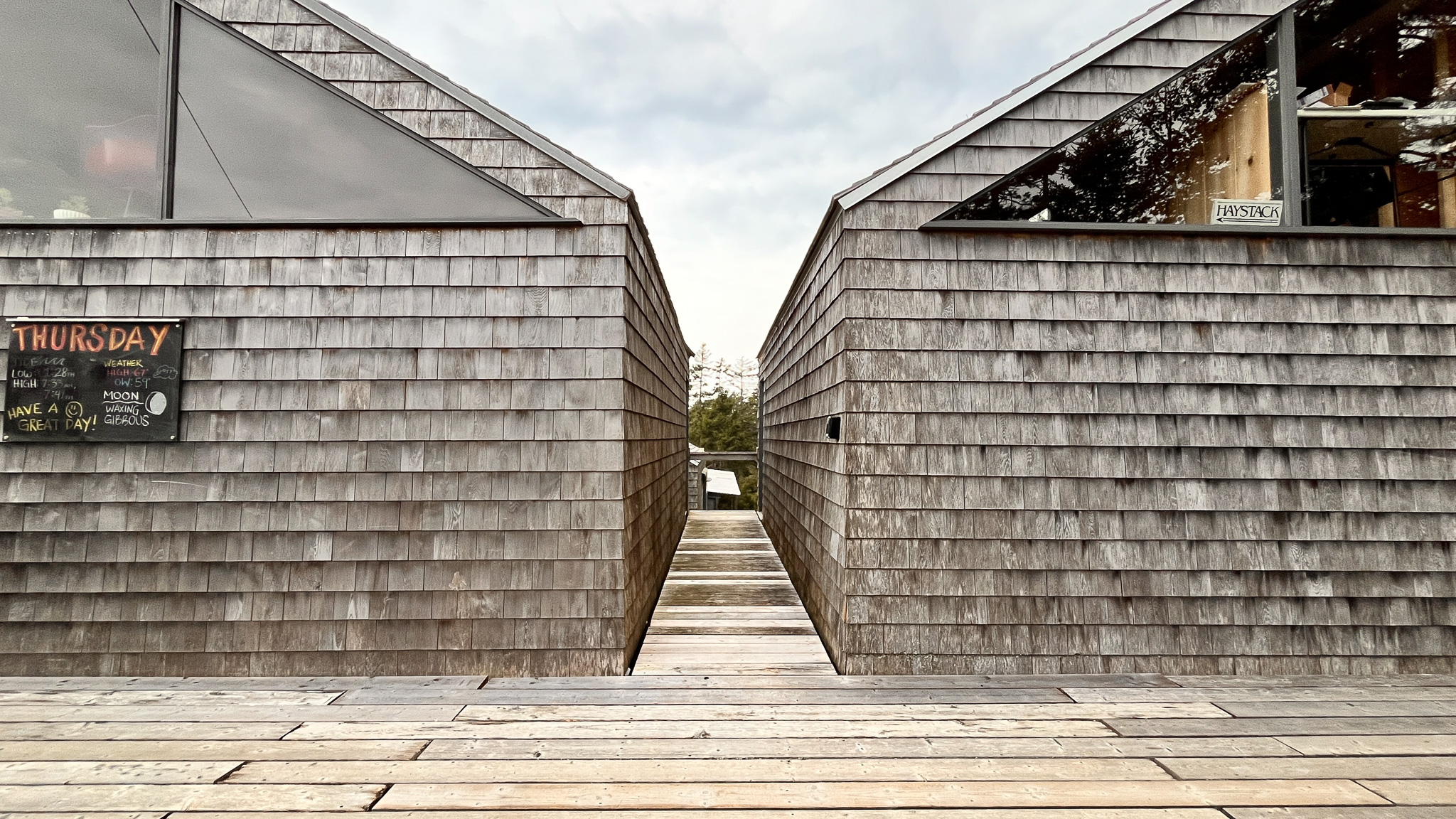
The geometrical shape of the buildings is striking not only because of their contrast with the forest but also because their scale and elevation from the ground humanize them. Set against the mossy, lichen-covered forest, the spare shed forms engage and shape the surrounding atmosphere in unexpected ways. Shrouded in early morning fog, they conjure the treehouses of the Ewok village in Return of the Jedi; in the middle of a well-lit afternoon, they might evoke an Italian hill town; in the evening, the buildings appear as relaxed and comfortable as Japanese tea houses on a mountainside. They have an extraordinary presence that allows them to take on the character of their surroundings.
Most of these effects are incidental. At Haystack, aesthetics were a secondary concern for Barnes, who was a reductivist. How to build an eight-acre campus on a steep wooded bluff without disturbing it was a greater concern and a monumental problem to solve. Most architects would have probably clustered the buildings along the top of the bluff and called it a day, but Barnes had other ideas, some of them he’d already tried out at a couple of children’s summer camps he designed in Fishkill, New York (Camp Bliss and Camp Anita, 1953-1955) that were also composed of simple wood structures set lightly into a forested landscape. But nothing like this. This was a magnitude greater difficulty.
Wandering the campus, I was struck by the thought that, of all the possible solutions to the problem of what and how to build on this rugged lot, Barnes seems to have come up with the most sensible. Rather than imposing a design onto the site, he simply elevates the structures above ground, so that they practically float above the earth. (Jack Lenor Larsen, a giant in the field of commercially produced textiles who taught at Haystack for many years, likened them to a network of docks and lobster boats that float over land instead of water.)
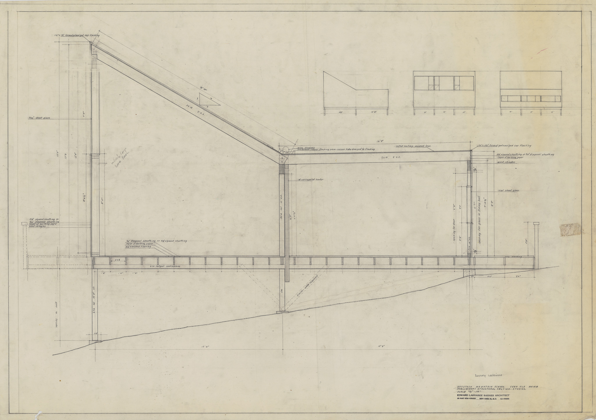
Of course, cost constraints were a significant factor. The founders of the school spent most of what they had on the land: $3,500 for 42 acres of breathtaking oceanfront property in the late 1950s. (This seems like an impossible bargain today but in those days the land was considered unbuildable.) According to Barnes’ own personal accounts of the project, the construction budget was a mere $5 per square foot. The owners couldn’t afford much else, forcing Barnes to think creatively how to meet their many requirements.
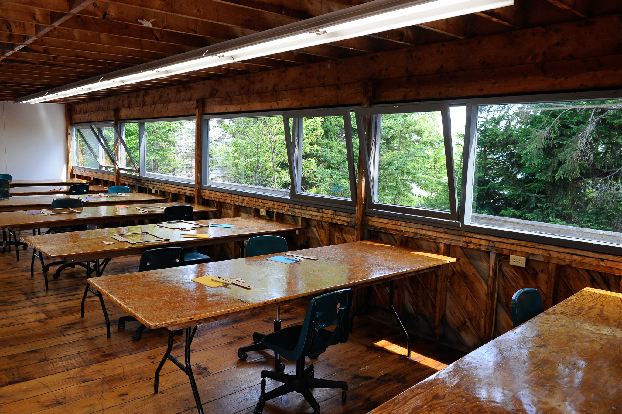
To minimize costs, Barnes relied on local labor and materials as much as possible. The buildings are mostly made of pine, cedar and plywood, with a foundation of treated wooden posts set on concrete footings and piers. They also were relatively easy to build because they didn’t have complex plans or sections. Here is a preliminary structural section drawing of a “luxury cabin”:
Cabin section. Courtesy of the Frances Loeb Library at Harvard University.
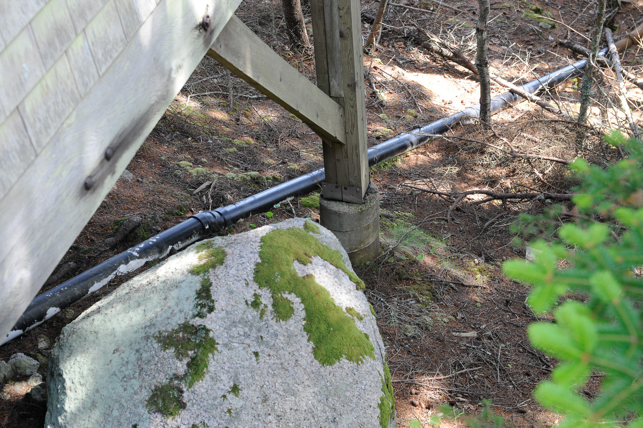
Aside from some steel and concrete, most of the material is standard 2x4s, 2X6s, 2X10s, and inexpensive rough-sawn cedar shingles. Since Haystack is operational only in summer, the buildings are uninsulated and unheated, which also helped keep costs down. (Where there is plumbing, the pipes are all run above ground.) The only processed materials in the buildings are the concrete, plate glass, metal doors, some galvanized metal and copper flashing, and synthetic rubber EPDM for the roofs, which wasn’t originally spec’d by Barnes but became necessary because Maine’s winter freeze-and-thaw cycles caused leaks.
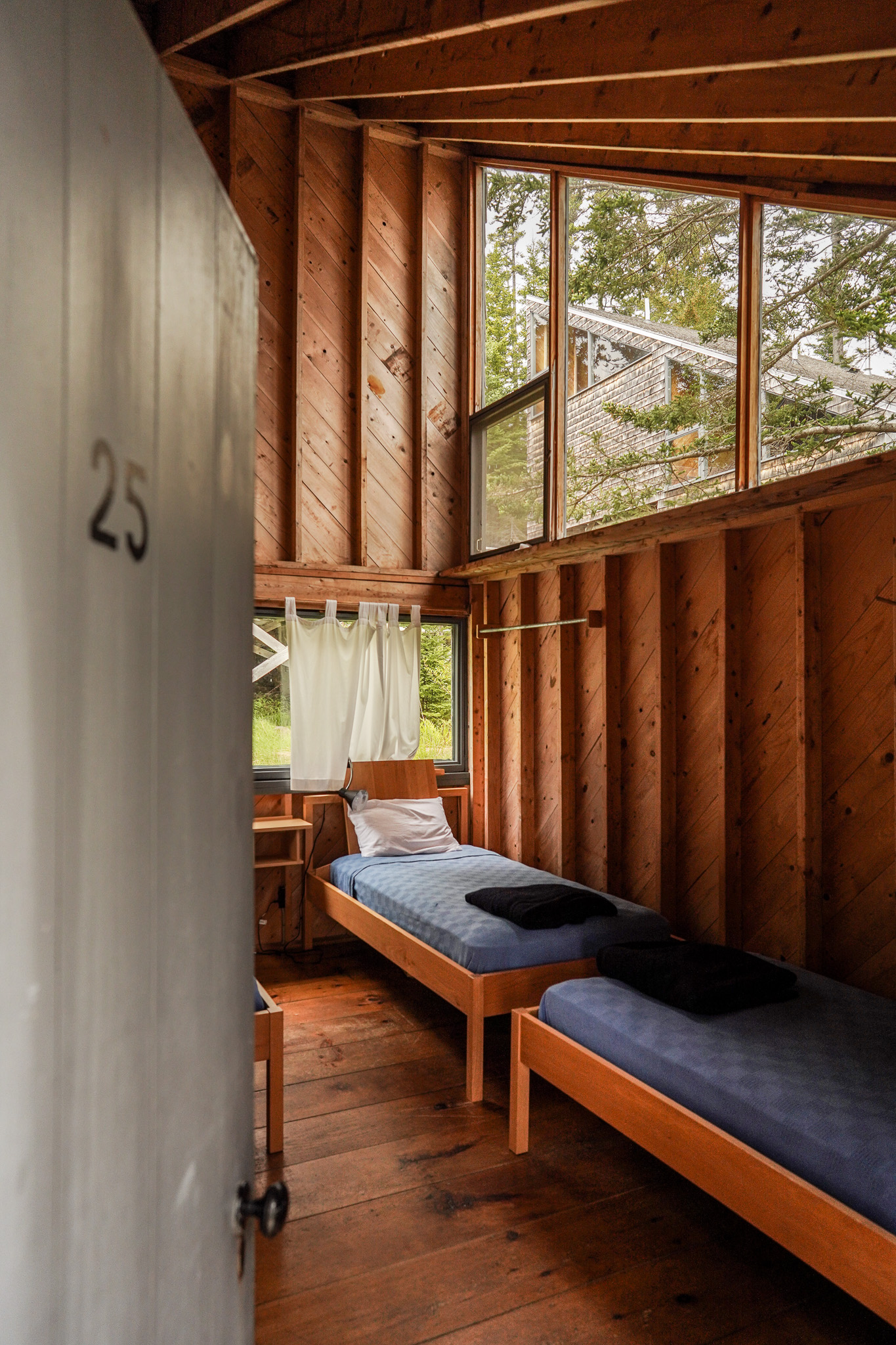
Here’s a peek inside:
Photo: Dan Rajter. Image courtesy of Haystack Mountain School of Crafts, Deer Isle, ME.
Hardly luxurious, but their rustic quality is in keeping with traditional Maine summer cottages.
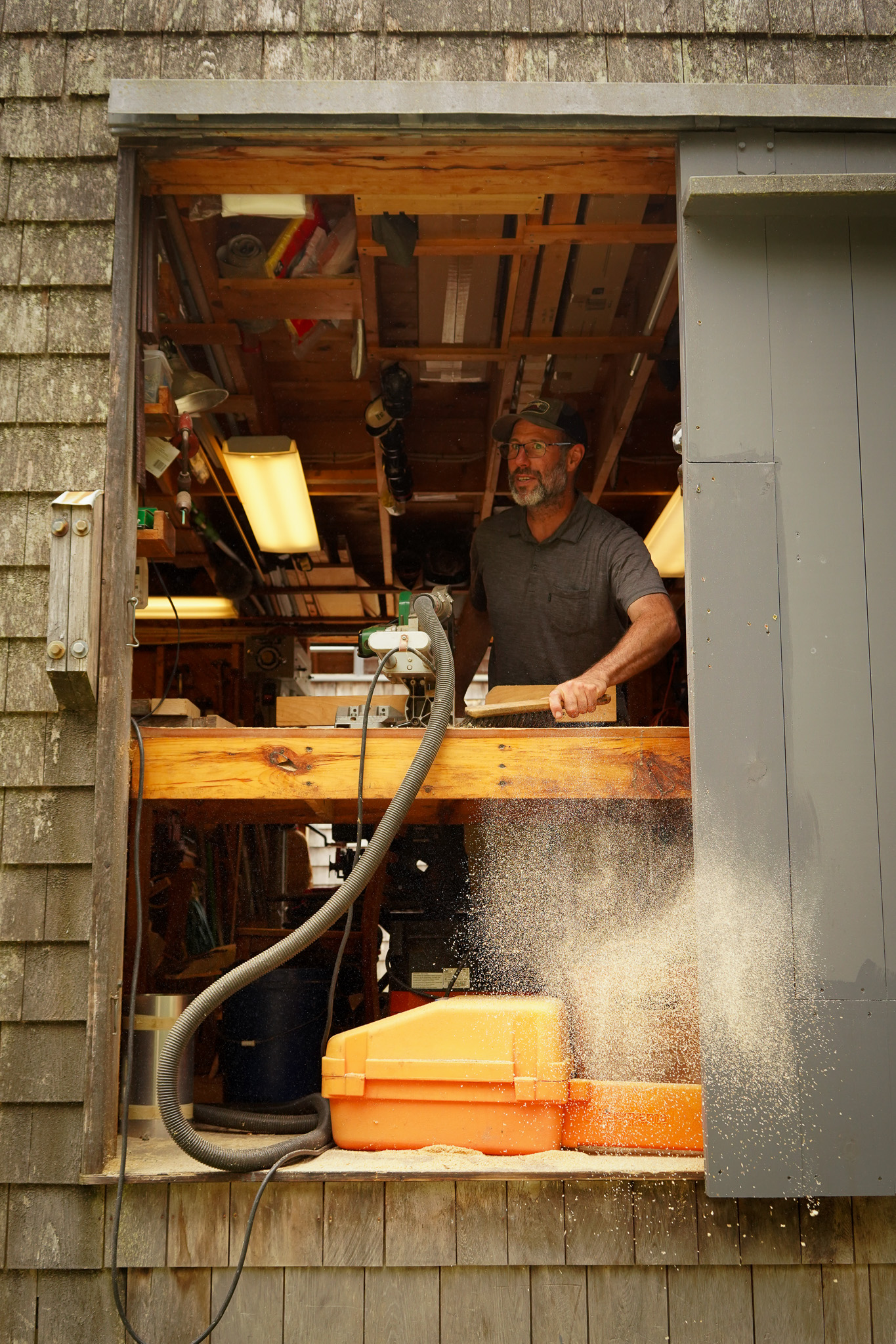
According to Stu Kestenbaum, a former Haystack artistic and executive director, there wasn’t much of a construction industry on Deer Isle in those days, so the carpenter crew was made up of people who most likely lobster fished and did other odd jobs.
“It was a hand-made, people-pitching-in kind of project,” Kestenbaum said. “I think they were figuring it out as they went along.”
Maybe because it was built by local carpenters, Haystack has the feel of a place where people build for themselves. The respect for Maine vernacular tradition—local materials, local influences, local technology—adds to the spirit of unity with the environment, even though the aesthetic is unapologetically industrial modern.
Apart from the mandate to keep costs down, by far Barnes’ toughest assignment was fulfilling the functional imperatives. He wrote that Haystack’s board wanted a clustered, communal layout that would foster “a cross-fertilization of thought and ideas between the crafts.” This prerequisite was at the heart of the founders’ vision.
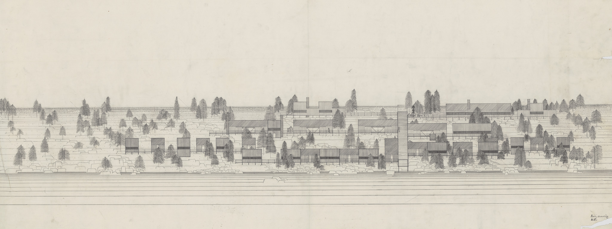
Courtesy of the Frances Loeb Library at Harvard University.
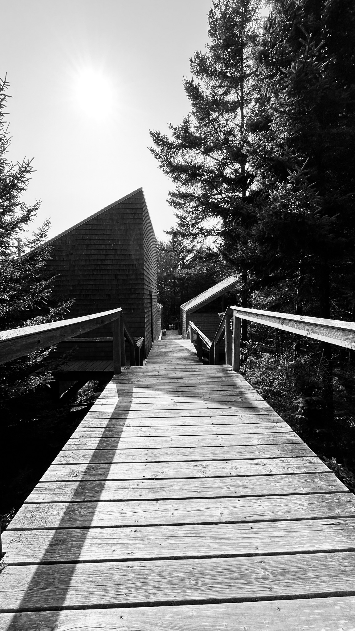
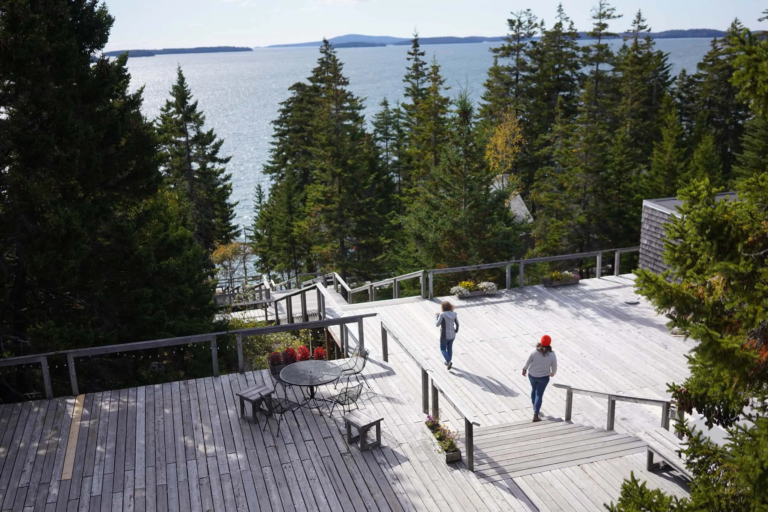
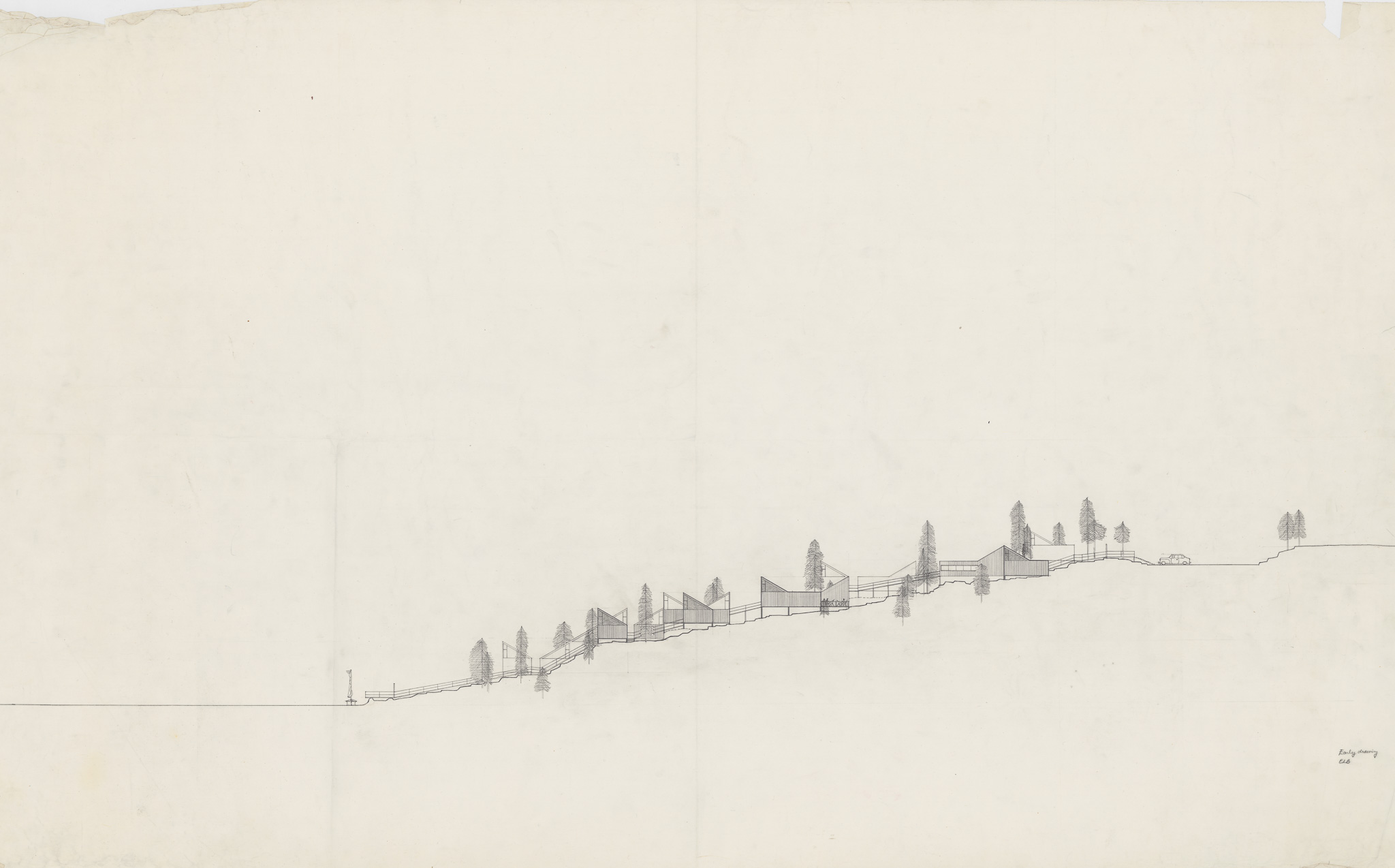
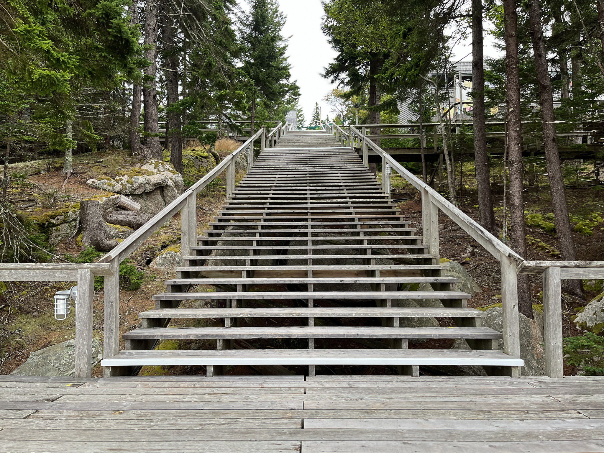
His solution is elegant and straightforward. Looking at his early concept drawings, the main organizing principle is a central staircase that cuts through the middle of the property, descending from the parking lot to the ocean. (The elevation change is nearly 130 feet.) Knowing just how powerful drawings in architecture can be, I asked Dennis Domer, Lawrence Modern’s observateur des structures, what he thought about Barnes’ design. (Before I showed it to him, he had never heard of Haystack or seen any photographs of it.)
“Just by looking at the plan you can really see how he [Barnes] made it work,” Domer said. “All the buildings feed off horizontally from the main spine, which pulls all the buildings together. It is a camp that is tied together through these corridors. Everything is right on them. It’s a very utilitarian approach, very practical, and at the same time quite delicate.”
Courtesy of the Frances Loeb Library at Harvard University.
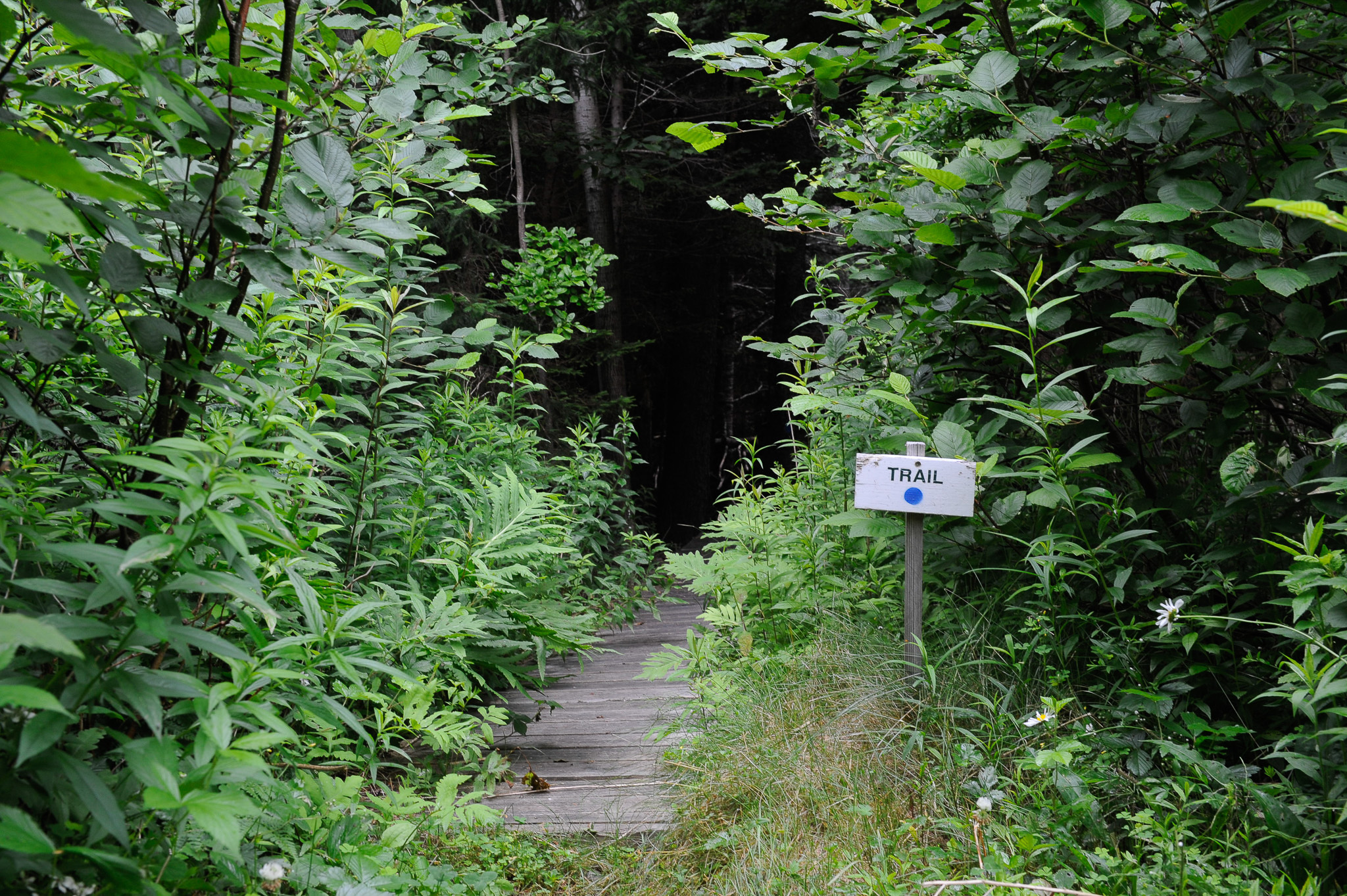
As a camp-goer, I was surprised how easy it was to get around campus, and how rhythmic and deliberate it all felt. In the morning, I would catch a breath of cool ocean air while climbing the stairs to the dining hall to eat. After breakfast, I would collect my thoughts as I walked farther up campus to the hot shop to work, return to the dining hall for lunch and dinner, then head all the way down to the sleeping cabins after finishing up work when I was usually exhausted. The quality in the pattern is the difference between if the architect put all the dorms at the top of the hill, to maximize views, and put the workspaces and dining hall at the bottom. This would have meant descending the stairs in the morning when fresh and trudging up them after a long day of work—a not-so-subtle drain on one’s energy.
(Despite my admiration, some critics have pointed out that Haystack’s top-down layout, while functional, can feel rigid or imposing in terms of circulation—a labyrinth of stairs, deck connections—especially for those with mobility issues.)
Expanding on Barnes’s functional concept, Domer observed that the hierarchy of structures mirrors the social order: the communal spaces are the most generous, while the private quarters grow progressively smaller. Even the faculty accommodations are spartan, he noted, conveying “a feeling of equality that helps make the camp work.
“There’s a real hierarchy in the disposition of all the most important places to the less important places, but none of them are unimportant,” Domer said.
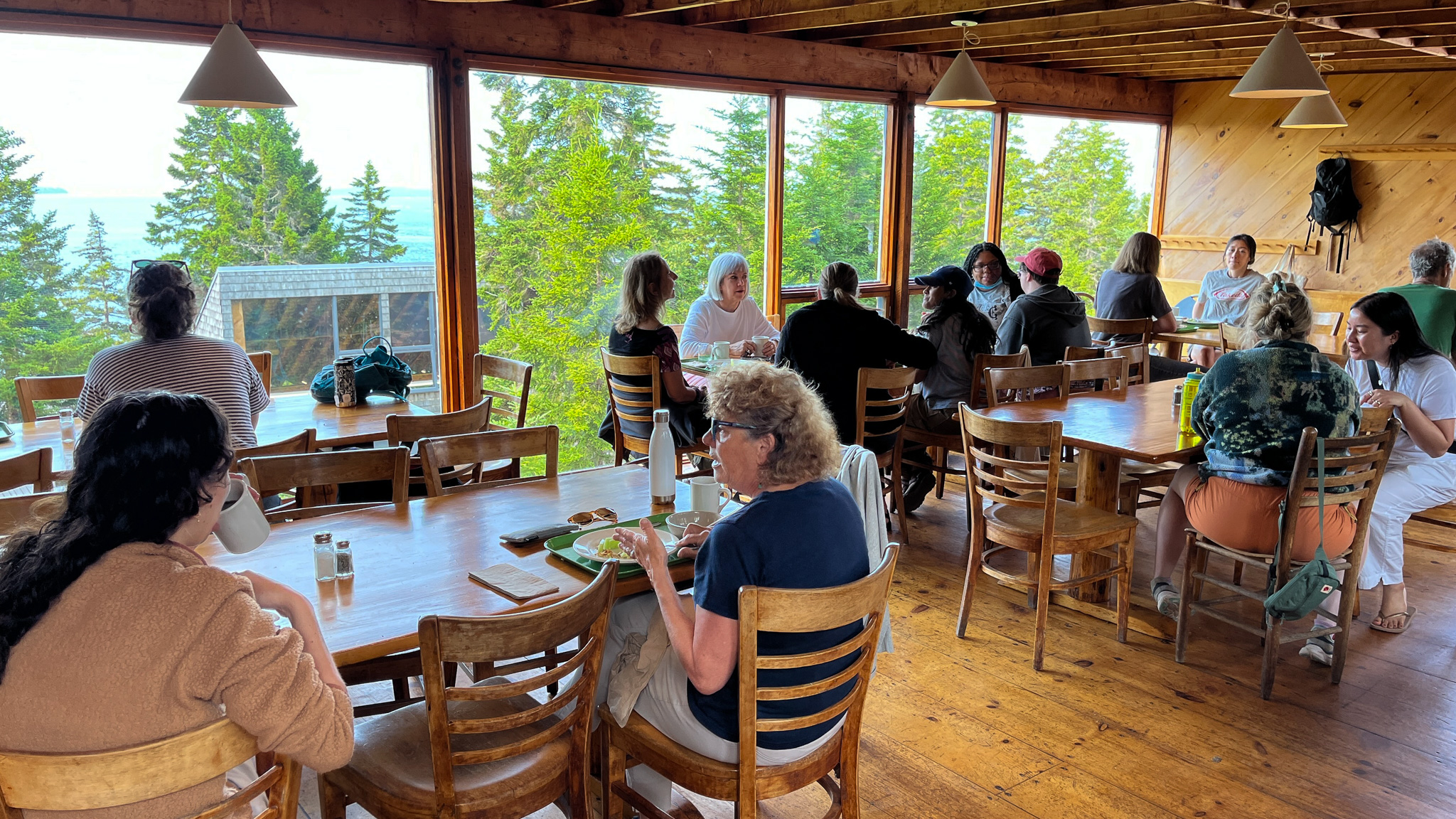
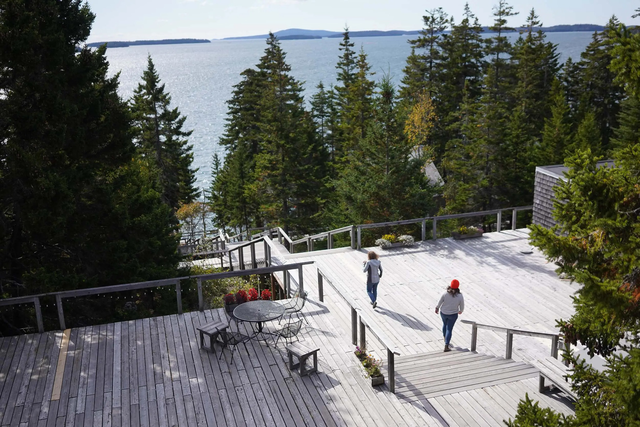
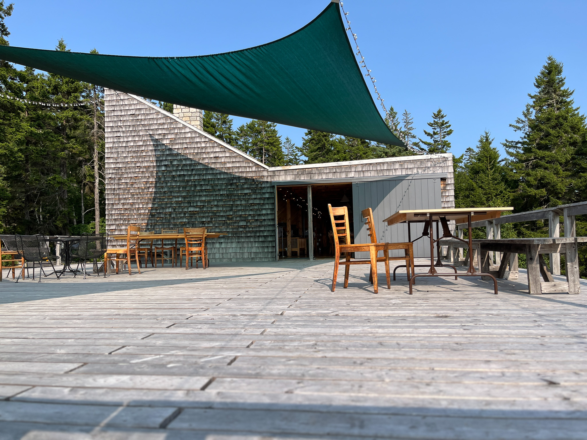
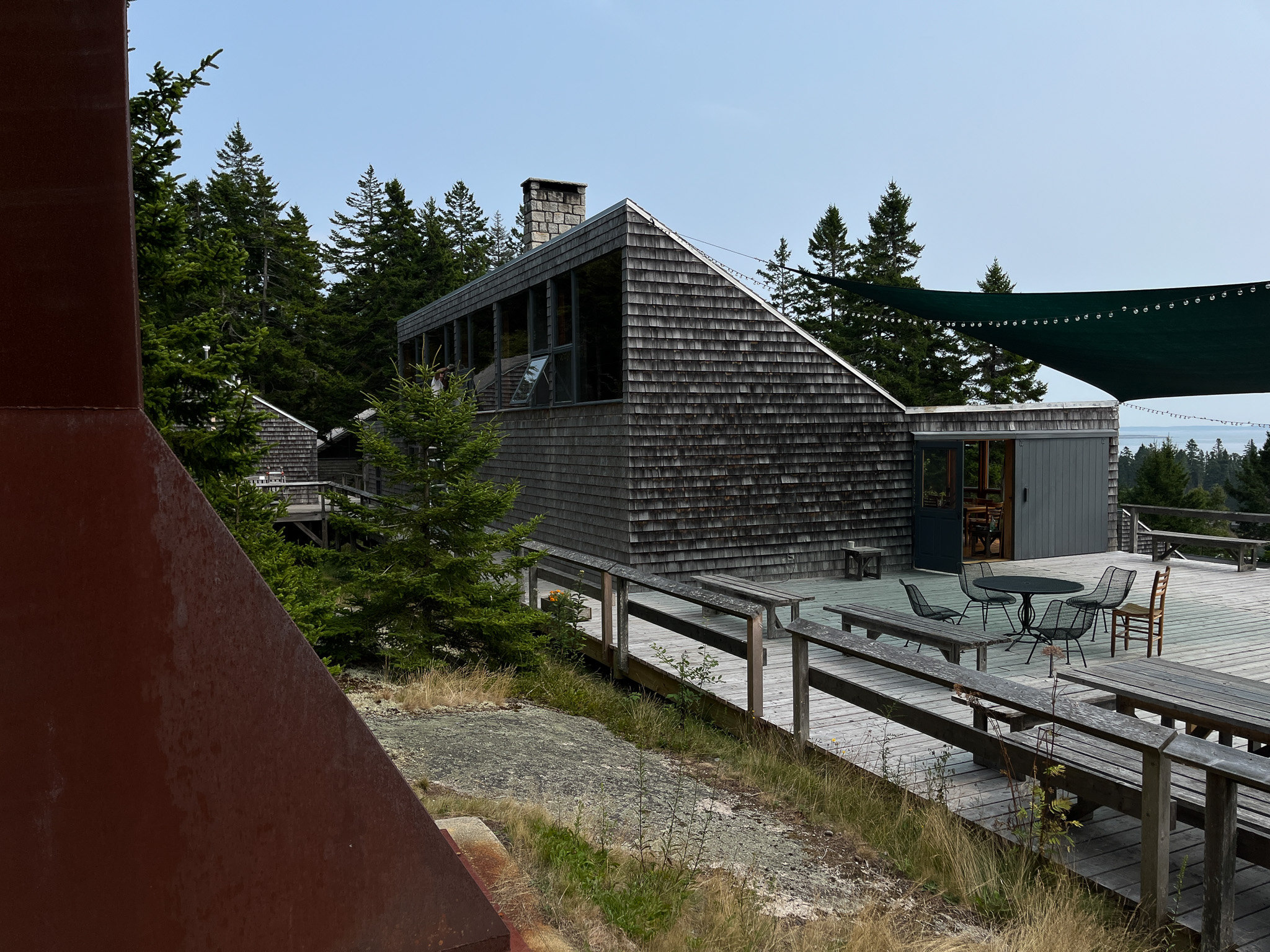
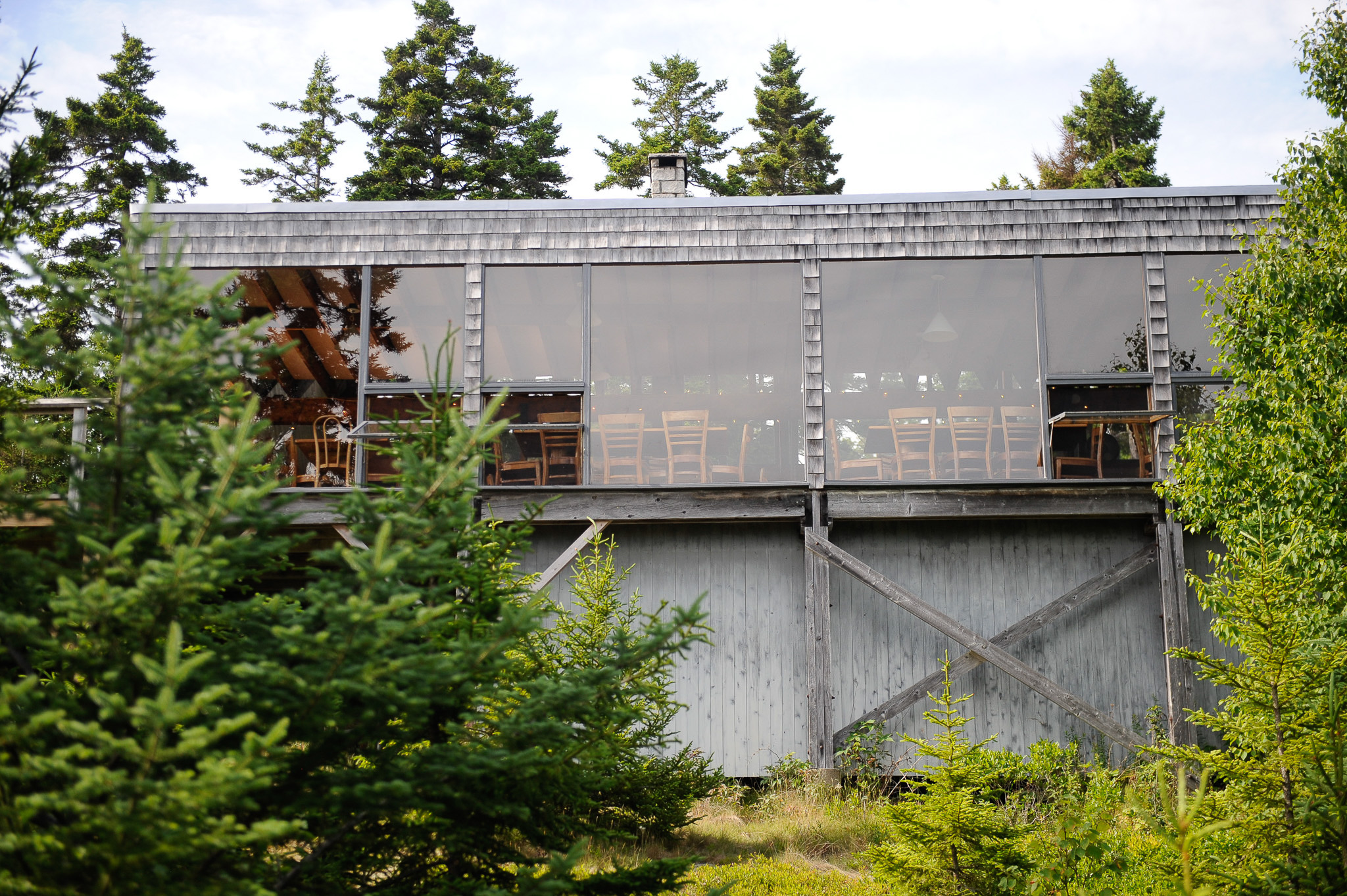
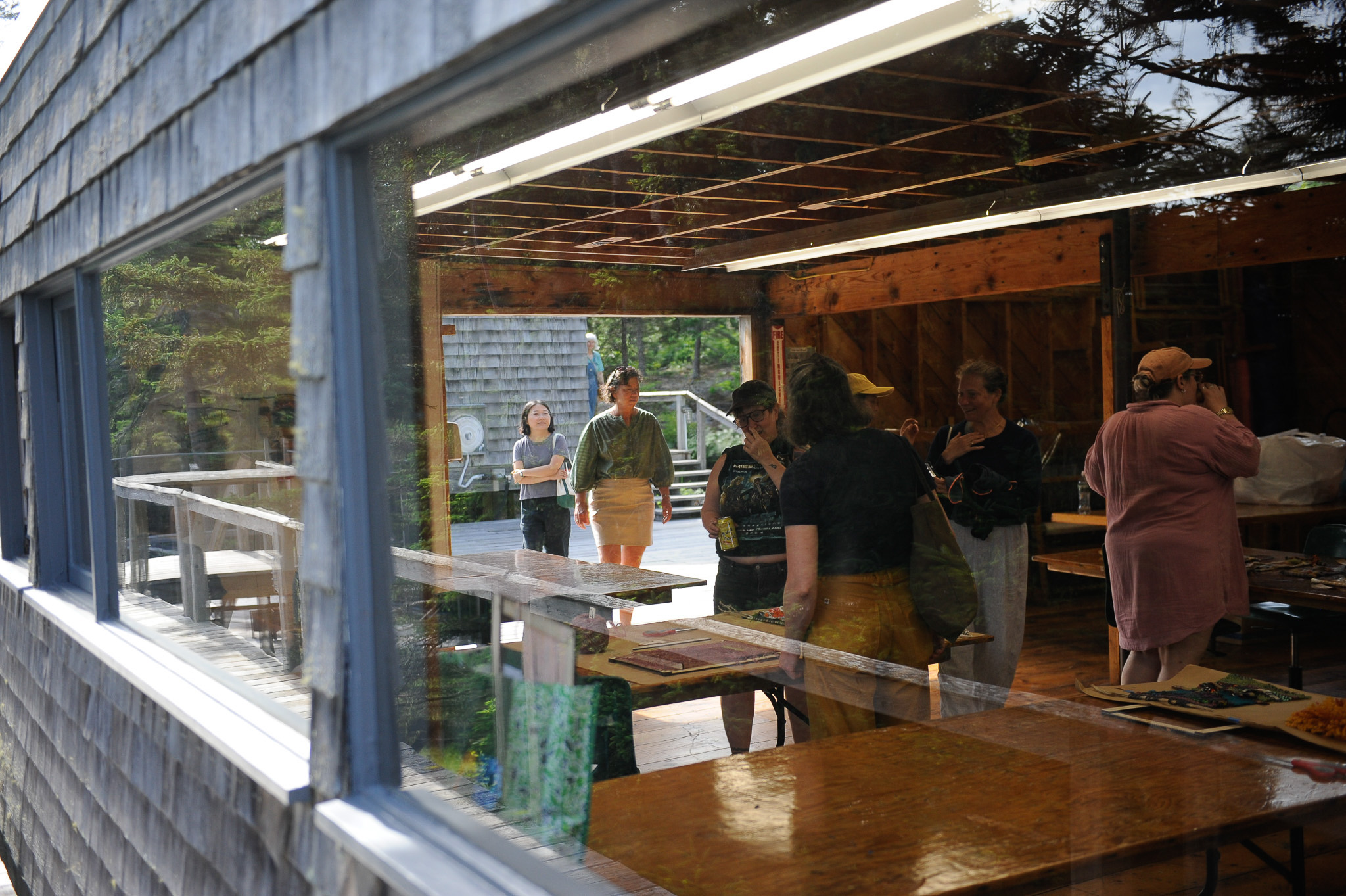
One of the most important places is the dining hall, which affords a spectacular view of Isle au Haut and the sparkling blue water of Jericho Bay. The entire campus eats there together like the old evening meals in the college dormitory, and it is fundamental to the Haystack experience. Indeed, it was during the sharing of meals with fellow students and faculty that I made the most connections and felt the greatest sense of community. It dawned on me that our culture has largely forfeited this ritual, but the fact that it persists at institutions like Haystack gives me hope that someday it might be revived in high schools and college campuses. Today’s mall-style food courts, with their diverse seating and flexible food options to meet student preferences, is anathema to community building.
Dining Hall. Photo: Bill Steele
Thinking I could be wrong about that, I spoke with KU industrial design professor May Tveit, who attended Haystack in 2021, right after the pandemic lockdown. She also emphasized the importance of the food during her two-week artist residency. “That communal dining experience facilitated conversation and relationships and nourishment on so many levels,” Tveit said. “You’re reminded of the power of these very basic elemental essences.”
At every level, Barnes reaches out to the archetypes of human experience: community, sharing, cohabitation, ritual, solitude. This knowledge requires a deeper understanding of architecture that “transcends the program,” as the late KU professor of architecture Steve Grabow used to tell students. It’s what separates architecture that is timeless and alive—to borrow a concept from Berkeley theorist Christopher Alexander—from architecture that is lifeless and dead. Artists seem to intuitively understand this, which is why their sensibilities—rooted in observation, empathy, and material honesty—remain indispensable to the evolution of architecture.
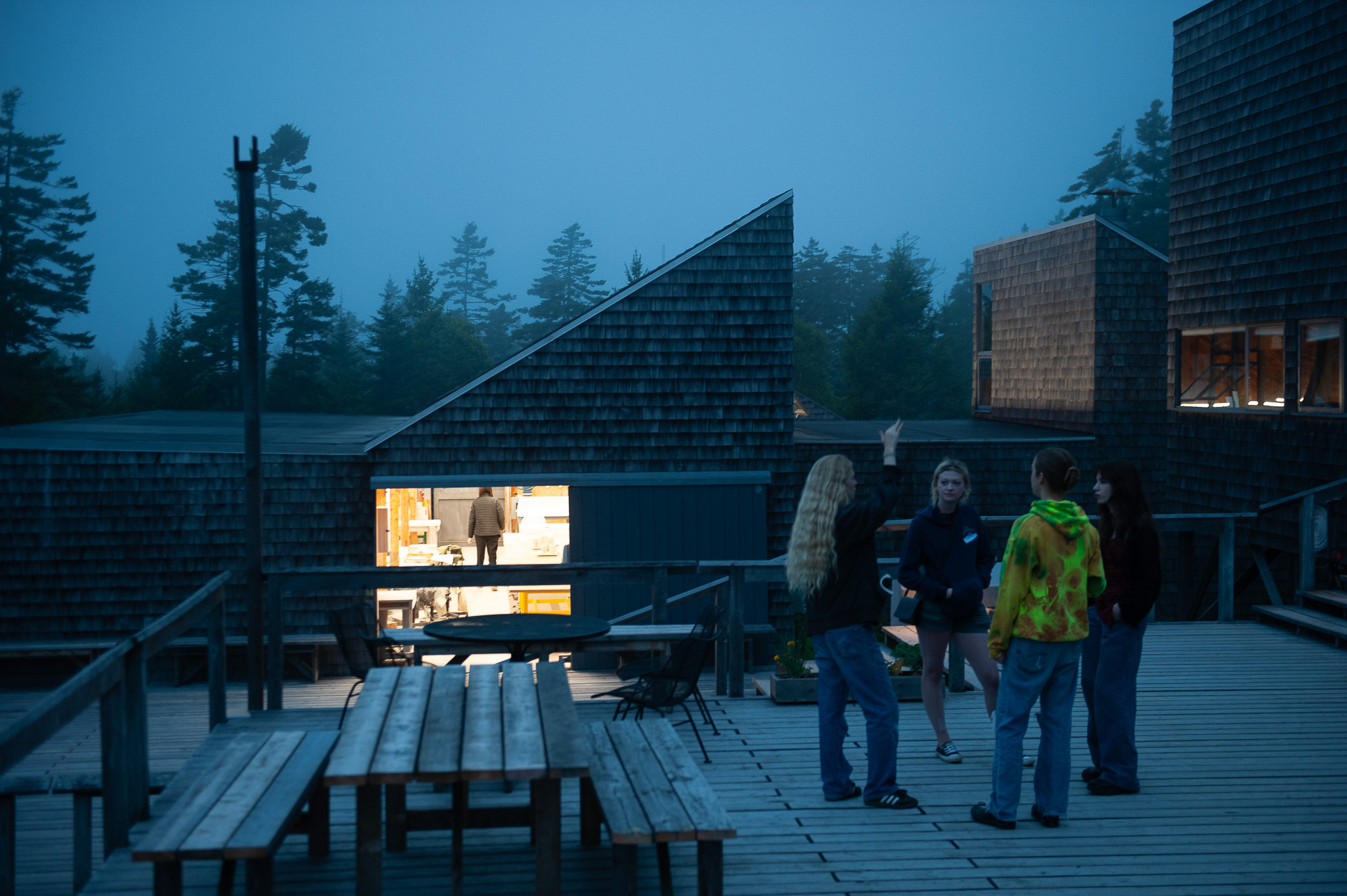
Dining Hall patio at dusk. The Clay Studio is in the background. Photo: Bill Steele
“It just made so much sense to me,” Tveit said of her two weeks at the school. “I didn’t want it to end. As I navigated my time there, I thought, every city should have a Haystack. Every town should have a Haystack where there’s this incredible architecture as well as an incredible program to facilitate creativity.”
Reflecting on my own all-too-brief visit, I also felt a mix of awe and envy and that all-too-insistent urge to broadcast my privilege—‘OMG!!! you’ve got to see this place!!’—but I stopped myself, as did, I think, many of the other artists in Square ONE. I noticed that hardly anyone at Haystack was on their phone. The remoteness of the location and lack of cell service in parts of Deer Isle certainly factored, but more than that, you don’t reach for your phone because you’re so immersed in what you’re doing, so present in the moment, that doing so would only interrupt the flow state. At Haystack, navel-gazing is a waste of time: the air insists on focus.
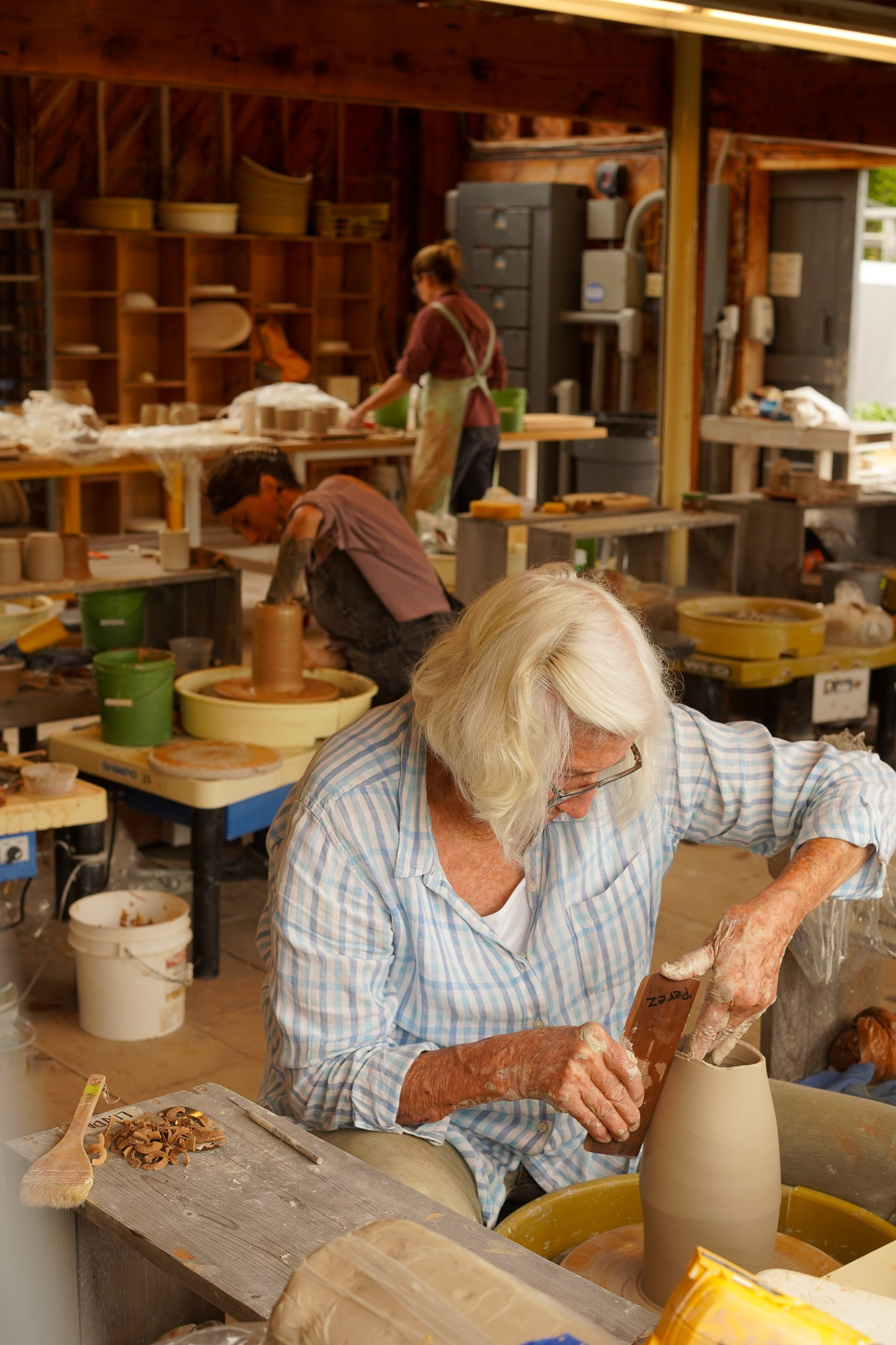
“People there work like hell,” said Cynthia Schira, a renowned textile artist who taught weaving at KU for more than 20 years and is an honorary board member of Haystack. “It’s beautiful, but it’s also a place for you to work, and your work is more important in the sense.”
Schira was first invited to teach at Haystack in the mid-1970s, after she graduated from the Rhode Island School of Design and got her M.F.A. at KU. I asked her if she thought the architecture influenced the intensity of students’ work, which often goes into the wee hours.
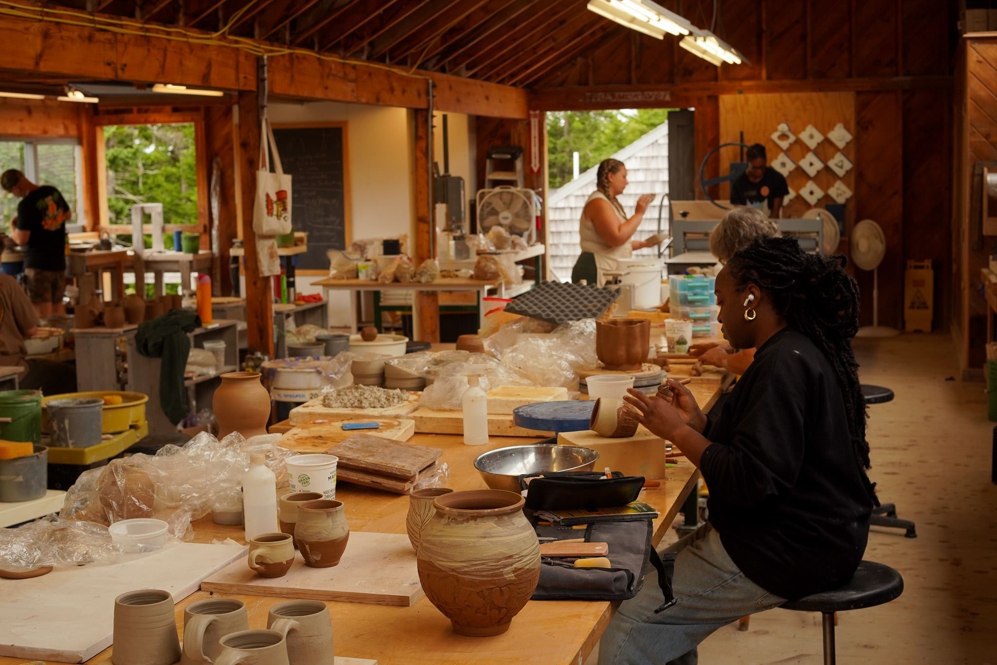
“Yes, I think the architecture really does,” said Schira, who continues to practice weaving in upstate New York at age 92. “Something I love about it is the openness—there are big doors on every studio. You have to slide them open. And there’s all the windows so, you know, you see. The walls are thin—you hear what’s going on. It keeps your curiosity going. Why not just poke into the studio next to yours?”
Schira didn’t mention the studio lighting, but it is worth highlighting. (Pun intended.) The placement of the windows, which are located on opposite sides, north and south, result in a consistent, diffused light throughout the daylight hours. They are ideal spaces in which to work. Most of the campus dorms also have windows on two sides, east- and west-facing. This would seem like a minor detail but many rooms in contemporary buildings have light from one side only.
Another textile artist from Kansas, Jennifer Morrow, remembers being transformed by the campus architecture when she first went to Haystack in 1982, both by its expressed structure and site repair.
“One of the things that influenced me was that sense of repair, like visible repair, what we now call visible mending,” said Morrow, who taught at KU in the early 1990s and now lives on Deer Isle. “It [Haystack] was the first place that I think I saw where people were just honestly repairing something and keeping and maintaining it and not trying to, like, paint it to look like it had always been.”
Indeed, a big part of Haystack’s timeless feel is the near monastic devotion of its caretakers, who maintain its wooden structures like shipbuilders in drydock. Incessant exposure to salt air, wind, snow, ice, lichens, moss, and water takes its toll.
Walter Kumiega, Haystack’s buildings and grounds manager, said that one of the difficulties maintaining the architectural integrity of the historic property is figuring out what was the intended design 65 years ago.
“There’s little details that you kind of have to worry about but there’s no documentation for,” Kumiega said.
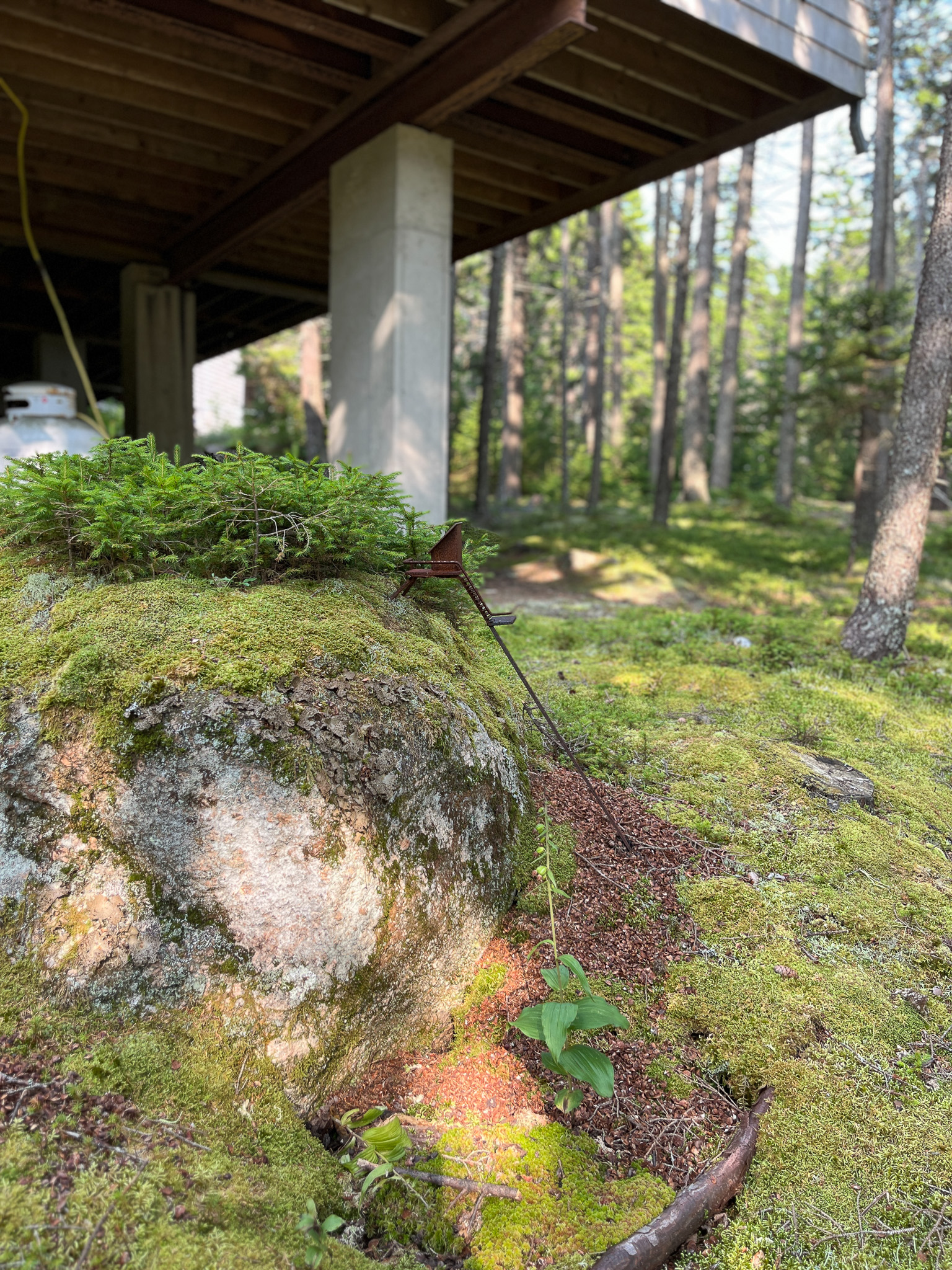
Concrete footing under the Fiber Studio. Photo: Bill Steele
According to Ginger Aldrich, the school’s development director, nearly everything on structure has been replaced at least once as part of the school’s rigorous maintenance regimen.
“It’s expensive and yet at the same time the idea was continuous repair and renewal so that we wouldn’t have to close for a season while we transformed a building,” Aldrich said. “There’s a lot of thought that goes into the maintenance and stewardship of the buildings and the grounds so it’s not a huge cost all at once.”
We are now in a period where midcentury modern buildings are increasingly being preserved and seen as worthy of conservation. Haystack offers us a time-tested model for preserving not just those buildings, but any building. The school’s approach to maintenance as incremental preservation—small, thoughtful repairs rather than one-off acts of restoration—is sustainable, economical, and avoids the sweeping overhauls that so often lead to regrettable changes. It is the surest way to maintain architectural integrity.
As I think about it, my lasting memory of Haystack may end up being not the architecture, the food, or the people I met but the reassuring sound of hammers reverberating across the campus, which had the surprisingly soothing effect of reminding me that, thankfully, not all aspects of American building culture have been thoughtlessly discarded. Not once did I hear the pop-pop-pop of a nail gun.
Not unrelatedly, perhaps Haystack’s greatest act of preservation has been its resistance to growth, expansion, and endless upgrading. While the school has added a few buildings (notably, a seamless library addition designed by Carol Wilson) and made numerous sustainability and infrastructure upgrades over the years, the gestalt remains unchanged. Critically, the school has capped the number of students it can accommodate to 100. (It originally accommodated about 65.) During my stay, around 75 students (mostly women) were enrolled in Square ONE, and by the time I left I felt like I knew many of them. “More than a hundred, you’re going to lose that sense of community and connection,” Aldrich said. “It really keeps our values honest.”
Ultimately, it is those shared values that accounts for Haystack’s greatness. From the beginning, the school has been governed by a board and director working closely together, with artists and craftspeople actively shaping the program rather than having decisions imposed by outsiders. (The school has remained fiercely independent, deliberately avoiding entanglement with commerce.) And while the campus architecture is the work of an outside architect, its essential goodness and beauty is not solely attributable to him, but the arts community as a whole—the founders, builders, caretakers, invited faculty, administrators, and students—who have been able to cultivate such a profound connection between architecture and people, sustaining a dialogue between design and use that remains as vital today as it was the day Haystack opened.
—Bill
Addison de Lisle Jill McDonald Sierra Iturrino Ellie Patten Oona Baker Emily Summers Will Steele
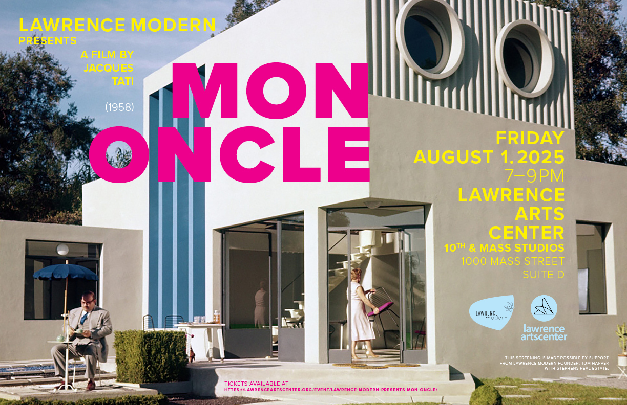
What happens when your charmingly clueless uncle stumbles into the future—and starts pressing all the wrong buttons? That’s the setup for director Jacques Tati’s French comedy Mon Oncle—the follow-up to his masterpiece, Playtime—where the endearingly inept Monsieur Hulot still finds himself at odds with modern architecture, mechanical efficiency and consumerism in postwar Paris. From Tati’s vantage, the absurdities and dehumanizing aspects of modern living are too ripe not to mine for laughs and social commentary. “Jacques Tati is the great philosophical tinkerer of comedy, taking meticulous care to arrange his films so that they unfold in a series of revelations and effortless delights,” wrote film critic Roger Ebert, who put Mon Oncle on his ‘Great Movies of All Time’ list.
Please join us at the Lawrence Arts Center’s Microcinema on Friday, August 1st for an amusing summertime diversion. Show starts at 7 p.m. Tickets are on sale at the Lawrence Arts Center and can be purchased in advance here or at the door for $10. Beer, wine and popcorn concessions will be available. Runtime is 1 hr. 57 min. Lawrence Modern’s Tim Hossler, fresh from a trip to Paris, and architectural historian Dennis Domer will enliven us with a discussion of the film after the screening.
Special thanks to Tim Hossler for creating the event flyer and to the Arts Center for their continued support of our film series.
All films are open to the public, seating is limited.